我有一个视频,在顶部叠加了文本。这个覆盖层周围有边框,但设计要求将角落剪掉。以下是我希望实现的效果图:  是否有一种只使用简单的CSS而不是添加透明HTML元素以增加边框的方法来实现这种具有切割角的白色边框呢?
是否有一种只使用简单的CSS而不是添加透明HTML元素以增加边框的方法来实现这种具有切割角的白色边框呢?是否有一种只使用简单的CSS而不是添加透明HTML元素以增加边框的方法来实现这种具有切割角的白色边框呢?:before 和 :after 来绘制一些边框,并调整一下 margin / width / height,以使其看起来更好:div:before {
content:'';
border-top: 4px solid white;
border-bottom: 4px solid white;
width: 596px;
height: 272px;
margin: 10px 20px;
position: absolute;
}
div:after {
content:'';
border-left: 4px solid white;
border-right: 4px solid white;
width: 612px;
height: 256px;
position: absolute;
margin: 20px 10px;
}
{{链接1:jsBin演示}}
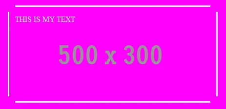
.video{
    position:relative;
    width:500px;
    height:300px;
    background:url(//placehold.it/500x300/f0f);
}
.overlay{
    /*Uncomment Bachground to reveal the logic */
    /*background:rgba(0,0,0,0.2);*/
    color:#fff;

    position:absolute;
    width:400px;
    margin:50px;
    height:164px;
    padding:15px 0; /* remember 15 ...*/

    border-top:3px solid #fff;
    border-bottom:3px solid #fff;
}
.overlay:before,
.overlay:after{
    content: " ";
    position:absolute;
    background:#fff;
    width: 3px; /* same as .overlay border width */

    top:5%; /* This is also interesting */
    height:90%; /* Do the math */
}
.overlay:before{left: -15px;} /* :) */
.overlay:after{right: -15px;}
从我的评论中:多重背景和渐变(可以是1像素的图像)演示
<div class="cornersOff"><img src="http://lorempixel.com/640/480/cats/1"/></div>
和 CSS
.cornersOff {
  position:relative;
  display:inline-block; /* or table or float or width or whatever*/
}
.cornersOff img,
/* not an image ? */ .cornersOff > * {
  display:block;/* or vertical-align:top for inline-block element*/
}
.cornersOff:before {
  content:'';
  height:100%;
  width:100%;
  position:absolute;
  border:solid 10px transparent;/* size here tells how far from borders you want to see these new borders drawn */
  box-sizing:border-box;/* include that border width */
  background:
    linear-gradient(to top, rgba(255,255,255,0.8), rgba(255,255,255,0.8)) top center no-repeat ,
    linear-gradient(to top, rgba(255,255,255,0.8), rgba(255,255,255,0.8)) bottom no-repeat,
    linear-gradient(to top, rgba(255,255,255,0.8), rgba(255,255,255,0.8)) left no-repeat,
    linear-gradient(to top, rgba(255,255,255,0.8), rgba(255,255,255,0.8)) right no-repeat;
  background-size: 580px 3px,580px 3px , 3px 420px, 3px 420px;
  /* it cactches the click event ? : uncomment this : *//* pointer-events:none*/
}
img标签内可以是iframe、video标签或者其他内容。
如果你在点击时遇到麻烦,你可以在.cornersOff:before中添加规则:pointer-events:none;,这样它就不会捕获点击事件……如果设置了一些透明度background-color的话,这可能是一个问题。