如何在Material-ui的TableSortText组件中自定义颜色文本和图标?

3

我想做什么:

我正在尝试为我的EnhancedTable组件提供自定义样式的选项,用户可以通过传递一个包含属性的样式对象,如headCellColorheadCellBackgroundColorbodyCellColorbodyCellBackgroundColor等,这些属性可以用于在TableHeadTableBody中着色单元格。

TableHead组件中,我使用了一个TableSortLabel,类似于这个material-ui文档示例中所做的https://material-ui.com/components/tables/#sorting-amp-selecting

我希望基于用户提供的props,在鼠标悬停和激活状态时自定义颜色文本和箭头图标。

让我们看看不同情况下TableSortLabel的颜色: 文本的颜色最初是灰色,没有箭头。当鼠标悬停在上面时,会出现一个灰色的箭头,并且文本变为黑色。单击后,设置为活动状态,灰色箭头变为黑色,并且文本永久变为黑色,直到删除活动状态。

我已经尝试过:

const useStyles = makeStyles({
  tableSortLabel: props => ({
    backgroundColor: "blue",
    color: props.headCellColor,
    fill: props.headCellColor,
    "&:hover": {
      backgroundColor: "blue"
    }
  })
});

function EnhancedTableHeadCell(props) {
  const { isActive, onHoverSortState, clickHandler, ...otherProps } = props;
  const classes = useStyles(props.styles);

  return (
    <FancyTableCell styles={props.styles} {...otherProps}>
      <TableSortLabel
        active={isActive}
        classes={{
          icon: classes.tableSortLabel,
          active: classes.tableSortLabel
        }}
        direction={onHoverSortState}
        onClick={clickHandler}
      >
        {props.children}
      </TableSortLabel>
    </FancyTableCell>
  );
}

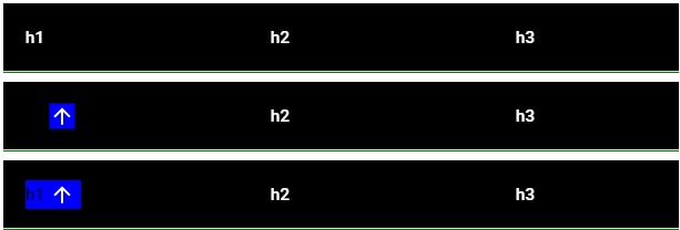
这是在浏览器中的样子:https://i.postimg.cc/fW7W2MRB/c1.jpg
第一个是正常的标题,第二个是悬停时显示的,第三个是点击后的状态。
从我们观察到的情况来看,在所有三种情况下(正常、悬停、激活),文本颜色完全不受 color CSS 属性的影响。在悬停时,backgroundColor 只影响图标而不影响文本。然而,我们可以看到当它处于激活状态时,backgroundColor 影响文本。图标一切如常,唯一的问题就在于文本。
我可能做错了什么?我该如何解决这个问题?
4个回答

7
我的经验是:
const StyledTableSortLabel = withStyles((theme: Theme) =>
createStyles({
    root: {
      color: 'white',
      "&:hover": {
        color: 'white',
      },
      '&$active': {
        color: 'white',
      },
    },
    active: {},
    icon: {
      color: 'inherit !important'
    },
  })
)(TableSortLabel);

你可以参考以下内容来提高CSS的特异性: https://material-ui.com/customization/components/#pseudo-classes

3
您的问题的解决方案如下:
MuiTableSortLabel: {
      root: {
        color: textPrimary,

        // if you want to have icons visible permanently
        // '& $icon': {
        //   opacity: 1,
        //   color: primaryMain
        // },

        "&:hover": {
          color: primaryMain,

          '&& $icon': {
            opacity: 1,
            color: primaryMain
          },
        },
        "&$active": {
          color: primaryMain,

          // && instead of & is a workaround for https://github.com/cssinjs/jss/issues/1045
          '&& $icon': {
            opacity: 1,
            color: primaryMain
          },
        },
      },
    }

我通过ThemeProvider全局使用这个重新样式化,但你当然可以通过"withStyles" HOC(请参见示例中的"BootstrapButton")在单个组件中单独使用它。


1
哇,这太疯狂了,但它起作用了。试图覆盖 MUI 类的超级特定性让我头痛,但你的解决方案起作用了,而且我学到了东西。 - Jarrod McGuire
@JarrodMcGuire 如果我不想全局应用此配置,而是针对特定组件应用该配置怎么办? - fredyjimenezrendon
@fredyjimenezrendon,你应该能够使用withStyles来包装组件做同样的事情。例如: import MuiTableSortLabel from '@material-ui/core/TableSortLabel'; const TableSortLabel = withStyles({ root: { } })(MuiTableSortLabel); - Jarrod McGuire

1

在Mui5中对我有用:

sx = {
    {
        '&.MuiTableSortLabel-root': {
            color: 'white',
        },
        '&.MuiTableSortLabel-root:hover': {
            color: 'blue',
        },
        '&.Mui-active': {
            color: 'blue',
        },
        '& .MuiTableSortLabel-icon': {
            color: 'blue !important',
        },
    }
}

'&.MuiTableSortLabel-root' <-- 没有空格 &。

'&.Mui-active' <-- 没有空格 &。

'& .MuiTableSortLabel-icon' <-- 有空格


0

我找不到一个合适的方法来解决这个问题,所以我想出了一个临时的解决方案,覆盖了 Material UI 的 CSS。

我将以下代码添加到我的全局 CSS 中:

.MuiTableSortLabel-root.MuiTableSortLabel-active,
.MuiTableSortLabel-root:hover,
.MuiTableSortLabel-icon {
  color: inherit !important;
}

网页内容由stack overflow 提供, 点击上面的
可以查看英文原文,
原文链接