我正在尝试在Jupyter Python笔记本中使用matplotlib绘制图形。但是当我分配y轴标签时,它不显示在图形中,并且它绘制了两个图形。我正在使用的代码是:
trans_count_month = df.groupby('month_').TR_AMOUNT.count()
plt.xlabel('Months')  #X-axis label
plt.ylabel('Total Transactions Count') #Y-axis label
plt.title("Month wise Total Transaction Count") #Chart title.
width = 9
height = 5
plt.figure(figsize=(width, height))
trans_count_month.plot(kind='bar')
plt.figure(figsize=(width, height))
我得到的输出是:
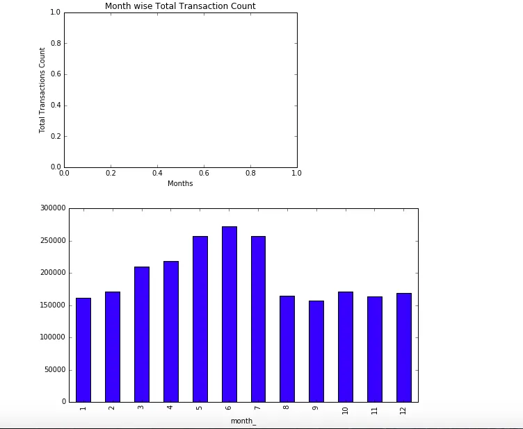 我该如何显示只有一个带y轴标签的图表,如果有其他绘制此图表的方法,请分享解决方案。
plt.figure(figsize=width, height)即可。 - ml4294plt.xlabel/ylable/title应该在.plot之后。此外,使用plot的figsize关键字参数,而不是plt.figure(figsize=())。 - Dror