我目前正在为朋友制作一个网站,使用的是Bootstrap 4 alpha。
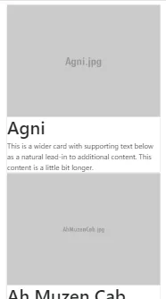
我使用Cards在页面上显示了三张卡片,并希望当屏幕变成移动尺寸时,每行只显示一张卡片:
我不想使用列,但我想使用Bootstrap Cards
示例:
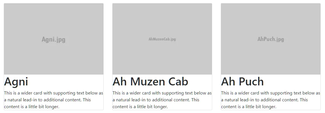
Normal Screen
+++ CARD 1 +++ +++ CARD 2 +++ +++ CARD 3 +++Mobile screen
+++ CARD 1 +++ +++ CARD 2 +++ +++ CARD 3 +++
网站链接是:http://www.smitefr.mmo-stream.net/index.php
代码示例:
<div class="row">
            <div class="card">
            <img src="images/dieux/Agni.jpg" alt="Card image cap">
            <h1> Agni</h1>
            <p class="card-text">This is a wider card with supporting text below as a natural lead-in to additional content. This content is a little bit longer.</p>
        </div><div class="card">
            <img src="images/dieux/AhMuzenCab.jpg" alt="Card image cap">
            <h1> Ah Muzen Cab</h1>
            <p class="card-text">This is a wider card with supporting text below as a natural lead-in to additional content. This content is a little bit longer.</p>
        </div><div class="card">
            <img src="images/dieux/AhPuch.jpg" alt="Card image cap">
            <h1> Ah Puch</h1>
            <p class="card-text">This is a wider card with supporting text below as a natural lead-in to additional content. This content is a little bit longer.</p>
        </div>
</div>
CSS示例:
.card {
    float: left;
    width: 33.333%;
    padding: .75rem;
    margin-bottom: 2rem;
    border: 0;
}

.card > img {
    margin-bottom: .75rem;
    display: block;
    width: 80%;
    height: auto;
    margin-left: auto;
    margin-right: auto;
}

.card-text {
    font-size: 85%;
}