我正在制作一个“灰色主题”,虽然还需要进行一些微调,但我对它感到相当满意。
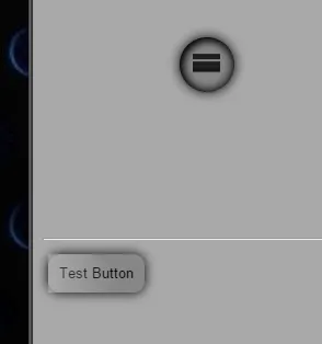
但我在使用Chrome浏览器时遇到了问题,当悬停在“测试按钮”上时,伪元素不遵循border-radius,导致出现了方形边角的hover效果。其他浏览器似乎没有这个问题。
 我希望伪元素能够遵循边框半径。
我的按钮代码如下:
有没有办法防止按钮伪类出现在实际元素的边框半径之前(这会产生“闪光”效果)?
重现说明:
- 在 Chrome 中运行片段 - 悬停在径向菜单上 - 现在悬停在按钮上 - 在动画完成时查看按钮伪类的“方形角”。
我目前得到的是:
我想得到的是:
我似乎在最新版本的 Chrome 中遇到了这个问题。
需要注意的一点是,这种效果在径向菜单中完美地使用,所以我不确定为什么它会在按钮实例上发生?
有没有办法确保这在生产中不会发生,以便这个“方形角”不会出现(似乎只在最新的 Chrome 中出现问题)?
更新:
- 另一个用户报告说; - 右键单击按钮,左键单击检查元素,在开发工具打开之前悬停 =>bug(“悬停离开”效果也有 bug) - 另一个用户根本无法重现此问题(在 V.24 上)。
我希望伪元素能够遵循边框半径。我的按钮代码如下:
+ function() {
  var to;
  $(".wrap").on('mouseenter', function() {
    var circles = $(this).find(".circle");
    var degree = (2 * Math.PI) / circles.length; //calc delta angle
    var transforms = [];

    // Calculate the position for each circle
    circles.each(function(index) {
        var x = 100 * Math.cos(-0.5 * Math.PI + degree * (-1 * index - 0.5));
        var y = 100 * Math.sin(-0.5 * Math.PI + degree * (-1 * index - 0.5));

      transforms.push('translate(' + x + 'px,' + y + 'px)');
    });

    // Function to moves all the circles
    // We'll pop a circle each time and than call this function recursively
    function moveCircles() {
      var transform = transforms.shift();
      circles.css('transform', transform);

      circles.splice(0, 1);
      if (circles.length) to = setTimeout(moveCircles, 400);
    }

    moveCircles();
  });

  $(".wrap").on('mouseleave', function() {
    var circles = $(this).children().css('transform', '');
    clearTimeout(to);
  });
}();html, body {
background:darkgray
}
/*****************Radial Menu (plus bit of button)***********************/
.wrap {
height:300px;
width:300px;
position:relative;
transform-origin: center center;
transition:all 0.8s;
}
.circle {
transition:all 0.8s;
position:absolute;
height:5px;
width:5px;
text-align: center;
line-height: 15px;
top: calc(50% - 2px);
left: calc(50% - 2px);
border-radius: 50%;
overflow:hidden;
}
.parent{
transition:all 0.8s;
position:absolute;
background:gray;
height:50px;
width:50px;
text-align: center;
line-height: 25px;
top: calc(50% - 25px);
left: calc(50% - 25px);
border-radius: 50%;
z-index:8;
box-shadow: inset 2px 2px 10px black, inset 0 0 15px black, 0 0 15px black;
}
.parent:before,.parent:after{
content:"";
position:absolute;
transition:all 0.8s;
height:5px;
width:25px;
top:22px;
left:12px;
background:black;
opacity:1;
}
.parent:before{
top:15px;
box-shadow: 0 14px 0 black;
}
.parent:hover:before,.parent:hover:after{
transform:translate(0,20px);
color:gray;
opacity:0;
box-shadow: 0 14px 0 none;
}
.wrap:hover .parent,.wrap:hover .parent:before,.wrap:hover .parent:after{
background:darkgray;
}
.wrap:hover .parent:before{
box-shadow:none;
}
.wrap:hover .circle {
height:50px;
width:50px;
line-height: 25px;
top: calc(50% - 25px);
left: calc(50% - 25px);
box-shadow: inset 2px 2px 10px black, inset 0 0 15px black, 0 0 15px black;
}
.circle img {
position:absolute;
height:100%;
width:100%;
left:0;
top:0;
}
.circle:before {
border-radius:50%;
transition:all 0.8s;
content:"";
position:absolute;
height:100%;
width:100%;
top:0;
left:0;
z-index:8;
}
.circle:after,button:after {
transition:all 0.8s;
border-radius:50%;
content:"";
position:absolute;
height:200%;
width:200%;
top:50%;
left:200%;
z-index:8;
background: -moz-linear-gradient(left, rgba(255, 255, 255, 0) 0%, rgba(255, 255, 255, 0.4) 50%, rgba(255, 255, 255, 0) 100%);
background: -webkit-gradient(linear, left top, right top, color-stop(0%, rgba(255, 255, 255, 0)), color-stop(50%, rgba(255, 255, 255, 0.4)), color-stop(100%, rgba(255, 255, 255, 0)));
background: -webkit-linear-gradient(left, rgba(255, 255, 255, 0) 0%, rgba(255, 255, 255, 0.4) 50%, rgba(255, 255, 255, 0) 100%);
background: -o-linear-gradient(left, rgba(255, 255, 255, 0) 0%, rgba(255, 255, 255, 0.4) 50%, rgba(255, 255, 255, 0) 100%);
background: -ms-linear-gradient(left, rgba(255, 255, 255, 0) 0%, rgba(255, 255, 255, 0.4) 50%, rgba(255, 255, 255, 0) 100%);
background: linear-gradient(to right, rgba(255, 255, 255, 0) 0%, rgba(255, 255, 255, 0.4) 50%, rgba(255, 255, 255, 0) 100%);
filter: progid:DXImageTransform.Microsoft.gradient(startColorstr='#00ffffff', endColorstr='#00ffffff', GradientType=1);
}
.circle:hover:after,button:hover:after {
left:-200%;
top:-50%;
}
.circle:hover:before {
box-shadow: inset 2px 2px 10px black, inset 0 0 15px black, 0 0 15px black;
}
/********************Button************************/
button {
margin:5px;
position:relative;
background:gray;
outline:0;
border:0;
padding:10px;
border-radius:10px;
box-shadow: inset 2px 2px 10px transparent, inset 0 0 15px transparent, 0 0 15px black;
background:rgba(0, 0, 0, 0.2);
transition:all 0.4s;
overflow:hidden;
}
button:active {
box-shadow: inset 2px 2px 8px black, inset 0 0 10px black, 0 0 18px black;
}<script src="https://ajax.googleapis.com/ajax/libs/jquery/2.1.1/jquery.min.js"></script>
<hr/>
hover near the menu to open
<div class="wrap">
<div class="parent"></div>
<div class="circle">
<img src="http://placekitten.com/g/300/300" />
</div>
<div class="circle">
<img src="http://placekitten.com/g/200/300" />
</div>
<div class="circle">
<img src="http://cdn.flaticon.com/png/256/56729.png" />
</div>
<div class="circle">
<img src="http://cdn.flaticon.com/png/256/54976.png" />
</div>
<div class="circle">Just Text</div>
<div class="circle">
<img src="http://cdn.flaticon.com/png/256/56582.png" />
</div>
</div>
<hr/>
then hover button
<button>Test Button</button>重现说明:
- 在 Chrome 中运行片段 - 悬停在径向菜单上 - 现在悬停在按钮上 - 在动画完成时查看按钮伪类的“方形角”。
我目前得到的是:
我想得到的是:
我似乎在最新版本的 Chrome 中遇到了这个问题。
需要注意的一点是,这种效果在径向菜单中完美地使用,所以我不确定为什么它会在按钮实例上发生?
有没有办法确保这在生产中不会发生,以便这个“方形角”不会出现(似乎只在最新的 Chrome 中出现问题)?
更新:
- 另一个用户报告说; - 右键单击按钮,左键单击检查元素,在开发工具打开之前悬停 =>bug(“悬停离开”效果也有 bug) - 另一个用户根本无法重现此问题(在 V.24 上)。