如何使用CSS应用多个transform?
例如:在下面的代码中,只有平移效果被应用,而旋转效果没有被应用。
li:nth-child(2) {
    transform: rotate(15deg);
    transform: translate(-20px,0px);
}
如何使用CSS应用多个transform?
例如:在下面的代码中,只有平移效果被应用,而旋转效果没有被应用。
li:nth-child(2) {
transform: rotate(15deg);
transform: translate(-20px,0px);
}
你需要将它们放在同一行,像这样:
li:nth-child(2) {
    transform: rotate(15deg) translate(-20px,0px);
}
请记住,多个变换指令在应用时从右到左进行。
这个:transform: scale(1,1.5) rotate(90deg);
和这个:transform: rotate(90deg) scale(1,1.5);
将不会产生相同的结果:
.orderOne, .orderTwo {
  font-family: sans-serif;
  font-size: 22px;
  color: #000;
  display: inline-block;
}

.orderOne {
  transform: scale(1, 1.5) rotate(90deg);
}

.orderTwo {
  transform: rotate(90deg) scale(1, 1.5);
}<div class="orderOne">
A
</div>
<div class="orderTwo">
A
</div>我添加这个答案不是因为它可能有帮助,而只是因为它是真实的。
除了使用已有的回答来解释如何通过链接它们进行多次翻译之外,您还可以自己构建4x4矩阵
我从在Google搜索时找到的一些随机网站中获取了以下图像,显示旋转矩阵:
绕x轴旋转: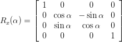
绕y轴旋转:
绕z轴旋转:
我找不到一个好的平移示例,所以假设我记得/理解正确,平移:
[1 0 0 0]
[0 1 0 0]
[0 0 1 0]
[x y z 1]
请参考维基百科关于转换矩阵的文章以及实用的CSS3教程,另外我发现了一份解释任意旋转矩阵的指南Egon Rath的矩阵笔记
当然,这些4x4矩阵之间可以通过矩阵乘法进行运算,所以要执行旋转后跟平移,就需要生成适当的旋转矩阵并将其乘以平移矩阵。
这可以给你更多自由去做出完美的效果,同时也会使得它几乎不可能被任何人理解,包括你在内在五分钟内。
但是,你知道,它起作用。
编辑:我刚才意识到我漏掉了可能是最重要和实际使用的部分,这是通过JavaScript逐步创建复杂的3D变换,这样事情会更有意义。
您也可以使用额外的标记层来应用多个转换,例如:
<h3 class="rotated-heading">
    <span class="scaled-up">Hey!</span>
</h3>
<style type="text/css">
.rotated-heading
{
    transform: rotate(10deg);
}

.scaled-up
{
    transform: scale(1.5);
}
</style>
当使用Javascript对元素进行变换动画时,这将非常有用。
transform-style: preserve-3d。 - Jack G您可以像这样应用多个变换:
li:nth-of-type(2){
    transform : translate(-20px, 0px) rotate(15deg);
}
li:nth-child(2) {
    rotate: 15deg;
    translate:-20px 0px;
}
<div class="teaser important"></div>

.teaser{rotate:10deg;}
.important{scale:1.5 1.5;}
我学到的教训。
如果您正在使用 style 的 React css,请不要包含分号,即使是在结尾处,因为 React 会自动内部包含它。
就像这样:
style={
  transform: "rotate(90deg) scaleX(-1)",
}
这是一个老问题,但最近对我来说非常相关。我发现使用 'transform: matrix(..)' 更方便。 因此,对于所提出的问题,以下示例在x轴上应用了约15度的旋转和20像素向右(为方便起见)的平移。
.matrixTransform {
    transform-origin: top left;
    transform: matrix(0.965,0.258,-0.258,0.965,20,0);
    font-size: 30px;
}
.combinedTransform {
    transform-origin: top left;
    transform: rotate(15deg) translateX(20px);
    font-size: 30px;
}<div class=matrixTransform>A</div>
<div class=combinedTransform>B</div>从这里开始,如果在CSS中重复2个或更多的值,则始终应用最后一个,除非使用!important标记,但同时尽可能避免使用!important,所以在您的情况下,这就是问题所在,因此第二个转换覆盖了第一个...
那么你该怎么做呢?...
别担心,transform可以同时接受多个值... 因此,下面的代码将起作用:
li:nth-child(2) {
  transform: rotate(15deg) translate(-20px, 0px); //multiple
}
If you like to play around with transform run the iframe from MDN below:
<iframe src="https://interactive-examples.mdn.mozilla.net/pages/css/transform.html" class="interactive " width="100%" frameborder="0" height="250"></iframe>请点击下面的链接获取更多信息:
如何在单行CSS中进行旋转和平移变换?
div.className{
    transform : rotate(270deg) translate(-50%, 0);
    -webkit-transform: rotate(270deg) translate(-50%, -50%);
    -moz-transform: rotate(270deg) translate(-50%, -50%);
    -ms-transform: rotate(270deg) translate(-50%, -50%);
    -o-transform: rotate(270deg) translate(-50%, -50%);
    float:left;
    position:absolute;
    top:50%;
    left:50%;
}<html>
<head>
</head>
<body>
<div class="className">
<span style="font-size:50px">A</span>
</div>
</body>
</html>