Bootstrap 4中的垂直居中对齐

489
我正在尝试使用Bootstrap 4将我的容器居中在页面中间。到目前为止,我一直没有成功。任何帮助都将不胜感激。
我已经在Codepen.io上构建了它,所以您可以与它进行交互,并让我知道哪些方法有效,因为我已经没有更多的想法了...

var currentAuthor = "";
var currentQuote  = "";
function randomQuote() {
  $.ajax({
      url: "https://api.forismatic.com/api/1.0/?",
      dataType: "jsonp",
      data: "method=getQuote&format=jsonp&lang=en&jsonp=?",
      success: function( response ) {
        $("#quote-content").html('<h2 id="quote-content" class="display-5"><i class="fa fa-quote-left" aria-hidden="true"> ' + response.quoteText + ' <i class="fa fa-quote-right" aria-hidden="true"></i></h2>');
        $("#quote-author").html('<p id="quote-author" class="lead"><em>' + response.quoteAuthor + '</em></p>');
        
        currentAuthor = response.quoteAuthor;
        currentQuote  = response.quoteText
      }
  });
}

function openURL(url){
  window.open(url,'Share', 'width=550, height=400, toolbar=0, scrollbars=1 ,location=0 ,statusbar=0,menubar=0, resizable=0');
}

function tweetQuote(){
      openURL('https://twitter.com/intent/tweet?hashtags=quotes,freecodecamp&related=freecodecamp&text=' + encodeURIComponent('"' + currentQuote + '" - ' + currentAuthor));
}

$(document).ready(function () {
    randomQuote();

    $("#get-another-quote-button").click(function(){
        randomQuote();
    });

   $('#tweet').on('click', function() {
       tweetQuote();
   });
});
html, body {
  background-image: url("https://www.mylinea.com/wp-content/uploads/beautiful-trees-stock-photo-055.jpg");
    background-color: #17234E;
    margin-bottom: 0;
    min-height: 30%;
    background-repeat: no-repeat;
    background-position: center;
    -webkit-background-size: cover;
    background-size: cover;
}


.btn-new-quote {
    color: #0C0C0D;
    background-color: transparent;
    border-color: #414147;
}

.btn-new-quote:hover {
    color: #0C0C0D;
    background-color: #9A989E;
    border-color: #0C0C0D;
}

#tweet {
    color: RGB(100, 100, 100);
}

#tweet:hover {
    color: RGB(50, 50, 50);
}


.jumbotron {
    position: relative;
    top: 50%;
    transform: translateY(-50%);
    opacity: .85;
    border-color:  RGB(50, 50, 50);
    padding-bottom: 8px;
}
<script src="https://cdnjs.cloudflare.com/ajax/libs/jquery/3.3.1/jquery.min.js"></script>
<link rel="stylesheet" href="https://cdnjs.cloudflare.com/ajax/libs/twitter-bootstrap/4.0.0-alpha.6/css/bootstrap.min.css">
<div class="container">
    <div class="row justify-content-center align-self-center">
        <div class="col-sm-6">
            <div class="jumbotron vertical-center text-center">
                <h2 id="quote-content" class="display-5"><i class="fa fa-quote-left" aria-hidden="true"></i><i class="fa fa-quote-right" aria-hidden="true"></i></h2>
                <p id="quote-author" class="lead"><em></em></p>
                <hr class="my-2">
                <div class="row align-items-center justify-content-between">
                    <div class="col-sm-1-4 text-left">
                        <a id="tweet" href="#">
                            <h2 class="display-4"><i class="fa fa-twitter" aria-hidden="true"></i></h2>
                        </a>
                    </div>
                    <div class="col-sm-1-4 text-right">
                        <button id="get-another-quote-button" type="button" class="btn btn-outline-secondary  btn-new-quote">Don't Quote Me on This...</button>
                    </div>

                </div>
            </div>
        </div>
    </div>
</div>

20个回答

1035

重要! 垂直居中是相对于父元素的高度

如果您尝试居中的元素的父元素没有定义高度任何垂直居中方案都无法工作!

现在,让我们来看垂直居中...

Bootstrap 5(2021年更新)

Bootstrap 5仍然基于flexbox,因此垂直居中的工作方式与Bootstrap 4相同。例如,在flexbox父元素(rowd-flex)上可以使用align-items-centerjustify-content-center或自动边距。

  • 在flexbox行父元素(rowd-flex)上使用align-items-center
  • 在flexbox列父元素(d-flex flex-column)上使用justify-content-center
  • 在flexbox父元素上使用my-auto

Bootstrap 5中的垂直居中


Bootstrap 4

您可以使用新的flexbox和尺寸实用工具容器(container)设置为全高并使用display:flex。这些选项不需要额外的CSS(除了容器(html,body)的高度必须为100%)。

选项1:在flexbox子元素上使用align-self-center

<div class="container d-flex h-100">
    <div class="row justify-content-center align-self-center">
     I'm vertically centered
    </div>
</div>

https://codeply.com/go/fFqaDe5Oey

选项2:在flexbox父元素上使用align-items-center.row采用display:flex; flex-direction:row

<div class="container h-100">
    <div class="row align-items-center h-100">
        <div class="col-6 mx-auto">
            <div class="jumbotron">
                I'm vertically centered
            </div>
        </div>
    </div>
</div>

enter image description here

https://codeply.com/go/BumdFnmLuk

选项 3 在弹性布局父元素上使用 justify-content-center.carddisplay:flex;flex-direction:column

<div class="container h-100">
    <div class="row align-items-center h-100">
        <div class="col-6 mx-auto">
            <div class="card h-100 border-primary justify-content-center">
                <div>
                    ...card content...
                </div>
            </div>
        </div>
    </div>
</div>

https://codeply.com/go/3gySSEe7nd


关于Bootstrap 4垂直居中

现在Bootstrap 4提供了flexbox和其他实用工具,有许多方法可以实现垂直对齐。 http://www.codeply.com/go/WG15ZWC4lf

1-使用自动边距进行垂直居中:

另一种实现垂直居中的方法是使用my-auto。这将使元素在其容器内居中。例如,h-100使行达到全高度,并且my-auto将使col-sm-12列垂直居中。

<div class="row h-100">
    <div class="col-sm-12 my-auto">
        <div class="card card-block w-25">Card</div>
    </div>
</div>

使用自动边距实现垂直居中演示

my-auto 表示在垂直 y 轴上的边距,相当于:

margin-top: auto;
margin-bottom: auto;

2 - 使用 Flexbox 实现垂直居中:

vertical center grid columns

自Bootstrap 4起,.row现在是display:flex,您可以在任何列上简单使用align-self-center来垂直居中它...
       <div class="row">
           <div class="col-6 align-self-center">
                <div class="card card-block">
                 Center
                </div>
           </div>
           <div class="col-6">
                <div class="card card-inverse card-danger">
                    Taller
                </div>
          </div>
    </div>

或者,在整个.row上使用align-items-center来垂直居中对齐行中的所有col-*...

       <div class="row align-items-center">
           <div class="col-6">
                <div class="card card-block">
                 Center
                </div>
           </div>
           <div class="col-6">
                <div class="card card-inverse card-danger">
                    Taller
                </div>
          </div>
    </div>

不同高度列的垂直居中演示

查看此问答以实现居中,但保持等高度


3 - 使用Display Utils垂直居中:

Bootstrap 4有显示工具, 可以用于display:table, display:table-cell, display:inline等。这些可以与垂直对齐工具一起使用,以对齐内联、内联块或表格单元格元素。

<div class="row h-50">
    <div class="col-sm-12 h-100 d-table">
        <div class="card card-block d-table-cell align-middle">
            I am centered vertically
        </div>
    </div>
</div>

使用Display Utils实现垂直居中演示

更多示例
<div>中垂直居中图片
在.container中垂直居中.row
<div>中垂直居中和底部对齐
在父元素中垂直居中子元素
垂直居中全屏的jumbotron


重要! 我有提到高度吗?

记住,垂直居中是相对于父元素的高度。如果你想在整个页面上居中,大多数情况下,这应该是你的CSS...

body,html {
  height: 100%;
}

使用父级/容器上的min-height: 100vh(在Bootstrap 4.1+中为min-vh-100),如果您想将子元素居中放置在父元素内。 父代必须具有定义的高度
另请参见:
Bootstrap 4中的垂直对齐
Bootstrap中心垂直和水平对齐

1
当在带有导航栏的页面上使用以上代码时,会出现滚动条。我认为它在导航栏下方添加了100%的高度,并在其上居中。我该如何解决这个问题? - newdimension
我正在尝试使用flex box将多行内容居中对齐。我想要将所有按钮都居中对齐。 https://www.codeply.com/go/5abdqC33cU - Coder
1
我准备了一个CodePen,目前展示了3种基于此处所示方法的居中方式:https://codepen.io/yigith/pen/oNjmGEL - KodFun
只有当
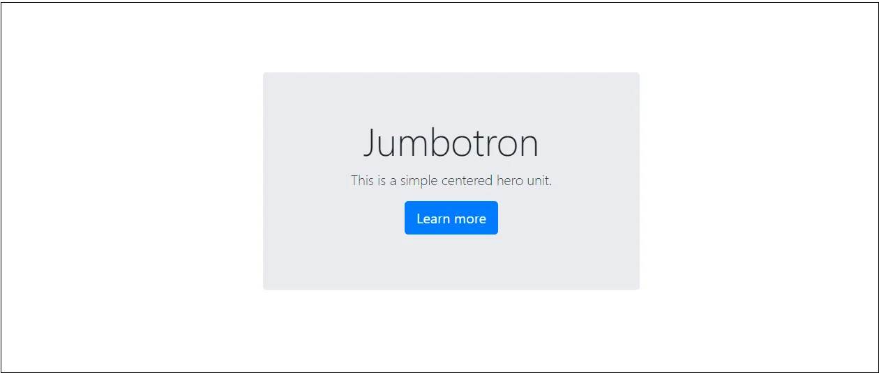
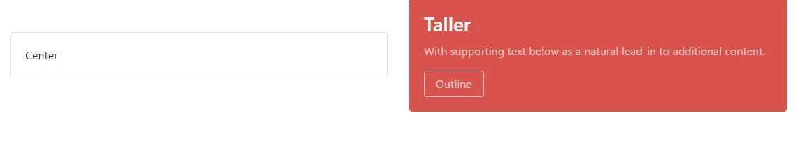
<div class="container d-flex h-100">更改为<div class="container d-flex vh-100">时,选项1才对我起作用。 - half of a glazier
这是正确的,因为 h-100 是其父容器的 100%,而 vh-100 是视口的高度。在提问时,Bootstrap 中还不存在 vh-100 - Carol Skelly
@Zim,你能帮我看一下这个问题吗?如果你能帮忙的话 - https://dev59.com/1MPra4cB1Zd3GeqPj5rM 谢谢zim。 - HDP

49

如果使用Bootstrap 5或更高版本,请使用以下代码将内容水平和垂直居中。

<div class="vh-100 d-flex justify-content-center align-items-center">
  <h1>Centered horizontally and vertically!</h1>
</div>

在此输入图像描述


你是真正的MVP。 - Ryan Buening
v5怎么样?这只是水平居中。 - TheRealChx101
这应该是被批准的答案。 - Nelson Katale
这是最好的方法!在BS4中也适用。 - aLamp

42

通过将父容器设置为弹性布局并添加align-items:center,您可以垂直对齐容器:

body {
  display:flex;
  align-items:center;
}

更新版的代码片段


2
哦,哈哈,我错过了描述中的链接...你还添加了 html,body {height:100%} ...添加这个让它工作了!谢谢! - canaan seaton
3
你的回答没有按照要求的方式解决问题(使用 Bootstrap)。 - Alexey Nikonov
1
我完全不同意你的观点,你提出了一种变通方法,而问题实际上是关于如何使用Bootstrap类来解决的。 - Alexey Nikonov
1
@AlexNikonov,OP的问题中并没有说他们只能使用Bootstrap - 这是为其他可能会在这个页面上寻找垂直对齐方法而不使用Bootstrap类的人提供的替代方案。请继续前进 - 这里有很多其他答案可供您使用。我不明白为什么你会对此困扰 - 这是一个可以帮助所有想法的论坛,而不仅仅是单一的答案。正是像你这样的用户通过对那些提供解决问题但只因为你不喜欢它而被投票反对的答案来破坏这个网站。 - Pete
1
或者使用BS4:<div class="d-flex align-items-center">一些文本</div> - MingalevME
显示剩余2条评论

41

以下Bootstrap 4类帮助我解决了这个问题。

<div class="col text-center justify-content-center align-self-center">
    <img width=3rem src=".." alt="...">
</div>

3
然而,这并没有使我的div垂直居中。 - dawn
你能否详细说明一下你的CSS代码?分享一小段给我,我会查看你所面临的问题。 - Manoj

19
因为以上方法都不适用于我,所以我要添加另一种答案。
目标:使用Bootstrap 4 flexbox类在页面上垂直和水平对齐一个div。
步骤1:将最外层的div设置为100vh高度。这将设置高度为视口高度的100%。如果您不这样做,其他任何操作都将无效。将其设置为100%的高度只是相对于父级,因此如果父级不是视口的完整高度,则什么也不会起作用。在下面的示例中,我将Body设置为100vh。
步骤2:使用d-flex类将容器div设置为flexbox容器。
步骤3:使用justify-content-center类水平居中div。
步骤4:使用align-items-center类垂直居中div。
步骤5:运行页面,查看您的垂直和水平居中的div。
请注意,并不需要在居中的div本身(子div)上设置特殊的类。
<body style="background-color:#f2f2f2; height:100vh;">

<div class="h-100 d-flex justify-content-center align-items-center">
    <div style="height:600px; background-color:white; width:600px;">
</div>

</div>

</body>

@AjayKumar,你想分享一下你的修改吗? - Greg Gum
谢谢,特别是100vh的技巧对我帮助很大。Bootstrap也提供了vh-100类来实现这个效果。 - svens

15

我用 Bootstrap 4.3.1 这个版本完成了这项任务:

<div class="d-flex vh-100">
  <div class="d-flex w-100 justify-content-center align-self-center">
    I'm in the middle
  </div>
</div>

终于有东西可以用了。 - Seyed Ali Roshan

13
.jumbotron {
    position: relative;
    top: 50%;
    transform: translateY(-50%);
}

8
<div class="row">
  <div class="col-md-6">
     <img src="/assets/images/ebook2.png" alt="" class="img-fluid">
  </div>
  <div class="col-md-6 my-auto">
     <h3>Heading</h3>
     <p>Some text.</p>
   </div>
</div>

这一行是奇迹发生的地方 <div class="col-md-6 my-auto">my-auto将使列中内容居中。这在像上面代码示例中可能有可变大小图像并需要将列中文本与其对齐的情况下非常有效。


7
我尝试了所有从这里获得的答案,但发现h-100vh-100之间存在差异。以下是我的解决方案:
      <div className='container vh-100 d-flex align-items-center col justify-content-center'>
        <div className="">
             ...
        </div>
      </div >


5
<div class="col-lg-5 col-sm-5 offset-1 d-flex">
            <div class="offer-txt justify-content-center align-self-center">
                <span class="inner-title">Our Offer</span>
                <h2 class="section-title">Today’s Special </h2>
                <p>One morning, when Gregor Samsa woke from troubled dreams, he found himself transformed in his bed into vermin. He lay on his armour-like back, and if he lifted his head a little he could see his brown belly.</p>
            </div>
        </div>

enter image description here


2
你的图片让我想起了Stack Overflow是如何开始的,太有趣了:D。 - Alexey Nikonov

网页内容由stack overflow 提供, 点击上面的
可以查看英文原文,
原文链接