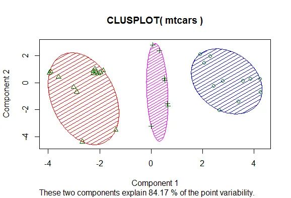
你展示的图表是聚类图。有不同的方法制作这些图表。以下是一种方法。您可以根据需要更改符号或关闭它们,以及填充。此外,还有用于树状图绘制的选项,即
here。
library(cluster)
head(mtcars)
fit <- kmeans(mtcars, 3)
aggregate(mtcars, by=list(fit$cluster), mean)
newmtcars <- data.frame(mtcars, fit$cluster)
head(newmtcars)
library(cluster)
clusplot(mtcars, fit$cluster,
color=TRUE, shade=TRUE, lines=0)
参考文献:http://www.statmethods.net/advstats/cluster.html https://stats.stackexchange.com/questions/31083/how-to-produce-a-pretty-plot-of-the-results-of-k-means-cluster-analysis
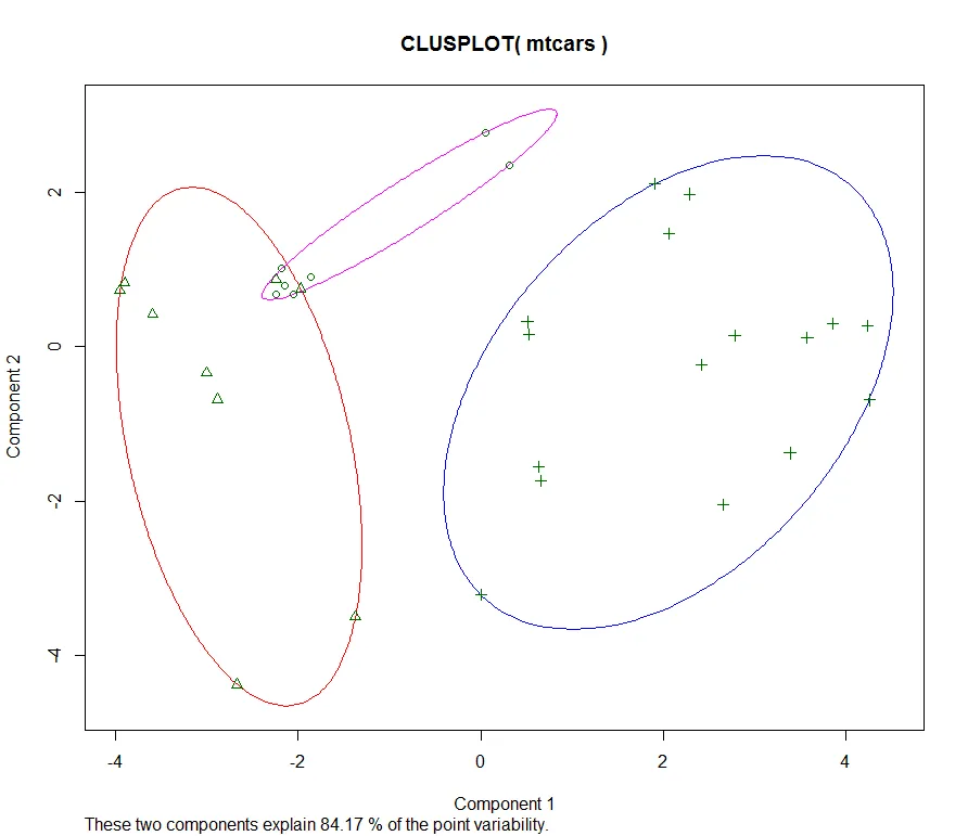
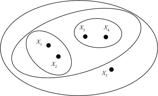
我不确定Venn图与上述图表有何不同。也许需要有重叠的组。这取决于数据和树命令。在这种情况下,可以尝试变化树命令(kmeans),当选择迭代次数时,显示了一个小的重叠。
fit <- kmeans(mtcars, 3, iter.max = 2)
clusplot(mtcars, fit$cluster,
color=TRUE, shade=FALSE, lines=0)
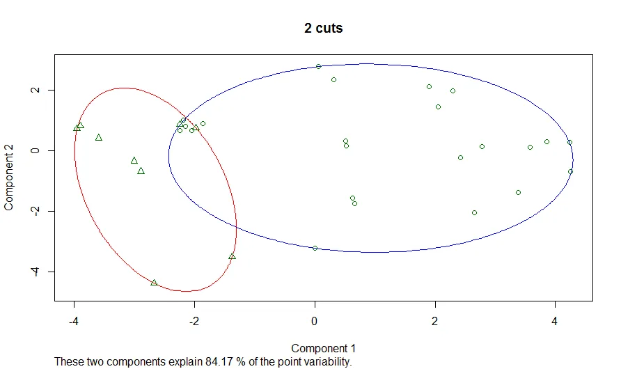
使用层次聚类的一种方法是从树中提取群组,然后在结果群组上使用clusplot。
fit <- hclust(dist(mtcars))
groups <- cutree(fit, k=3)
clusplot(mtcars, groups[rownames(mtcars)],
         color=TRUE, shade=FALSE, lines=0)
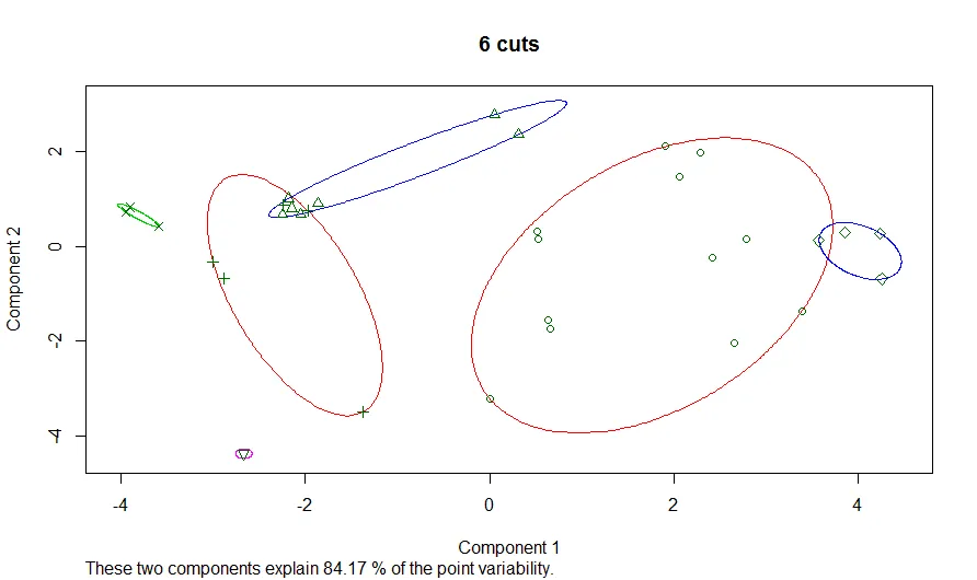
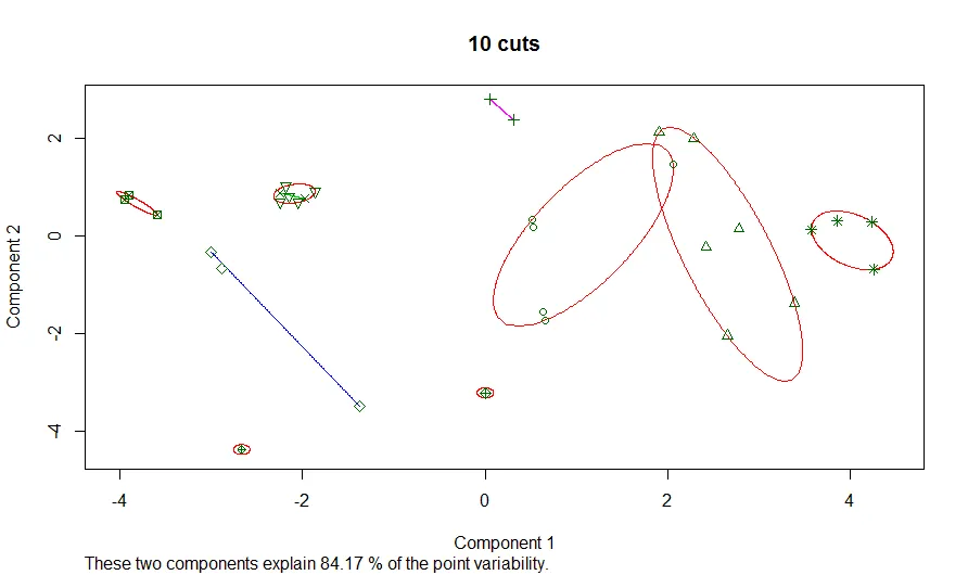
如果想要查看树形结构中切割更多的数据段,包括分层树,可以使用cut和clusplot方法。
heir_tree_fit <- hclust(dist(mtcars))
for (ncut in seq(1,10)) {
  group <- cutree(heir_tree_fit, k=ncut)
  clusplot(mtcars, group[rownames(mtcars)],
           color=TRUE, shade=FALSE, lines=0, main=paste(ncut,"cuts"))
}
这里是2、6和10刀的数字。
您可以使用所有切割来制作一个图。
par(new=FALSE)
for (ncut in seq(1,10)) {
  group <- cutree(heir_tree_fit, k=ncut)
  clusplot(mtcars, group[rownames(mtcars)],
           color=TRUE, shade=FALSE, lines=0, xlim=c(-5,5),ylim=c(-5,5))
  par(new=TRUE)
}
par(new=FALSE)
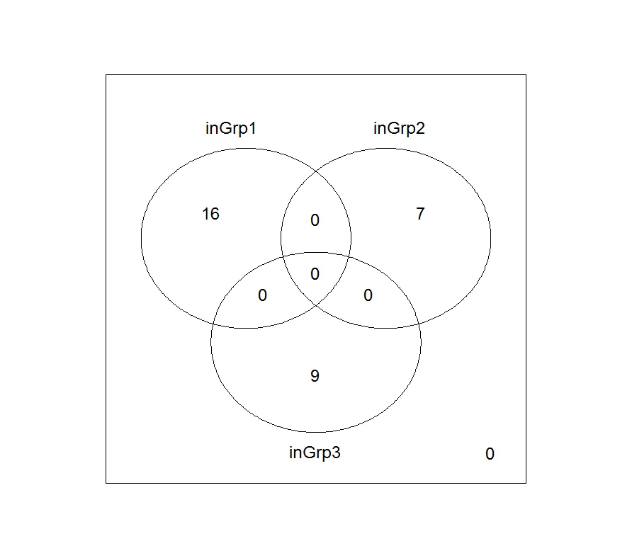
另一种制作层次聚类的维恩图的方法是从树中提取组,并使用vennDiagram处理结果组。
biocLite("limma")
library(limma)
inGrp1 <- groups==1
inGrp2 <- groups==2
inGrp3 <- groups==3
vennData <- cbind(inGrp1, inGrp2, inGrp3)
aVenn <- vennCounts(vennData)
vennDiagram(aVenn)