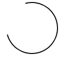
我有兴趣完全使用CSS创建一个加载图标,但为此需要能够绘制如下的开放式环形:

该环将在圆周线上自行绘制。这可以通过CSS实现吗?
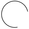
我有兴趣完全使用CSS创建一个加载图标,但为此需要能够绘制如下的开放式环形:
该环将在圆周线上自行绘制。这可以通过CSS实现吗?
使用SVG来创建逐渐绘制其外部路径的圆。
SVG的stroke-dasharray属性将把任何路径转换为虚线,您可以通过将破折号大小设置为几乎与路径本身一样长来利用它。
然后使用CSS动画逐渐改变stroke-dashoffset以沿着圆的周长移动虚线。
circle {
  fill: white;
  stroke: black;
  stroke-width: 2;
  stroke-dasharray: 250;
  stroke-dashoffset: 1000;
  animation: rotate 5s linear infinite;
}

@keyframes rotate {
  to {
    stroke-dashoffset: 0;
  }
}<svg height="100" width="100">
<circle cx="50" cy="50" r="40" />
</svg>一个只依赖于单个HTML元素和CSS类的简化示例可能如下所示:
.arc {
  /* Border size and color */
  border: 2px solid #000;
  /* Creates a circle */
  border-radius: 50%;
  /* Circle size */
  height: 100px;
  width: 100px;
  /* Use transparent borders to define opening (more transparent = larger opening) */
  border-top-color: transparent;
  border-left-color: transparent;
  /* Use transform to rotate to adjust where opening appears */
  transform: rotate(300deg)
}
示例
.arc {
  border: 2px solid #000;
  border-radius: 50%;
  height: 100px;
  width: 100px;
  border-top-color: transparent;
  transform: rotate(300deg)
}<div class='arc'></div>您可以利用基于CSS的动画运用@keyframes对前面静态示例进行基本旋转:
.arc {
  /* Border size and color */
  border: 2px solid #000;
  /* Creates a circle */
  border-radius: 50%;
  /* Circle size */
  height: 100px;
  width: 100px;
  /* Use transparent borders to define opening (more transparent = larger opening) */
  border-top-color: transparent;
  /* Rotate indefinitely (longer time = slower rotation) */
  animation: rotate 2s infinite linear;
}

@keyframes rotate {
  0%    { transform: rotate(0deg);  }
  100%  { transform: rotate(360deg);  }
}
示例
.arc {
  border: 2px solid #000;
  border-radius: 50%;
  height: 100px;
  width: 100px;
  border-top-color: transparent;
  animation: rotate 2s infinite linear;
}

@keyframes rotate {
  0%    { transform: rotate(0deg);  }
  100%  { transform: rotate(360deg);  }
}<div class='arc'></div>我发现另一种方法虽然不如之前的方法优雅,但似乎可以实现您想要的效果。它涉及到多个动画以及根据需要显示/隐藏圆形的不同部分。
代码片段包含演示示例。
示例
#container {
  position: absolute;
  width: 100px;
  height: 100px;
  animation: colors 1s infinite;
}
#halfclip {
  width: 50%;
  height: 100%;
  right: 0px;
  position: absolute;
  overflow: hidden;
  transform-origin: left center;
  animation: cliprotate 4s steps(2) infinite;
  -webkit-animation: cliprotate 4s steps(2) infinite;
}
.halfcircle {
  box-sizing: border-box;
  height: 100%;
  right: 0px;
  position: absolute;
  border: solid 2px transparent;
  border-top-color: #000;
  border-left-color: #000;
  border-radius: 50%;
}
#clipped {
  width: 200%;
  animation: rotate 2s linear infinite;
  -webkit-animation: rotate 2s linear infinite;
}
#fixed {
  width: 100%;
  transform: rotate(135deg);
  animation: showfixed 4s steps(2) infinite;
  -webkit-animation: showfixed 4s linear infinite;
}
@-webkit-keyframes cliprotate {
  0% {
    transform: rotate(0deg);
  }
  100% {
    transform: rotate(360deg);
  }
}
@keyframes cliprotate {
  0% {
    transform: rotate(0deg);
  }
  100% {
    transform: rotate(360deg);
  }
}
@-webkit-keyframes rotate {
  0% {
    transform: rotate(-45deg);
  }
  100% {
    transform: rotate(135deg);
  }
}
@keyframes rotate {
  0% {
    transform: rotate(-45deg);
  }
  100% {
    transform: rotate(135deg);
  }
}
@-webkit-keyframes showfixed {
  0% {
    opacity: 0;
  }
  49.9% {
    opacity: 0;
  }
  50% {
    opacity: 1;
  }
  100% {
    opacity: 1;
  }
}<div id="container">
<div id="halfclip">
<div class="halfcircle" id="clipped">
</div>
</div>
<div class="halfcircle" id="fixed">
</div>
</div>利用SVG可能是解决此问题的最佳方法,因为它专门设计用于在浏览器内进行绘图。如果支持SVG,则强烈建议采用这种方法。
Dylan的回答详细说明了这种实现可能的样子。
::after 来创建打开的部分,只需将圆形元素重叠即可。优点是打开的部分可以任意长度(不限于3/4个圆)。
.circle {
  width: 100px;
  height: 100px;
  border: 2px solid;
  border-radius: 50%;
  margin: 30px;
  animation: rotate 1s infinite linear;
}
.circle::after {
  content: "";
  display: block;
  width: 80px;
  height: 80px;
  background: white;
  border-radius: 50%;
  margin: -30% 0 0 -30%;
}
@keyframes rotate {
  0%    { transform: rotate(0deg);  }
  100%  { transform: rotate(360deg);  }
}<div class="circle"></div>linear-gradient(阴影可减少或增加)和background-clip。mix-blend-mode可以使其半透明。
currentcolor和animation也可用于动画颜色:
.loader {
  font-size: 1.5em;
  color: gray;
  position: relative;
  padding: 3px;
  /* make a square */
  height: 100px;
  width: 100px;
  /* center content*/
  display: flex;
  align-items: center;
  justify-content: center;
  animation: coloranim infinite 5s;
}

.circle {
  border-radius: 100%;
  overflow: hidden;
}

.loader:after {
  border-radius: inherit;
  color: inherit;
  content: '';
  position: absolute;
  top: 0;
  bottom: 0;
  left: 0;
  right: 0;
  padding: 3px;
  background: linear-gradient(white, white), linear-gradient(0deg, transparent 40%, currentcolor 60%), linear-gradient(50deg, transparent 50%, currentcolor 52%);
  background-clip: content-box, border-box, border-box;
  z-index: -1;
  mix-blend-mode: multiply;/* if avalaible, else bg remains white */
}

.spin:after {
  animation: spin 2s linear infinite;
}

@keyframes spin {
  to {
    transform: rotate(360deg);
  }
}

@keyframes coloranim {
  20% {
    color: tomato;
  }
  40% {
    color: purple;
  }
  60% {
    color: turquoise;
  }
  80% {
    color: green;
  }
}


/* demo purpose, use your own style wherever your loader is needed */

html {
  height: 100%;
  display: flex;
  background: url(http://lorempixel.com/800/800/food/3);
  background-size: cover;
  box-shadow: inset 0 0 0 2000px rgba(255, 255, 255, 0.3)
}

body {
  margin: auto;
}<div class="spin circle loader coloranim"> loading... </div>
stroke-dasharray来实现类似的效果。这很可能是仅使用HTML和CSS“绘制”圆形轮廓的唯一方法。 - Dylan Stark