让CSS网格区域在移动设备上堆叠(单列布局)

5

我试图让CSS Grid块在小屏幕上堆叠在一起。我知道我可以编写媒体查询来将两列更改为一列。但是我认为Grid可以在没有它们的情况下处理这个问题?

我认为我可以通过列上的 auto-fit 来实现这一点。然而,我认为我可能误解了它的工作原理?

.grid-container {
  display: grid;
  grid-template-columns: repeat(auto-fit, minmax(400px, 1fr));
  grid-template-rows: 1fr 1fr;
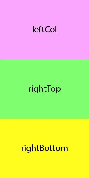
  grid-template-areas: "leftCol rightTop" "leftCol rightBottom";
  height: 100vh;
}

.leftCol {
  grid-area: leftCol;
  background-color: pink;
  width: 100%;
  height: 100;
}

.rightBottom {
  grid-area: rightBottom;
  background-color: yellow;
  width: 100%;
  height: 100;
}

.rightTop {
  grid-area: rightTop;
  background-color: blue;
  width: 100%;
  height: 100;
}
<div class="grid-container">
  <div class="leftCol"></div>
  <div class="rightBottom"></div>
  <div class="rightTop"></div>
</div>

当屏幕宽度小于400像素时,右侧栏会消失。我原本期望它们会堆叠在一起。
例如: Grid mock up CodePen 示例

为什么你不想要媒体查询提供的控制权呢? - Mike Poole
我想问,它们不是必需的时为什么要编写它们?不用媒体查询也能实现响应式布局! - Grant Smith
另外,也许可以使用flexbox而不是grid https://css-tricks.com/snippets/css/a-guide-to-flexbox/ - Keith
我已经在Flexbox中实现了这个,但我正在尝试理解如何在CSS Grid中实现。 - Grant Smith
尝试在没有grid-template-areas或任何grid-area定义的情况下查看网格行为 - 您会看到随着窗口大小的减小,网格项会堆叠起来... - kukkuz
2个回答

3

我想在小屏幕上观看时,让CSS Grid块堆叠在一起。我知道可以编写媒体查询来将两列更改为一列。但是我认为Grid可以不需要它们就能处理这个问题?我认为我可以通过在列上使用auto-fit来实现此目的。

确实可以实现。

以下是代码:

.grid-container {
  display: grid;
  grid-template-columns: repeat(auto-fit, minmax(400px, 1fr));
  grid-auto-rows: 50%;
  height: 100vh;
}

.leftCol     { background-color: pink; }
.rightBottom { background-color: yellow; }
.rightTop    { background-color: blue; }
body         { margin: 0; }
<div class="grid-container">
  <div class="leftCol"></div>
  <div class="rightBottom"></div>
  <div class="rightTop"></div>
</div>

修正后的 CodePen


你的原始代码存在问题:

repeat() 函数允许您在网格容器中呈现轨道模式。

使用 auto-fitauto-fillrepeat() 函数将呈现尽可能多的轨道,而不会溢出容器。

单独运行您的代码时,它按照您的期望工作,如上图所示。

grid-template-columns: repeat(auto-fit, minmax(400px, 1fr))

使用这个规则,当屏幕变小时,网格项会堆叠成一列。
然而,当你引入明确的列和行时,这会干扰 repeat() 和 auto-fit 的执行。
grid-template-areas: "leftCol rightTop" "leftCol rightBottom"

这个规则告诉网格项它们需要被放置在哪里,并使用 repeat() 函数来限制。

grid-template-rows: 1fr 1fr

此规则将在容器中创建两行的限制,将第三个项目推出屏幕。

简而言之,不要添加与repeat()/auto-fit冲突的规则。如果您需要更复杂的布局,请使用媒体查询。


-6

尝试使用

CSS:

.grid-container div {
    display: inline-block;
    float: left;
}

网页内容由stack overflow 提供, 点击上面的
可以查看英文原文,
原文链接