有没有办法将 ElevatedButton 的背景颜色更改为渐变色?
如何在Flutter中为按钮添加渐变?
75
- Moein Hosseini
3
过去我曾经尝试给墨水飞溅区域添加背景渐变,但是渐变会遮盖住飞溅效果。你是只想要一个渐变背景还是想要带有飞溅效果的渐变背景呢?至于带有高度、边框半径和渐变的按钮,是可以实现的。 - Ashton Thomas
@AshtonThomas 正如你所说,渐变色遮盖了墨水飞溅。这是因为墨水飞溅需要一个 Material widget 作为其父级。我也遇到了同样的情况。最终我创建了自己的自定义按钮。 - Vamsi Krishna
我尝试了自定义按钮的想法,但是我无法实现默认凸起按钮具有的阴影动画!你能帮我吗? - Moein Hosseini
13个回答
98
所有以上的解决方案都存在一些小问题或瑕疵(例如,缺少波纹效果、不需要的边框、不遵守按钮的主题minWidth)。
下面的解决方案没有上述问题 (关键是使用
下面的解决方案没有上述问题 (关键是使用
Ink小部件以保留渐变的涟漪能力):RaisedButton(
onPressed: () { },
shape: RoundedRectangleBorder(borderRadius: BorderRadius.circular(80.0)),
padding: const EdgeInsets.all(0.0),
child: Ink(
decoration: const BoxDecoration(
gradient: myGradient,
borderRadius: BorderRadius.all(Radius.circular(80.0)),
),
child: Container(
constraints: const BoxConstraints(minWidth: 88.0, minHeight: 36.0), // min sizes for Material buttons
alignment: Alignment.center,
child: const Text(
'OK',
textAlign: TextAlign.center,
),
),
),
)
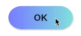
- bonnyz
3
我在
MaterialButton上使用了这个解决方案,它完美地工作了! - jux_97希望这可以帮到你:https://betterprogramming.pub/instagram-gradient-animation-for-flutter-1d74d3869997 - abdul rehman
71
你可以自己创建一个定制化的。
class RaisedGradientButton extends StatelessWidget {
  final Widget child;
  final Gradient gradient;
  final double width;
  final double height;
  final Function onPressed;

  const RaisedGradientButton({
    Key key,
    @required this.child,
    this.gradient,
    this.width = double.infinity,
    this.height = 50.0,
    this.onPressed,
  }) : super(key: key);

  @override
  Widget build(BuildContext context) {
    return Container(
      width: width,
      height: 50.0,
      decoration: BoxDecoration(gradient: gradient, boxShadow: [
        BoxShadow(
          color: Colors.grey[500],
          offset: Offset(0.0, 1.5),
          blurRadius: 1.5,
        ),
      ]),
      child: Material(
        color: Colors.transparent,
        child: InkWell(
            onTap: onPressed,
            child: Center(
              child: child,
            )),
      ),
    );
  }
}
并且可以在任何地方按以下方式使用:
RaisedGradientButton(
  child: Text(
    'Button',
    style: TextStyle(color: Colors.white),
  ),
  gradient: LinearGradient(
    colors: <Color>[Colors.green, Colors.black],
  ),
  onPressed: (){
    print('button clicked');
  }
),
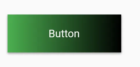
您可以通过编辑容器的装饰属性来进一步调整阴影和圆角边框,直到它符合您的规格。
- Vamsi Krishna
3
实际上,我希望阴影与默认凸起按钮完全相同,但无法实现。 - Moein Hosseini
Vamsi,@MoeinHosseini,请尝试将“高程”添加到材料中,而不是阴影。 - Ashton Thomas
这个功能缺少一些按钮所拥有的功能。例如语义学。 - JoKr
27
更新:
由于RaisedButton和OutlineButton已被弃用,您应该使用ElevatedButton和OutlinedButton。
ElevatedButton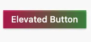
Container(
  height: 44.0,
  decoration: BoxDecoration(gradient: LinearGradient(colors: [Colors.pink, Colors.green])),
  child: ElevatedButton(
    onPressed: () {},
    style: ElevatedButton.styleFrom(backgroundColor: Colors.transparent, shadowColor: Colors.transparent),
    child: Text('Elevated Button'),
  ),
)
OutlinedButton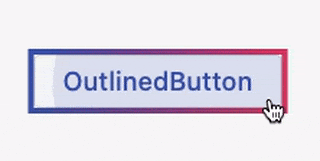
创建一个类(空安全):
class MyOutlinedButton extends StatelessWidget { final VoidCallback onPressed; final Widget child; final ButtonStyle? style; final Gradient? gradient; final double thickness; const MyOutlinedButton({ super.key, required this.onPressed, required this.child, this.style, this.gradient, this.thickness = 2, }); @override Widget build(BuildContext context) { return DecoratedBox( decoration: BoxDecoration(gradient: gradient), child: Container( color: Colors.white, margin: EdgeInsets.all(thickness), child: OutlinedButton( onPressed: onPressed, style: style, child: child, ), ), ); } }用法:
MyOutlinedButton(
  onPressed: () {},
  gradient: LinearGradient(colors: [Colors.indigo, Colors.pink]),
  child: Text('OutlinedButton'),
)
- CopsOnRoad
2
2谢谢,这是我使用凸起按钮找到的第一个解决方案!要去除阴影效果,请在凸起按钮上使用以下样式:
ElevatedButton.styleFrom(primary: Colors.transparent, elevation: 0,), - Sam Doggettprimary属性自v3.1.0版本起已被弃用。为了实现透明度并去除阴影,需要像你提到的那样同时添加backgroundColor: Colors.transparent和elevation: 0。最终代码:ElevatedButton.styleFrom(backgroundColor: Colors.transparent, elevation: 0,)。 - undefined16
请参考以下内容 -
RaisedButton(
     onPressed: () {},
     textColor: Colors.white,
     padding: const EdgeInsets.all(0.0),
     shape:RoundedRectangleBorder(borderRadius: BorderRadius.circular(80.0)),
     child: Container(
       decoration: const BoxDecoration(
         gradient: LinearGradient(
           colors: <Color>[
             Color(0xFF0D47A1),
             Color(0xFF1976D2),
             Color(0xFF42A5F5),
           ],
         ),
         borderRadius: BorderRadius.all(Radius.circular(80.0))
       ),
       padding: const EdgeInsets.fromLTRB(20, 10, 20, 10),
       child: const Text(
           'Gradient Button',
           style: TextStyle(fontSize: 20)
       ),
     ),
   )
- Krishna Lohiya
8
Flutter API文档中有一个示例,展示如何渲染带有渐变背景的
RaisedButton - 请查看此处https://api.flutter.dev/flutter/material/RaisedButton-class.html。Widget gradientButton = Container(
child: RaisedButton(
onPressed: () { },
textColor: Colors.white,
padding: const EdgeInsets.all(0.0),
child: Container(
width: 300,
decoration: new BoxDecoration(
gradient: new LinearGradient(
colors: [
Color.fromARGB(255, 148, 231, 225),
Color.fromARGB(255, 62, 182, 226)
],
)
),
padding: const EdgeInsets.all(10.0),
child: Text(
"Gradient Button",
textAlign: TextAlign.center,
),
),
),
);
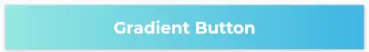
- Leonardo
2
1这是一个无关的问题。您在该按钮上使用了什么字体? - Asyraf Dayan
5
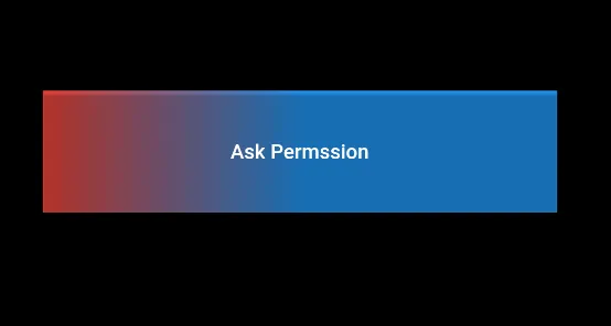
只需创建一个子容器,设置该容器的装饰,并按需设置渐变颜色
然后,在此之后使用 RaisedButton 作为上述容器的子元素 与 MaterialButton 相同
   child: Container(
      decoration: BoxDecoration(
        gradient: LinearGradient(
            colors: [Colors.red, Colors.blue],
            begin: FractionalOffset(0.0, 0.0),
            end: FractionalOffset(0.5, 0.0),
            stops: [0.0, 1.0],
            tileMode: TileMode.clamp),
      ),
      child: RaisedButton(
        color: Colors.transparent,
        child: Text("Ask Permssion"),
        onPressed: () {
          askPermission();
        },
      )),
Output:
- Muhammad Mustafa
2
文档的最后一个例子 https://api.flutter.dev/flutter/material/RaisedButton-class.html
RaisedButton(
  onPressed: () {},
  textColor: Colors.white,
  padding: const EdgeInsets.all(0.0),
  child: Container(
    decoration: const BoxDecoration(
      gradient: LinearGradient(
        colors: <Color>[
          Color(0xFF0D47A1),
          Color(0xFF1976D2),
          Color(0xFF42A5F5),
        ],
      ),
    ),
    padding: const EdgeInsets.all(10.0),
    child: const Text(
      'Gradient Button',
      style: TextStyle(fontSize: 20)
    ),
  ),
);
- ztvmark
1
你可以使用
material.dart 中的 RawMaterialButton 更轻松地处理,你也可以将其形状设置为圆角或圆形。这里是一个简单的示例。 Card(
elevation: 7,
child: Container(
width: 120.0,
height: 75.0,
decoration: BoxDecoration(
gradient: LinearGradient(
begin: Alignment.bottomLeft,
end: Alignment.topRight,
colors: <Color>[
Colors.blue,
Colors.red,
],
),
),
child: RawMaterialButton(
onPressed: () {},
splashColor: Colors.grey,
child: Text(
"Button",
style: TextStyle(color: Colors.white, fontSize: 20.0),
),
),
),
),
- Fatima Hossny
0
这是对我有用的方法。RaisedButton已被弃用,我使用ElevatedButton。所以这应该是正确的做法。
import 'package:flutter/material.dart';

class MainButton extends StatelessWidget {
  final Widget thechild;
  final double width;
  final double height;
  final Function theaction;

  const MainButton({
    Key key,
    @required this.thechild,
    this.width = double.infinity,
    this.height = 50.0,
    this.theaction,
  }) : super(key: key);

  @override
  Widget build(BuildContext context) {
    return ElevatedButton(
      onPressed: theaction,
      style: ElevatedButton.styleFrom(
        primary: Colors.transparent,
        elevation: 4.0,
        minimumSize: Size(88.0, 45.0),
        padding: const EdgeInsets.all(0.0),
      ),
      child: Ink(
        decoration: const BoxDecoration(
          gradient: LinearGradient(
              begin: Alignment.topCenter,
              end: Alignment.bottomCenter,
              stops: [
                0.1,
                0.8,
                0.9
              ],
              colors: [
                Color.fromARGB(255, 186, 252, 244),
                Color.fromARGB(255, 55, 183, 230),
                Color.fromARGB(255, 49, 175, 230),
              ]),
          borderRadius: BorderRadius.all(Radius.circular(8.0)),
        ),
        child: Container(
          constraints: const BoxConstraints(minWidth: 88.0, minHeight: 45.0),
          alignment: Alignment.center,
          child: thechild,
        ),
      ),
    );
  }
}
使用方法
首先导入
import '../widgets/mainButton.dart';
然后
MainButton(
                        thechild: Text(AppLocalization.translate('loginbtn'),
                            textAlign: TextAlign.center,
                            style: TextStyle(
                                color: Colors.white,
                                fontWeight: FontWeight.bold,
                                fontSize: 20)),
                        theaction: () {},
                      ),
- Mr commit
网页内容由stack overflow 提供, 点击上面的可以查看英文原文,
原文链接
原文链接