我希望在一个分面 ggplot 图表中包含多个统计测试的结果。
我已经找到了很多优秀的示例(如 this)来说明如何将类似内容包含在标题或注释中,但是,我的兴趣在于将其作为文本注释包含在图表中,以便我可以在一个图上展示许多测试的结果。
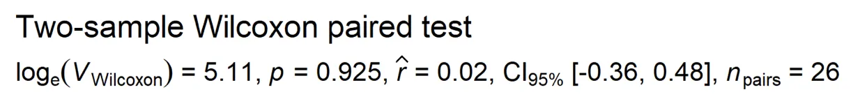
我已经能够使用标准文本注释来实现这一点,但我想使用 polymath/expressions 来呈现我的结果,以便我可以生成符合 APA 样式指南的注释,该样式指南在 [ggstatsplot]1 包中实现,如下例所示:
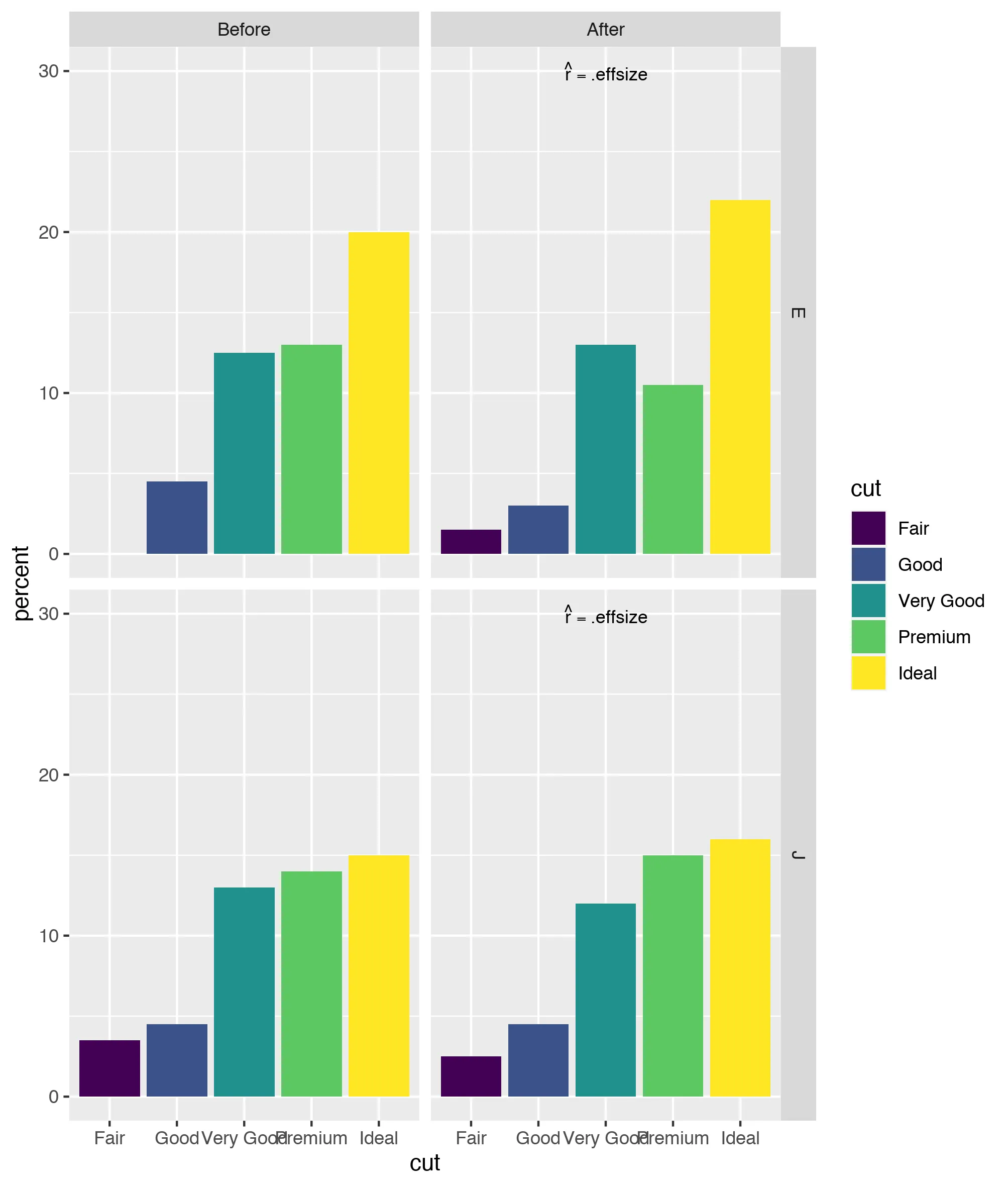
ggplot2 中的 diamonds 数据。 我尝试过的一些方法包括:
- 尝试将
bquote和expression对象存储为wilcox_stats对象中的列 - 但是 dplyr 似乎不喜欢它 - 尝试从
ggplot调用所有内容 - 但是当尝试排除geom_text打印的所有注释时,情况变得非常混乱
# LOAD REQUIRED PACKAGES

library(ggplot2)
library(tidyverse)
library(rstatix)

# CREATE SAMPLE DATA

sample_data <- diamonds %>%
  select(cut, color, table) %>%
  filter(color == c("E","J")) %>%
  mutate(time = factor(case_when(
    table %% 2 == 0 ~ "Before",
    TRUE ~ "After"))) %>%
  group_by(color, time) %>%
  sample_n(100) %>%
  ungroup() %>%
  mutate(numeric_cut = case_when(
    cut == "Ideal" ~ 1,
    cut == "Premium" ~ 2,
    cut == "Very Good" ~ 3,
    cut == "Good" ~ 4,
    cut == "Fair" ~ 5))

# STAT TESTS

wilcox_test <- sample_data %>%
  group_by(color) %>%
  wilcox_test(numeric_cut ~ time, paired = TRUE, detailed = TRUE) %>%
  select(color, statistic, p, n1)

wilcox_es <- sample_data %>%
  group_by(color) %>%
  wilcox_effsize(numeric_cut ~ time, paired = TRUE, ci = TRUE) %>%
  select(color, effsize, conf.low, conf.high)

## EXTRACT ELEMENTS OF STAT TESTS AND USE THEM TO CREATE ANNOTATION

wilcox_stats <- left_join(wilcox_test, wilcox_es) %>%
  mutate(statistic = round(statistic, 1)) %>%
  mutate(effsize = round(effsize, 2)) %>%
  mutate(p = round(p, 3)) %>%
  mutate(result = deparse(bquote(
    V[Wilcoxon]==.(statistic)~ #this code does not work
    italics(p)==.p~
    hat(r) == .effsize~
    "CI"["95%"]~
    .conf.low~.conf.high~
    n[pairs]==.n1)))

## PREPARE PLOT DATA

plot_data <- sample_data %>%
  group_by(time, cut, color) %>%
  tally() %>%
  ungroup() %>%
  group_by(color) %>%
  mutate(total_n = sum(n)) %>%
  mutate(percent = (n/total_n)*100) %>%
  mutate(percent = round(percent, 1)) %>%
  ungroup() %>%
  left_join(wilcox_stats) %>%
  mutate(result = case_when(
    time == "Before" & cut == "Ideal" ~ "",
    time == "After" & cut == "Ideal" ~ "",
    time == "Before" & cut == "Premium" ~ "",
    time == "After" & cut == "Premium" ~ "",
    time == "Before" & cut == "Very Good" ~ "",
    time == "After" & cut == "Very Good" ~ result,
    time == "Before" & cut == "Good" ~ "",
    time == "After" & cut == "Good" ~ "",
    time == "Before" & cut == "Fair" ~ "",
    time == "After" & cut == "Fair" ~ "")) %>%
  mutate(time = factor(time, levels = c("Before", "After", ordered = TRUE)))

## PLOT RESULTS

plot <- plot_data %>%
  ggplot() +
  aes(x = cut, y = percent, fill = cut) +
  geom_bar(stat = "identity") +
  geom_text(aes(label = result, y = 30), size = 5, parse = TRUE) +
  facet_grid(color ~ time)
下图显示了我希望创建的输出要点...