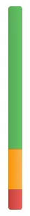
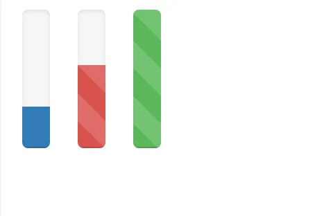
将 Twitter Bootstrap 进度条和动画从水平位置更改为垂直位置
==============================================================
HTML
<div class="progress progress-vertical progress-striped active progress-success">
    <div class="bar" style="width: 40px;"></div>
</div>
<div class="progress progress-vertical progress-striped active progress-danger">
    <div class="bar" style="width: 40px;"></div>
</div>
CSS
.progress-vertical {
position: relative;
width: 40px;
min-height: 240px;
float: left;
margin-right: 20px; }
按照以下规定修改Twitter bootstrap.css文件:
        @-webkit-keyframes progress-bar-stripes {
  from {
    background-position: 0 40px;
  }
  to {
    background-position: 0 0;
  }
}
@-moz-keyframes progress-bar-stripes {
  from {
    background-position: 0 40px;
  }
  to {
    background-position: 0 0;
  }
}
@-ms-keyframes progress-bar-stripes {
  from {
    background-position: 0 40px;
  }
  to {
    background-position: 0 0;
  }
}
@-o-keyframes progress-bar-stripes {
  from {
    background-position: 0 0;
  }
  to {
    background-position: 0 40px;
  }
}
@keyframes progress-bar-stripes {
  from {
    background-position: 0 40px;
  }
  to {
    background-position: 0 0;
  }
}
将背景重复属性更改为
repeat-y,角度更改为
0deg。这样,动画就能垂直渲染了。
    .progress-danger .bar,
    .progress .bar-danger {
      background-repeat: repeat-y;
      }

.progress-danger.progress-striped .bar,
.progress-striped .bar-danger {
  background-color: #ee5f5b;
  background-image: -webkit-gradient(linear, 0 100%, 100% 0, color-stop(0.25, rgba(255, 255, 255, 0.15)), color-stop(0.25, transparent), color-stop(0.5, transparent), color-stop(0.5, rgba(255, 255, 255, 0.15)), color-stop(0.75, rgba(255, 255, 255, 0.15)), color-stop(0.75, transparent), to(transparent));
  background-image: -webkit-linear-gradient(0deg, rgba(255, 255, 255, 0.15) 25%, transparent 25%, transparent 50%, rgba(255, 255, 255, 0.15) 50%, rgba(255, 255, 255, 0.15) 75%, transparent 75%, transparent);
  background-image: -moz-linear-gradient(0deg, rgba(255, 255, 255, 0.15) 25%, transparent 25%, transparent 50%, rgba(255, 255, 255, 0.15) 50%, rgba(255, 255, 255, 0.15) 75%, transparent 75%, transparent);
  background-image: -o-linear-gradient(0deg, rgba(255, 255, 255, 0.15) 25%, transparent 25%, transparent 50%, rgba(255, 255, 255, 0.15) 50%, rgba(255, 255, 255, 0.15) 75%, transparent 75%, transparent);
  background-image: linear-gradient(0deg, rgba(255, 255, 255, 0.15) 25%, transparent 25%, transparent 50%, rgba(255, 255, 255, 0.15) 50%, rgba(255, 255, 255, 0.15) 75%, transparent 75%, transparent);
}
跟其他进度类型(如success、warning等)一样,实现垂直的Twitter Bootstrap进度条和动画...!
如果您有任何问题,请告诉我,我可以帮助您...!
如果有人有比这更优化的解决方案,请让我知道...!
不要忘记支持这个解决方案...!
享受吧!