如何对矩阵的条形图进行排序?

3
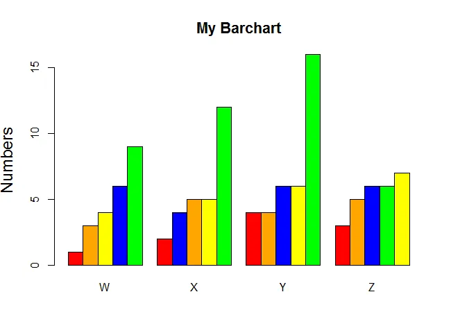
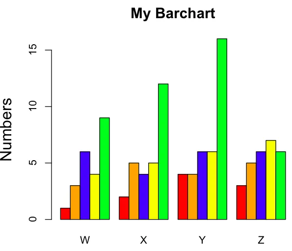
data <- structure(list(W= c(1L, 3L, 6L, 4L, 9L), X = c(2L, 5L, 
4L, 5L, 12L), Y = c(4L, 4L, 6L, 6L, 16L), Z = c(3L, 5L, 
6L, 7L, 6L)), .Names = c("W", "X", "Y", "Z"),
     class = "data.frame", row.names = c(NA, -5L))
colours <- c("red", "orange", "blue", "yellow", "green")

barplot(as.matrix(data), main="My Barchart", ylab = "Numbers", 
          cex.lab = 1.5, cex.main = 1.4, beside=TRUE, col=colours).

barchars

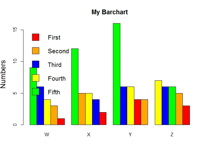
这样做是可以的,但我需要分别对每个组进行降序排序,即显示相同的图表,但是按从高到低的顺序显示W,…,Z。例如:对于W,绿色将从左侧开始,蓝色,黄色等等。对于x,绿色将从左侧开始,橙色,黄色等等。

1个回答

3
这可以通过生成颜色向量来实现,该向量的元素数量与条形图中的条形数量相同,并单独对每个矩阵列进行排序:
对于每一列,按照 x 轴顺序对颜色进行排序并转换为向量。
colours <- as.vector(apply(data, 2, function(x){
  col <- colours[order(x)]
  }))

分别对每列进行排序:

df <- apply(data, 2, sort)

barplot(df,
        main = "My Barchart",
        ylab = "Numbers",
        cex.lab = 1.5,
        cex.main = 1.4,
        beside = TRUE,
        col = colours)

enter image description here

为降序并带有图例。
colours <- c("red", "orange", "blue", "yellow", "green")

colours1 <- as.vector(apply(data, 2, function(x){
  col <- colours[order(x, decreasing = TRUE)]
  }))

barplot(apply(data, 2, sort,  decreasing = TRUE),
        main = "My Barchart",
        ylab = "Numbers",
        cex.lab = 1.5,
        cex.main = 1.4,
        beside = TRUE,
        col = colours1)

legend("topleft", c("First","Second","Third","Fourth","Fifth"), cex=1.3, bty="n", fill=colours)

这里使用了一个颜色向量来为条形图上色,另一个用于图例

enter image description here

最后回答评论中有关聚合数据的问题:

all <- apply(data, 1, mean)
colours <- c("red", "orange", "blue", "yellow", "green")

barplot(sort(all, decreasing = T), col = colours[order(all, decreasing = T)])

enter image description here


网页内容由stack overflow 提供, 点击上面的
可以查看英文原文,
原文链接