根据宽度计算div的高度并保持比例

14

我正在寻找一种纯CSS解决方案,以取代我在此处使用jQuery进行帮助的方法。

基本上,我有3个div在一个容器中平均分布宽度。它们保持3/4的比例,高度根据宽度计算。此外,每个div都有一个背景图像,保持比例,并且有一些水平和垂直居中的文本。

$(document).ready(function() {
  function setw() {
    var footdivwidth = $('footer div').width();
    var footdivheight = footdivwidth * .75;
    $('footer div').css({
      'height': footdivheight + 'px'
    });
    $('footer div span').html('w: ' + footdivwidth + '<br>h: ' + footdivheight);
  }
  setw();
  $(window).resize(function() {
    setw();
  })
});
FOOTER {
  max-width: 1000px;
  margin: 0 auto;
  background-color: rgba(0, 0, 0, 0.171);
  display: flex;
  flex-wrap: wrap;
  justify-content: space-between;
}

FOOTER DIV {
  background-image: url('https://learnwebdesign.online/img/bg.jpg');
  background-position: center;
  background-size: cover;
  background-repeat: no-repeat;
  flex: 1;
  text-align: center;
  display: flex;
  align-items: center;
  justify-content: center;
}

FOOTER DIV SPAN {
  display: inline-block;
  text-align: center;
  background-color: rgba(165, 165, 165, 0.282);
  padding: 7px 15px;
  border-radius: 3px;
  color: #FFFFFF;
  text-transform: uppercase;
  font-weight: bold;
  letter-spacing: 2px;
  font-size: 21px;
}
<script src="https://cdnjs.cloudflare.com/ajax/libs/jquery/3.3.1/jquery.min.js"></script>
<footer>
  <div><span>left photo</span></div>
  <div><span>center photo</span></div>
  <div><span>right photo and more text</span></div>
</footer>

这是一个演示我拥有的笔的网页。 https://codepen.io/nom3d/pen/arGpBV

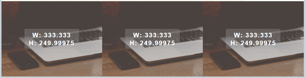
这是一个动态图展示缩放时的效果。请注意背景图片保持比例,文本保持居中对齐。 3 box resize with proportions kept

如果只用 CSS 不行,是否可以使用 普通的 JavaScript 来实现?我需要在 div 中添加 id 吗?

更新:这里有一个处理此任务的纯 JavaScript 函数。

function setHeight(el,val){
    var box = document.querySelectorAll(el);
    var i;
    for(i = 0;i < box.length;i++){
        var width = box[i].offsetWidth;
        var height = width * val;
        box[i].style.height = height + 'px';        
    }
}
// set your element to target and the ratio value
setHeight('footer div',.75);
window.onresize = function(event) {
    setHeight('footer div',.75);
};

1
这在仅使用 CSS 是不可能的,你可以尝试使用类似于 height: calc((1000px / 3) * .75) 的公式,利用 calc 函数为 footer 设置高度,但是当你调整窗口大小时它无法起到作用,只有使用 JS 才能捕获调整大小事件并计算每个像素的高度比例来设置高度。 - Towkir
这是真的。对于这个问题,没有纯CSS的解决方案。但是,如果你想写更少的JS,我相信你可以使用@Towkir建议的公式,但是你可以使用一个CSS变量来更新它,而不是1000px - The24thDS
@The24thDS 一个纯CSS的解决方案是添加5行代码,可以给你想要的宽高比。 - user2560539
使用 calc,这不会使它成为纯 CSS 解决方案吗?@Towkir - user2560539
@PeterDarmis 是的,它会,calc 是一个纯 CSS 解决方案。 - Towkir
8个回答

3
保持CSS中特定的高度:宽度比通常是通过利用填充百分比总是基于元素的宽度计算这一事实来实现的。
例如,假设您有一个具有width: 500px、height: 300px和padding: 10%的元素。现在,您可能希望上下填充为height的10%,左右填充为width的10%。然而,这将导致不均匀的垂直和水平填充,这与预期的相反 - 均等的10%填充。为了理解这一点,我们需要将填充百分比基于相同的尺寸,并且选择的尺寸为宽度。
因此,要始终具有3:4的高度:宽度比率的元素,我们可以将高度设置为0,将底部(或顶部)填充设置为宽度的3/4。
在您的示例中,Flex 为每个项目分配了33%的宽度。对于3:4的比率,底部填充应为33% * 3/4,即24.74%。您的 CSS 可能如下所示:
width: 33%;
height: 0;
padding-bottom: 24.75%;

请注意,由于高度为0,该元素需要通过绝对定位的包装器来进行相对定位。如果您尝试直接在div中放置内容,它将破坏比例。您上面的代码可以进行如下修改:

footer {
  max-width: 1000px;
  margin: 0 auto;
  background-color: rgba(0, 0, 0, 0.171);
  display: flex;
  flex-wrap: wrap;
  justify-content: space-between;
}
footer div {
  background-image: url('https://learnwebdesign.online/img/bg.jpg');
  background-position: center;
  background-size: cover;
  background-repeat: no-repeat;
  position: relative;
  width: 33%;
  height: 0;
  padding-bottom: 24.75%;
}
footer div span {
  /* Used as content wrapper, with flex to centre content */
  position: absolute;
  top: 0; bottom: 0;
  left: 0; right: 0;
  display: flex;
  align-items: center;
  justify-content: center;
  text-align: center;
  background-color: rgba(165, 165, 165, 0.282);
  padding: 7px 15px;
  border-radius: 3px;
  color: #FFFFFF;
  text-transform: uppercase;
  font-weight: bold;
  letter-spacing: 2px;
  font-size: 21px;
}
<footer>
  <div><span>left photo</span></div>
  <div><span>center photo</span></div>
  <div><span>right photo and more text</span></div>
</footer>


玩转CSS flex布局属性。请查看此网址以获取更多详细信息:https://developer.mozilla.org/zh-CN/docs/Web/CSS/flex。 - Prakash Mhasavekar
1
根据我的经验,这是最简单和最实用的解决方案。顺便说一下,它也可以应用于视频,以在HTML5 <video>标签中保持内容的纵横比。 - Bryce Howitson

2
这是一个更通用的方法,适用于不想查看原始代码但需要使用CSS解决响应式固定比例元素的任何人。
基本思路是将padding作为百分比根据元素的宽度进行计算。这意味着padding-bottom: 100% == element.width(在这种情况下是正方形)。我们可以利用这个技巧来计算比率并用于填充。

图像示例

图片有点奇怪,因为它们已经具有纵横比,所以您只需设置height: auto即可。

比率:4:3

Original Answer翻译成"最初的回答"

img {
  --aspectRatio: calc(3/4 * 100%);
  display:block;
  width: 300px; // this one needs a width to work.
  height:var(--aspectRatio);
}
<img src="https://images.unsplash.com/photo-1559666126-84f389727b9a" />

图片背景

假设您想让容器管理大小,而不考虑原始内容比例怎么办?只需使用背景图像。

这个是16:9的(典型的宽屏)


.fixedAspect {
  --aspectRatio: calc(9/16 * 100%);
  height: 0;
  padding-bottom: var(--aspectRatio);
  background-size: cover;
  background-position: center center;
}
<div class="fixedAspect" style="background-image: url(https://images.unsplash.com/photo-1559662780-c3bab6f7e00b)"></div>

带内容的HTML元素

在高度为0且具有大量填充的元素中添加内容可能不是最好的解决方案。但我们可以通过使用伪类来解决这个问题,以强制实现“最小高度”。

额外福利:如果您的内容比您定义的宽高比更大,这种方法也不会破坏,就像position: absolute;包装器一样。

.fixedAspect {
  margin: 20px;
  background-color: #f6f3f0;
}

p {
  font-family: Helvetica, Arial, Sans-Serif;
  padding: 10px;
}

.fixedAspect:before {
  --aspectRatio: calc(5/20 * 100%);
  content: "";
  height:0;
  padding-top: var(--aspectRatio);
  
  /* so you can see the element */
  background-color: #F47E20;
  
  /* get this out of the way */
  float: left;
  width: 1px;
  margin-left:-1px;
}

.fixedAspect:after {
  /* we need to clear the float so its container respects height */
  content: "";
  display: table;
  clear: both;
}
<div class="fixedAspect">
  <p>My default size is a ratio of 20:5 but I'll grow if there's too much content.</p>
</div>


1

一个快速的纯 CSS 解决方案涉及添加到 FOOTER DIV

  max-width: 333px;
  width: calc(100vw/3);
  height: calc(100vw*0.75/3);
  max-height: calc(333px*0.75);

并添加到FOOTER
  width: 100vw;

// Javascript is only used in order to check the width/height ratio in console live.
$(document).ready(function() {

  $(window).resize(function() {
    console.log('width: ' + $('footer div').width() + ', height: ' + $('footer div').height());
  });
  
});
FOOTER {
  max-width: 1000px;
  width: 100vw;
  margin: 0 auto;
  background-color: rgba(0, 0, 0, 0.171);
  display: flex;
  flex-wrap: wrap;
  /*justify-content: space-between;*/
}

FOOTER DIV {
  background-image: url('https://learnwebdesign.online/img/bg.jpg');
  background-position: center;
  background-size: cover;
  background-repeat: no-repeat;
  flex: 1;
  text-align: center;
  display: flex;
  align-items: center;
  justify-content: center;
  max-width: 333px;
  width: calc(100vw/3);
  height: calc(100vw*0.75/3);
  max-height: calc(333px*0.75);
}

FOOTER DIV SPAN {
  display: inline-block;
  text-align: center;
  background-color: rgba(165, 165, 165, 0.282);
  padding: 7px 15px;
  border-radius: 3px;
  color: #FFFFFF;
  text-transform: uppercase;
  font-weight: bold;
  letter-spacing: 2px;
  font-size: 21px;
}
<script src="https://cdnjs.cloudflare.com/ajax/libs/jquery/3.3.1/jquery.min.js"></script>
<footer>
  <div><span>left photo</span></div>
  <div><span>center photo</span></div>
  <div><span>right photo and more text</span></div>
</footer>


1

您可以简单地使用填充来维护保持纵横比的基本技巧。

以下是一个示例,我保留了两个示例供您比较,一个使用jQuery,另一个使用纯CSS。

$(document).ready(function() {
  function setw() {
    var footdivwidth = $('footer div').width();
    var footdivheight = footdivwidth * .75;
    $('footer.no-padd div').css({
      'height': footdivheight + 'px'
    });
    $('footer div span').html('w: ' + footdivwidth + '<br>h: ' + footdivheight);
  }
  setw();
  $(window).resize(function() {
    setw();
  })
});
FOOTER {
  max-width: 1000px;
  margin: 0 auto;
  background-color: rgba(0, 0, 0, 0.171);
  display: flex;
  flex-wrap: wrap;
  justify-content: space-between;
}

FOOTER DIV {
  background-image: url('https://learnwebdesign.online/img/bg.jpg');
  background-position: center;
  background-size: cover;
  background-repeat: no-repeat;
  flex: 1;
  text-align: center;
  display: flex
}
FOOTER:not(.no-padd) DIV:before {
  content:"";
  padding-top: 75%;
}

FOOTER DIV SPAN {
  margin:auto;
  text-align: center;
  background-color: rgba(165, 165, 165, 0.282);
  padding: 7px 15px;
  border-radius: 3px;
  color: #FFFFFF;
  text-transform: uppercase;
  font-weight: bold;
  letter-spacing: 2px;
  font-size: 21px;
}
<script src="https://cdnjs.cloudflare.com/ajax/libs/jquery/3.3.1/jquery.min.js"></script>
<footer class="no-padd">
  <div><span>left photo</span></div>
  <div><span>center photo</span></div>
  <div><span>right photo and more text</span></div>
</footer>

<footer >
  <div><span>left photo</span></div>
  <div><span>center photo</span></div>
  <div><span>right photo and more text</span></div>
</footer>


你介意在 FOOTER:not(.no-padd) DIV:before 这一行添加注释吗?我认为这会有助于理解答案。谢谢! - drooh
@drooh 这一行是一个简单的选择器,仅将逻辑应用于最后一个 fooer。我添加了两个 footer,一个使用 jQuery(你的),另一个使用 CSS(我的)。因此,我只选择具有 no-padd 类的 footer 来应用逻辑... 我只是从我已经链接的问题的答案中获取了答案 [由于有赏金,我无法将其关闭为重复问题,所以我将其作为社区答案]。 - Temani Afif

0
<!DOCTYPE html>
<html lang="en">
<head>
    <meta charset="UTF-8">
    <meta name="viewport" content="width=device-width, initial-scale=1.0">
    <meta http-equiv="X-UA-Compatible" content="ie=edge">
    <title>Document</title>
    <style>
        FOOTER {
            max-width: 1000px;
            margin: 0 auto;
            background-color: rgba(0, 0, 0, 0.171);
            display: flex;
            flex-wrap: wrap;
            justify-content: space-between;
        }
        FOOTER DIV {
            position: relative;
            width: calc(100vw / 3);
            height: calc(100vw / 3 * 0.75 );
            max-height: calc(1000px / 3 * 0.75 );
            background-image: url('https://learnwebdesign.online/img/bg.jpg');
            background-position: center;
            background-size: cover;
            background-repeat: no-repeat;
            flex: 1;
            text-align: center;
            display: flex;
            align-items: center;
            justify-content: center;

        }
        FOOTER DIV SPAN {
            position: absolute;
            top:50%;
            left: 50%;
            transform: translate(-50%, -50%);
            display: inline-block;
            text-align: center;
            background-color: rgba(165, 165, 165, 0.282);
            padding: 7px 15px;
            border-radius: 3px;
            color: #FFFFFF;
            text-transform: uppercase;
            font-weight: bold;
            letter-spacing: 2px;
            font-size: 21px;
        }
    </style>
</head>
<body>
    <footer>
        <div><span>left photo</span></div>
        <div><span>center photo</span></div>
        <div><span>right photo and more text</span></div>
    </footer>
</body>
</html>

您可以直接使用给定的代码来制作比例宽高。有两种不同的方法,其中一种如下所示:您可以使用百分比宽度和相同的calc高度。

另一种方法是以百分比给出宽度,而不是高度,您可以以百分比给出padding-bottom,所有内容都在相同的比例中。


0

可能有点晚了,但我也会添加我的解决方案。

我认为最简单的方法是使用填充计算来获得固定比例和一些div。

  1. Flex容器
  2. Flex项目(带有填充):此容器用于维护分辨率。它的填充量取决于项目的宽度。 例如:项目宽度= 100%-->填充=(100/4)* 3--> 75%填充
  3. 内容容器内的Flex-Item,您可以在其中放置您的内容
  4. 内容容器内的背景Div
  5. 将您需要的所有内容作为背景div的同级元素

这里有一个fiddle可以玩耍,代码中有一些注释:https://jsfiddle.net/Hoargarth/Lry5gbsq/ 如果您需要任何帮助,请随时问我

关于所有这些容器的快速说明: 您可以只使用flex-item和另一个容器来完成它。但是在我看来,如果您需要任何悬停事件、动画或其他奇特的东西,使用额外的容器会更加灵活。 对于简单的解决方案,请参见此fiddle:https://jsfiddle.net/Hoargarth/m57b9jcw/

.container {
  width: 100%;
  display: flex;
  flex-wrap: wrap;
}

/* padding bottom gives the height of the container, 33.33% padding would be a quadratic box. 100% would be the same height as the container's width. Therefore simple trignomometry, (100/4) * 3 = 75%; or for screen width > 500px: (33.33 / 4) * 3 for a 4/3 resolution. You'll find the media query at the end of the css. It's just to demonstrate that it's working with media queries as well. */
.item {
  position: relative;
  width: 100%;
  padding-bottom: 75%;
}

/* Overflow hidden so nothing can overlap to the other items */
.content-wrapper {
  position: absolute;
  overflow: hidden;
  width: 100%;
  height: 100%;
}

.image-holder {
  position: relative;
  height: 100%;
  background-image: url("https://previews.123rf.com/images/happydancing/happydancing1706/happydancing170600014/80282512-flat-lay-photo-of-workspace-desk-with-laptop-smartphone-blank-notebook-and-green-plant-with-copy-spa.jpg");
  background-size: cover;
  background-position: 50%;
  background-repeat: no-repeat;
}

/* Absolute positioned by 50% top, left; To completely center it, you have to translate the holder back by it's own half width and height transform: translate(-50%, -50%) */
.text-holder {
  position: absolute;
  top: 50%;
  left: 50%;
  padding: 10px;
  width: 70%;
  background-color: rgba(255, 255, 255, 0.5);
  transform: translate(-50%, -50%);
  text-align: center;
}

/* Simple media Query to test it. Be aware: If the item's width is changing, the padding has to change as well */
@media (min-width: 500px) {
  .item {
    width: 33.33%;
    padding-bottom: 24.75%;
  }
}
<div class="container">

  <div class="item">
    <div class="content-wrapper">
      <div class="image-holder"></div>
      <div class="text-holder">
        <p>
          Some Centered Text
        </p>
      </div>
    </div>
  </div>
  
  <div class="item">
    <div class="content-wrapper">
      <div class="image-holder"></div>
      <div class="text-holder">
        <p>
          Some Centered Text but larger and longer so we see a difference
        </p>
      </div>
    </div>
  </div>
  
  <div class="item">
    <div class="content-wrapper">
      <div class="image-holder"></div>
      <div class="text-holder">
        <p>
          Groot
        </p>
      </div>
    </div>
  </div>
  
</div>


0

我相信如果浏览器高度改变,这个比例不会保持不变。另外,calc() 无法根据同一元素的宽度确定高度。 - drooh

-1

PURE CSS 修复

根据需要调整宽度和高度

footer {
    display: flex;
    width: 100vw;
    align-items: center;
    justify-content: center;
}

.responsive-box {
    width: 33vw;
    border: 1px solid blue;
    max-width: 333px;
    min-width: 35px;
    flex-flow: row;
    height: 60vh;
  position: relative;
}

.responsive-box span {
   position: absolute;
   top:40%;
   bottom:0;
   left:0;
   right:0;
   text-align: center;
}
<footer>
  <div class="responsive-box left"><span>left photo</span></div>
  <div class="responsive-box center"><span>center photo</span></div>
  <div class="responsive-box right"><span>right photo and more text</span></div>
</footer>


网页内容由stack overflow 提供, 点击上面的
可以查看英文原文,
原文链接