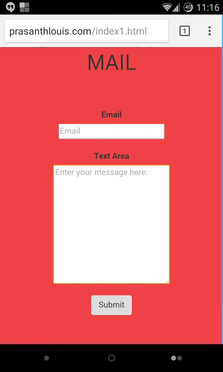
我使用Bootstrap、CSS和HTML创建了一个表单。
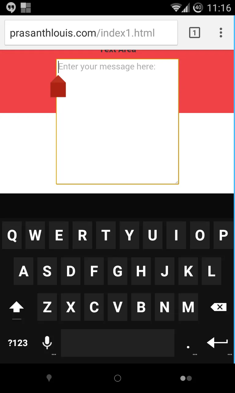
但是,当我在Android手机上点击文本区域(也就是获得焦点时),文本区域的下半部分会变成白色。
我不明白为什么它会变成白色。 顺便说一句:在PC上它运行得很好。
我的CSS代码:
    .container-fluid{
       background-color: #EF4247;
     border-color: #EF4247;
     }
form {
            height: 100%;
        width: 100%;
        padding: 50;
           background-color: #EF4247;
     border-color: #EF4247;
    text-align: center;

    margin: 0;
    }


h1{
text-align:center;
}

textarea{ width:200px;
}

.form-horizontal .control-group {
  margin-bottom: 20px;
}
我的HTML代码:
    <html>
    <head>
        <meta name="viewport" content="width=device-width, initial-scale=1">
        <link rel="stylesheet" type="text/css" href="style1.css">
<link rel="stylesheet" href="http://maxcdn.bootstrapcdn.com/bootstrap/3.2.0/css/bootstrap.min.css">


     </head>
<body>
<div class="container-fluid">
<h1>SEND ME SOME MAIL</h1>
<form class="form-horizontal" action="mail.php" method="post" >
  <div class="control-group">
    <label class="control-label" for="inputEmail">Email</label>
    <div class="controls">
      <input type="text" id="inputEmail" placeholder="Email" name="subject">
    </div>
  </div>
  <div class="control-group">
  <label class="control-label" for="textarea">Text Area</label>
  <div class="controls">
    <textarea id="textarea"  rows="10" name="message" placeholder="Enter your message here:"></textarea>
  </div>
</div>
<button type="submit" class="btn">Submit</button>

</form>


 <script src="https://ajax.googleapis.com/ajax/libs/jquery/1.11.1/jquery.min.js"></script>
    <script src="http://maxcdn.bootstrapcdn.com/bootstrap/3.2.0/js/bootstrap.min.js"></script>
    <script src="fitter-happier-text.js"></script>
    <script type="text/javascript"></script>
    </div>
</body>
</html>