我希望我的选项卡能像图片中那样显示,下面有小三角形。这是否可能?如果是,请帮我提供一些代码或文档。

我认为下面的方法是最简单的。您只需要设置以下drawable(实际上,它是Android默认的选项卡drawable)作为选项卡的背景即可:
<?xml version="1.0" encoding="utf-8"?>
<selector xmlns:android="http://schemas.android.com/apk/res/android">
    <!-- Non focused states -->
    <item android:state_focused="false" android:state_selected="false" android:state_pressed="false" android:drawable="@drawable/tab_unselected" />
    <item android:state_focused="false" android:state_selected="true" android:state_pressed="false" android:drawable="@drawable/tab_selected" />
    <!-- Focused states -->
    <item android:state_focused="true" android:state_selected="false" android:state_pressed="false" android:drawable="@drawable/tab_focus" />
    <item android:state_focused="true" android:state_selected="true" android:state_pressed="false" android:drawable="@drawable/tab_focus" />
    <!-- Pressed -->
    <item android:state_pressed="true" android:drawable="@drawable/tab_press" />
</selector>
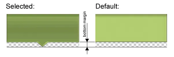
在这里,tab_press、tab_focus和tab_selected的图像将会是PNG格式(我更喜欢使用9-patch),其中包含有向下箭头以及附近的透明区域。而tab_unselected的图像不会有这个箭头,但仍然会有相同的透明区域。唯一要做的就是为您的TabWidget指定负的底部边距。它的值由箭头的高度决定(不要忘记使用密度无关的单位):
tab_0_info.xml:
<?xml version="1.0" encoding="utf-8"?>
<selector xmlns:android="http://schemas.android.com/apk/res/android">
    <item android:drawable="@drawable/ic_menu_yourImg_selected"
        android:state_selected="true" />
    <item android:drawable="@drawable/ic_menu_yourImg" />
</selector>


private void addTab(int resouceTabId, int drawableId,
        Class<? extends ActivityGroup> groupActivityClass)
{
    Intent intent = new Intent(this, groupActivityClass);
    TabHost.TabSpec spec = tabHost.newTabSpec("tab" + resouceTabId);

    View tabIndicator = LayoutInflater.from(this).inflate(
            R.layout.tab_indicator, getTabWidget(), false);

    TextView title = (TextView) tabIndicator.findViewById(R.id.title);
    title.setText(resouceTabId);
    ImageView icon = (ImageView) tabIndicator.findViewById(R.id.icon);
    icon.setImageResource(drawableId);

    spec.setIndicator(tabIndicator);
    spec.setContent(intent);
    tabHost.addTab(spec);

}

//addTab(R.string.yourTabTitle, R.drawable.tab_0_info, YourGroup.class);
您可以在选项卡布局中添加图片:
<RelativeLayout
    android:orientation="vertical"
    android:layout_width="fill_parent"
    android:layout_height="fill_parent">
    <TabWidget
        android:id="@android:id/tabs"
        android:layout_width="match_parent"
        android:layout_height="wrap_content"
        android:padding="0dip" />
    <FrameLayout
        android:fadingEdge="none"
        android:id="@android:id/tabcontent"
        android:layout_width="fill_parent"
        android:layout_height="0px"
        android:layout_below="@android:id/tabs"
        android:layout_alignParentBottom="true"
        android:padding="0px" />
    <ImageView
        ....
        android:id="@+id/down_arrow_left"/>
    <ImageView
        ....
        android:id="@+id/down_arrow_right"/>
</RelativeLayout>
getTabHost().setOnTabChangedListener(new OnTabChangeListener() {
        public void onTabChanged(String tabId) {
            if (tabId.equels("left")){
                findViewById(R.id.down_arrow_left).setVisibility(View.VISIBLE);
                findViewById(R.id.down_arrow_right).setVisibility(View.INVISIBLE);
            } else if (tabId.equels("right")){
                findViewById(R.id.down_arrow_left).setVisibility(View.INVISIBLE);
                findViewById(R.id.down_arrow_right).setVisibility(View.VISIBLE);
            }
        }
    });
TabWidget应该比ListView具有更高的 Z-order,即在 xml 中后定义。 - a.ch.