我正在尝试更改mdc-select中下拉箭头的默认紫色:
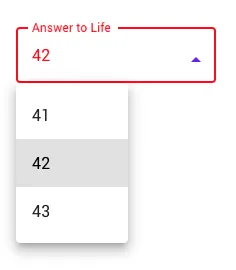
没有任何SASS混合可以做到。
应该如何实现?
以下是我已经尝试过的:
HTML
<div class="mdc-select mdc-select--outlined">
    <input type="hidden" name="enhanced-select">
    <i class="mdc-select__dropdown-icon"></i>
    <div class="mdc-select__selected-text" class="mdc-select__selected-text" role="button" aria-haspopup="listbox" aria-labelledby="demo-label"></div>
    <div class="mdc-select__menu mdc-menu mdc-menu-surface">
        <ul class="mdc-list">
            <li class="mdc-list-item" data-value="41" role="option">41</li>
            <li class="mdc-list-item" data-value="42" role="option">42</li>
            <li class="mdc-list-item" data-value="43" role="option">43</li>
        </ul>
    </div>
    <div class="mdc-notched-outline">
        <div class="mdc-notched-outline__leading"></div>
        <div class="mdc-notched-outline__notch">
            <label class="mdc-floating-label">Answer to Life</label>
        </div>
        <div class="mdc-notched-outline__trailing"></div>
    </div>
</div>
SCSS
@import "@material/list/mdc-list";
@import "@material/menu-surface/mdc-menu-surface";
@import "@material/menu/mdc-menu";
@import "@material/select/mdc-select";

.mdc-select {
    @include mdc-select-ink-color(red);
    // @include mdc-select-container-fill-color(red);
    @include mdc-select-label-color(red);
    @include mdc-select-focused-label-color(red);
    @include mdc-select-bottom-line-color(red);
    @include mdc-select-focused-bottom-line-color(red);
    @include mdc-select-hover-bottom-line-color(red);
    @include mdc-select-outline-color(red);
    @include mdc-select-focused-outline-color(red);
    @include mdc-select-hover-outline-color(red);
    @include mdc-select-icon-color(red);
}
TS
import { MDCSelect } from '@material/select';
const select = new MDCSelect(document.querySelector('.mdc-select'));
filter: grayscale(1);这个方法对我有用。再次感谢。我不知道 CSS 滤镜。 - nuxibyte