我想使用以下数据点生成等值分布图:
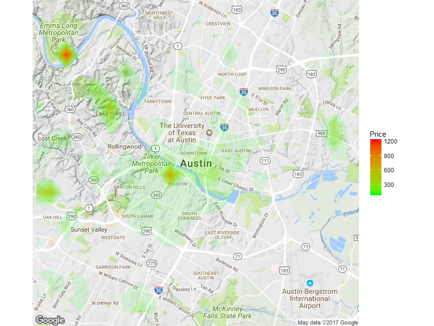
我想让地图显示价格较高和价格较低的区域。它应该像这样(样例图片): 这是我的代码:
我收到了以下错误信息:
- 经度
- 纬度
- 价格
我想让地图显示价格较高和价格较低的区域。它应该像这样(样例图片):
这是我的代码:library(ggmap)
map <- get_map(location = "austin", zoom = 9)
data <- read.csv(file.choose(), stringsAsFactors = FALSE)
data$average_rate_per_night <- as.numeric(gsub("[\\$,]", "",
data$average_rate_per_night))
ggmap(map, extent = "device") +
stat_contour( data = data, geom="polygon",
aes( x = longitude, y = latitude, z = average_rate_per_night,
fill = ..level.. ) ) +
scale_fill_continuous( name = "Price", low = "yellow", high = "red" )
我收到了以下错误信息:
2: Computation failed in `stat_contour()`:
Contour requires single `z` at each combination of `x` and `y`.
我非常希望能够得到帮助,解决这个问题或找到其他方法来生成这种类型的热力图。请注意,我对价格的权重感兴趣,而不是记录的密度。