Python: 如何根据节点的度数着色网络中的节点?

4
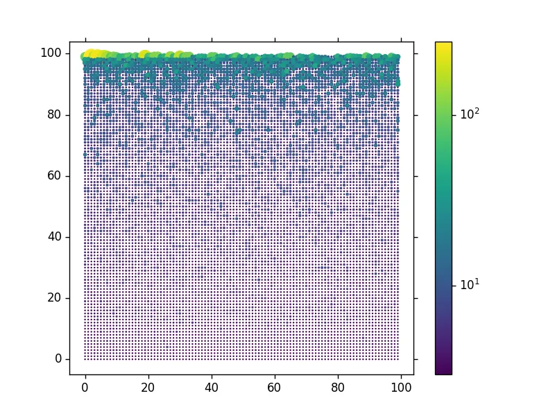
我有一个由10000个节点组成的无标度网络,但边的纹理和节点数量使得它过于复杂而难以理解。我希望能够直观地找到最高度连接的节点。 如何根据节点的度k对其进行着色? 特别是,我想根据预先分配的范围对它们进行着色,例如:
  • 如果1<k<10,则为绿色;
  • 如果11<k<20,则为浅蓝色;
  • 如果21<k<30,则为蓝色;
  • 如果31<k<40,则为紫色;
  • ...
以下是如何获取网络:
import networkx as nx
import matplotlib.pyplot as plt
n = 10000  # Number of nodes
m = 3  # Number of initial links
seed = 500
G = nx.barabasi_albert_graph(n, m, seed)
ncols = 100
pos = {i : (i % ncols, (n-i-1)//ncols) for i in G.nodes()}
fig, ax = plt.subplots()
nx.draw(G, pos, with_labels=False, ax=ax, node_size=10)
degrees=G.degree() #Dict with Node ID, Degree
sum_of_degrees=sum(degrees.values()) #Sum of degrees
avg_degree_unaltered=sum_of_degrees/10000 #The average degree <k>
short_path=nx.average_shortest_path_length(G)
print('seed: '+str(seed)+', short path: '+str(round(short_path,3))+', log(N)=4')
#Plot the graph
plt.xlim(-20,120,10)
plt.xticks(numpy.arange(-20, 130, 20.0))
plt.ylim(120,-20,10) 
plt.yticks(numpy.arange(-20, 130, 20.0))
plt.axis('on')
title_string=('Scale-Free Network') 
subtitle_string=('100x100'+' = '+str(n)+' nodes')
plt.suptitle(title_string, y=0.99, fontsize=17)
plt.title(subtitle_string, fontsize=8)
plt.show()

不应用差分颜色的结果如下所示。PS:初始节点ID为0,位于左上角。
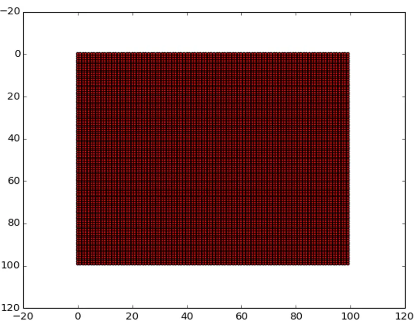
enter image description here

2个回答

7
在底层,这只是一个基于matplotlib的scatter图表实现,而networkx API允许您通过多个选项进行传递
import numpy as np
import matplotlib.colors as mcolors
import networkx as nx
import matplotlib.pyplot as plt
n = 10000  # Number of nodes
m = 3  # Number of initial links
seed = 500
G = nx.barabasi_albert_graph(n, m, seed)

ncols = 100
pos = {i : (i % ncols, (n-i-1)//ncols) for i in G.nodes()}

fig, ax = plt.subplots()
degrees = G.degree() #Dict with Node ID, Degree
nodes = G.nodes()
n_color = np.asarray([degrees[n] for n in nodes])
sc = nx.draw_networkx_nodes(G, pos, nodelist=nodes, node_color=n_color, cmap='viridis',
                            with_labels=False, ax=ax, node_size=n_color)
# use a log-norm, do not see how to pass this through nx API
# just set it after-the-fact
sc.set_norm(mcolors.LogNorm())
fig.colorbar(sc)

图表示例输出

此图表同时根据度数缩放颜色和大小。

可以使用BoundryNorm和离散的颜色地图将节点分段成带。


请检查我编辑后的图片。我一直有这个问题。在我的网络中,ID为“0”的节点位于左上角,而在你的网络中它位于左下角。这会影响“热力图”的显示,因为该网络是通过从上排开始的增长优先附加生成的。如何在您的绘图中更改此设置? - FaCoffee
1
有一个 ax.invert_yaxis() 方法,可以将0翻转到左上角。节点的位置由 pos 设置,您可以按任何方式定义它。例如,使用 {i : (i % ncols, i//ncols for i in G.nodes()} 将最大的节点放在(0, 0)附近,而不是(0, 100)。 - tacaswell
我喜欢viridis颜色方案,但我的matplotlib 1.5无法识别它。如何包含它? - FaCoffee

2

我将只使用三种颜色:如果 k < 10 则为绿色;如果 10 <= k < 20,则为蓝色;如果 20 <= k,则为橙色。

greennodes = [node for node in G.nodes_iter() if G.degree(node)<10]
bluenodes = [node for node in G.nodes_iter() if 10<=G.degree(node)<20]
orangenodes = [node for node in G.nodes_iter() if 20<= G.degree(node)]

pos = {i : (i % ncols, (n-i-1)//ncols) for i in G.nodes()}
fig, ax = plt.subplots()
nx.draw_networkx_edges(G, pos) #draw edges first
nx.draw_networkx_nodes(G, pos, with_labels=False, ax=ax, node_size=10, nodelist = 
greennodes, node_color = 'g') #draw green nodes
nx.draw_networkx_nodes(G, pos, with_labels=False, ax=ax, node_size=10, nodelist = 
bluenodes, node_color = 'g') #draw blue nodes
nx.draw_networkx_nodes(G, pos, with_labels=False, ax=ax, node_size=10, nodelist = 
orangenodes, node_color = 'g') #draw orange nodes

也许有更好的方法(使用itertools?)来避免循环三次以收集所有节点。

网页内容由stack overflow 提供, 点击上面的
可以查看英文原文,
原文链接