将文本刻度标签添加到pcolor热图

3
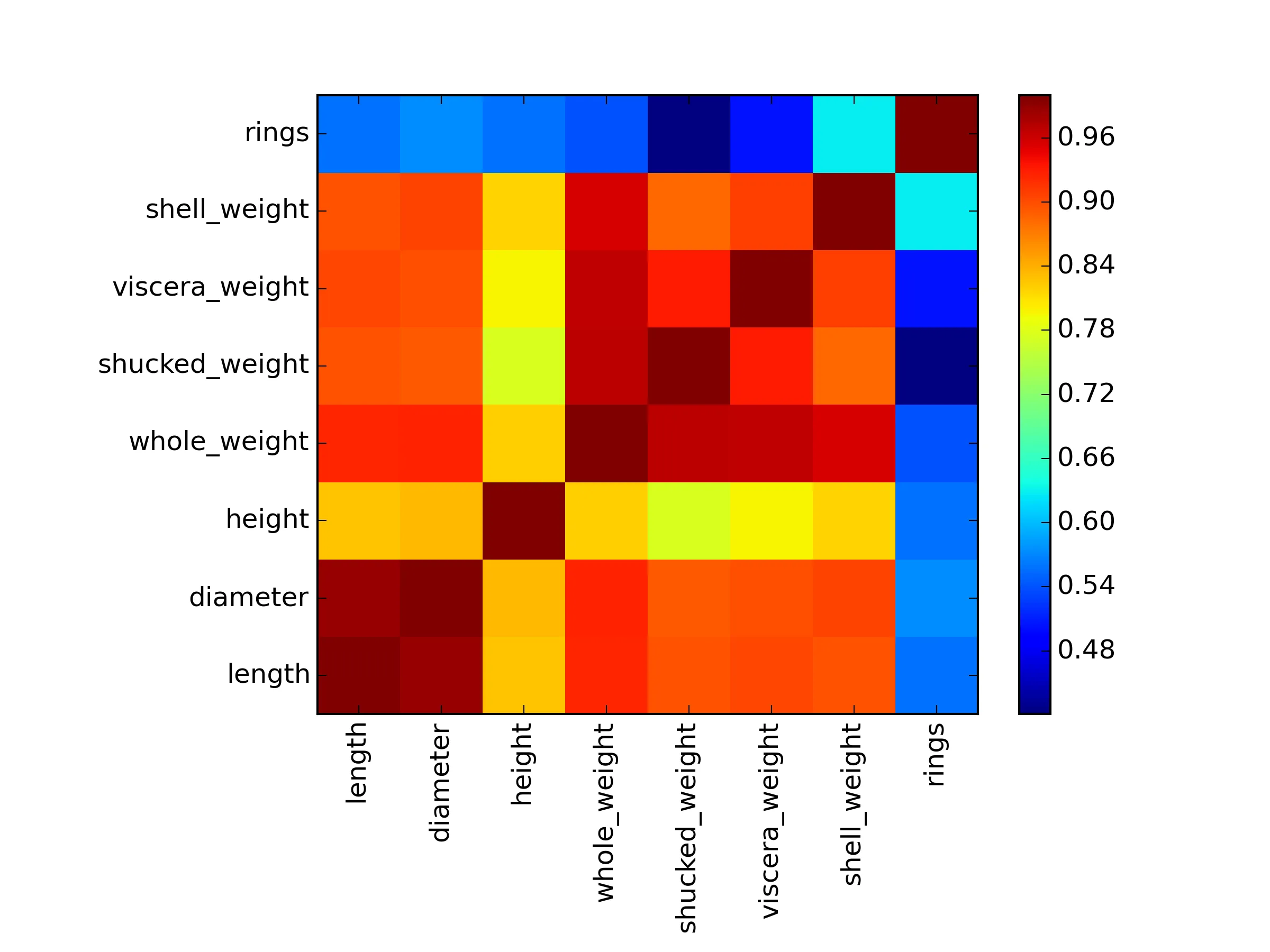
DF_correlation = [[ 1.          0.98681158  0.82755361  0.92526117  0.89791366  0.9030177
   0.89770557  0.55671958]
 [ 0.98681158  1.          0.83368369  0.9254521   0.89316248  0.89972443
   0.90532978  0.57465985]
 [ 0.82755361  0.83368369  1.          0.81922077  0.77497229  0.7983193
   0.81733801  0.55746732]
 [ 0.92526117  0.9254521   0.81922077  1.          0.96940546  0.96637508
   0.95535544  0.54038968]
 [ 0.89791366  0.89316248  0.77497229  0.96940546  1.          0.93196132
   0.88261706  0.42088366]
 [ 0.9030177   0.89972443  0.7983193   0.96637508  0.93196132  1.
   0.90765632  0.50381925]
 [ 0.89770557  0.90532978  0.81733801  0.95535544  0.88261706  0.90765632
   1.          0.62757404]
 [ 0.55671958  0.57465985  0.55746732  0.54038968  0.42088366  0.50381925
   0.62757404  1.        ]]

我正在按照https://www.geekbooks.me/book/view/machine-learning-in-python的指导,制作回归热力图。

import pandas as pd
from pandas import DataFrame
import matplotlib.pyplot as plt

headers = ["sex", "length","diameter", "height", "whole_weight", "shucked_weight","viscera_weight","shell_weight","rings"]

以下是Michael Bowles的代码:

plt.pcolor(DF_correlation)
plt.show()

这段代码可以正常工作,但是没有标签。为了加入标签,我尝试了matplotlib: colorbars and its text labels中的方法。虽然我稍微修改了一下格式,但还是没有成功。
fig, ax = plt.subplots()
heatmap = ax.pcolor(DF_correlation)
cbar = plt.colorbar(heatmap)
ax.set_xticklabels = ax.set_yticklabels = headers[1:]
plt.show()

如何给这个图添加标签?由于这是一个相关性图,因此x轴和y轴的标签将是相同的......基本上是 headers[1:]

1个回答

9
你提供的答案中的代码很好用。看起来你改变了一些东西,导致它无法工作。
你的主要问题是在这里尝试将set_xticklabelsset_yticklabels设置为列表。
ax.set_xticklabels = ax.set_yticklabels = headers[1:]

然而,它们是Axes对象(ax)的方法,因此您需要调用它们并将headers列表作为参数。

ax.set_xticklabels(headers[1:])
ax.set_yticklabels(headers[1:])

这里是从链接答案中采用到您脚本中的方法。我还将xticklabels旋转以防止它们重叠(rotation=90),并将它们移动到单元格的中心(请参见下面的set_xticksset_yticks行)。
import pandas as pd
import matplotlib.pyplot as plt
import numpy as np

# Make DF_correlation into a DataFrame
DF_correlation = pd.DataFrame([
 [ 1.        ,  0.98681158,  0.82755361,  0.92526117,  0.89791366,  0.9030177 ,  0.89770557,  0.55671958],
 [ 0.98681158,  1.        ,  0.83368369,  0.9254521 ,  0.89316248,  0.89972443,  0.90532978,  0.57465985],
 [ 0.82755361,  0.83368369,  1.        ,  0.81922077,  0.77497229,  0.7983193 ,  0.81733801,  0.55746732],
 [ 0.92526117,  0.9254521 ,  0.81922077,  1.        ,  0.96940546,  0.96637508,  0.95535544,  0.54038968],
 [ 0.89791366,  0.89316248,  0.77497229,  0.96940546,  1.        ,  0.93196132,  0.88261706,  0.42088366],
 [ 0.9030177 ,  0.89972443,  0.7983193 ,  0.96637508,  0.93196132,  1.        ,  0.90765632,  0.50381925],
 [ 0.89770557,  0.90532978,  0.81733801,  0.95535544,  0.88261706,  0.90765632,  1.        ,  0.62757404],
 [ 0.55671958,  0.57465985,  0.55746732,  0.54038968,  0.42088366,  0.50381925,  0.62757404,  1.        ]
 ])

headers = ["sex", "length","diameter", "height", "whole_weight", "shucked_weight","viscera_weight","shell_weight","rings"]

fig, ax = plt.subplots()
fig.subplots_adjust(bottom=0.25,left=0.25) # make room for labels

heatmap = ax.pcolor(DF_correlation)
cbar = plt.colorbar(heatmap)

# Set ticks in center of cells
ax.set_xticks(np.arange(DF_correlation.shape[1]) + 0.5, minor=False)
ax.set_yticks(np.arange(DF_correlation.shape[0]) + 0.5, minor=False)

# Rotate the xlabels. Set both x and y labels to headers[1:]
ax.set_xticklabels(headers[1:],rotation=90)
ax.set_yticklabels(headers[1:])

plt.show()

enter image description here


网页内容由stack overflow 提供, 点击上面的
可以查看英文原文,
原文链接