如何使用CSS创建如下屏幕截图中所示的形状。绿色矩形看起来很容易制作,但问题在于橙色和蓝色。这个项目是一个开源项目https://github.com/LLK/scratch-www,但我找不到上述块的代码。
我能得到一些提示吗?
我能得到一些提示吗?
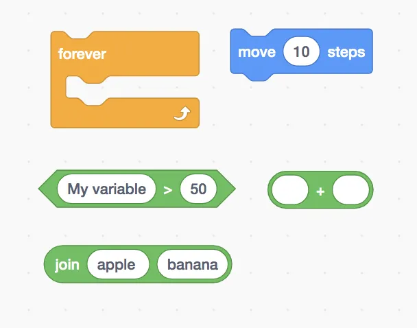
图片来源: https://scratch.mit.edu/projects/editor/?tutorial=getStarted
图片来源: https://scratch.mit.edu/projects/editor/?tutorial=getStarted
body {
  background: #f9f9f9;
  background-image: radial-gradient(#dfdfdf 2%, transparent 6%);
  background-position: 0 0, 100px 100px;
  background-size: 100px 100px;
  padding: 2rem;
}

.svg-shape {
  position: relative;
}

.svg-shape span {
  display: block;
  position: absolute;
  padding: 1rem;
  color: #fff;
}<div class="svg-shape">
<span>move 10 steps</span>
<svg>
<path class="blocklyPath blocklyBlockBackground" stroke="#3373CC" fill="#4C97FF" fill-opacity="1" d="m 0,4 A 4,4 0 0,1 4,0 H 12 c 2,0 3,1 4,2 l 4,4 c 1,1 2,2 4,2 h 12 c 2,0 3,-1 4,-2 l 4,-4 c 1,-1 2,-2 4,-2 H 145.3670997619629 a 4,4 0 0,1 4,4 v 40 a 4,4 0 0,1 -4,4 H 48 c -2,0 -3,1 -4,2 l -4,4 c -1,1 -2,2 -4,2 h -12 c -2,0 -3,-1 -4,-2 l -4,-4 c -1,-1 -2,-2 -4,-2 H 4 a 4,4 0 0,1 -4,-4 z"></path>
</svg>
</div>您还可以使用CSS的clip-path属性创建它,但该属性的浏览器支持有限,需要做一些调整才能完美实现。
clip-path属性允许您通过将元素剪切为基本形状(圆形、椭圆形、多边形或内嵌)或SVG源,以在CSS中创建复杂的形状。
我使用https://bennettfeely.com/clippy/快速创建了剪切路径。
body {
  background: #f9f9f9;
  background-image: radial-gradient(#dfdfdf 2%, transparent 6%);
  background-position: 0 0, 100px 100px;
  background-size: 100px 100px;
  font-family: sans-serif;
  font-size:18px;
}

.shape-blue {
  position: relative;
  height: 280px;
  width: 280px;
  background: #4274c6;
  color: #fff;
  -webkit-clip-path: polygon( 9% 27%, 22% 27%, 26% 35%, 44% 34%, 48% 25%, 94% 25%, 94% 50%, 50% 50%, 44% 60%, 25% 60%, 20% 51%, 9% 51%);
  clip-path: polygon( 9% 27%, 22% 27%, 26% 35%, 44% 34%, 48% 25%, 94% 25%, 94% 50%, 50% 50%, 44% 60%, 25% 60%, 20% 51%, 9% 51%);
  border: 1px solid #000;
}

.text {
  position: absolute;
  z-index: 1;
  color: #fff;
  font-weight: bold;
  top: 108px;
  left: 60px;
  z-index: 2;
  font-style: 1rem;
}

.text span {
  background: #f9f9f9;
  color: #585e73;
  border: 1px solid #585e73;
  padding: 0.5rem;
  border-radius: 1rem;
}

.shape-blue:before {
  position: absolute;
  content: "";
  display: block;
  top: 0px;
  left: 0px;
  height: 279px;
  width: 279px;
  background-color: #5d98f7;
  -webkit-clip-path: polygon( 9% 27%, 22% 27%, 26% 35%, 44% 34%, 48% 25%, 94% 25%, 94% 50%, 50% 50%, 44% 60%, 25% 60%, 20% 51%, 9% 51%);
  clip-path: polygon( 9% 27%, 22% 27%, 26% 35%, 44% 34%, 48% 25%, 94% 25%, 94% 50%, 50% 50%, 44% 60%, 25% 60%, 20% 51%, 9% 51%);
  display: none;
}<div class="shape-blue">
<div class="text">
move <span>10</span> steps
</div>
</div><svg version="1.1"
baseProfile="full"
width="300" height="200"
xmlns="http://www.w3.org/2000/svg">
<path class="blocklyPath blocklyBlockBackground" stroke="#3373CC" fill="#4C97FF" fill-opacity="1" d="m 0,4 A 4,4 0 0,1 4,0 H 12 c 2,0 3,1 4,2 l 4,4 c 1,1 2,2 4,2 h 12 c 2,0 3,-1 4,-2 l 4,-4 c 1,-1 2,-2 4,-2 H 145.3670997619629 a 4,4 0 0,1 4,4 v 40 a 4,4 0 0,1 -4,4 H 48 c -2,0 -3,1 -4,2 l -4,4 c -1,1 -2,2 -4,2 h -12 c -2,0 -3,-1 -4,-2 l -4,-4 c -1,-1 -2,-2 -4,-2 H 4 a 4,4 0 0,1 -4,-4 z"></path>
</svg>