我正在尝试找出如何创建一个滚动的 div,只有在鼠标悬停时才显示其滚动条。
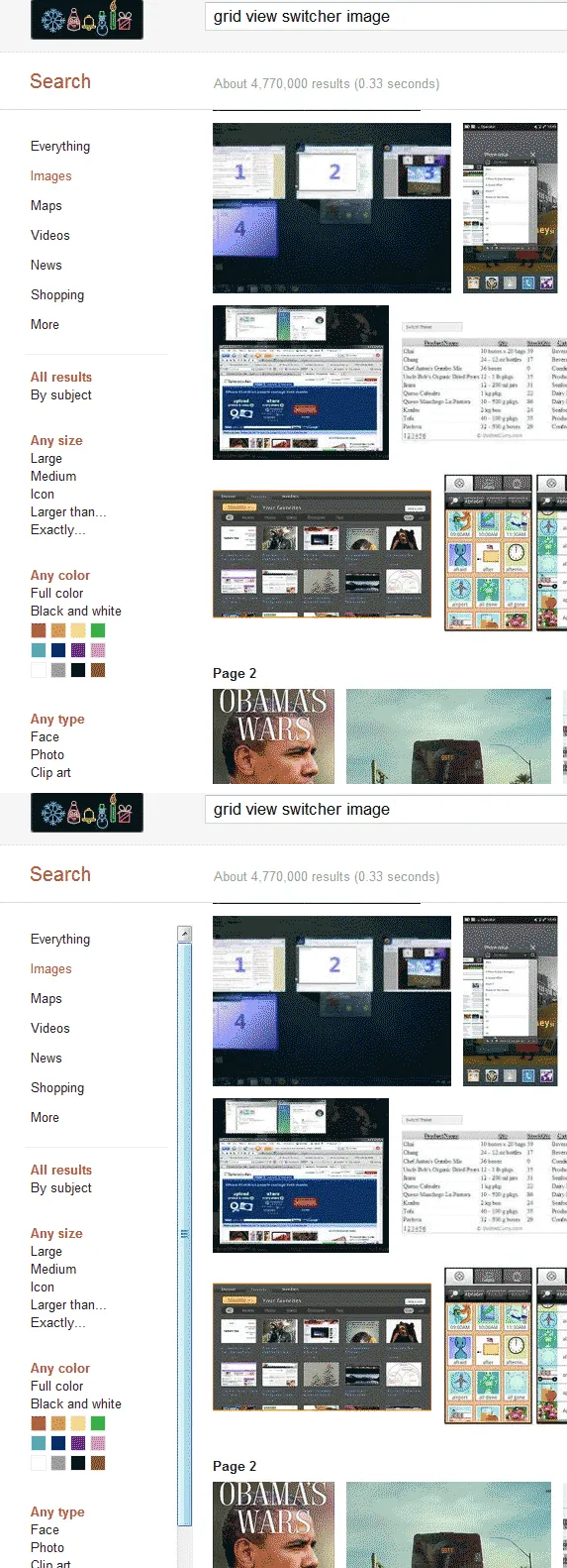
谷歌图片搜索是一个例子,在下面的图片中,你可以看到左侧边栏似乎不能滚动,直到你将鼠标悬停在它上面。
这个功能可以用 CSS 实现吗?还是需要 JavaScript?如果可能,能否提供一个快速示例来完成这样的任务?
我正在尝试找出如何创建一个滚动的 div,只有在鼠标悬停时才显示其滚动条。
谷歌图片搜索是一个例子,在下面的图片中,你可以看到左侧边栏似乎不能滚动,直到你将鼠标悬停在它上面。
这个功能可以用 CSS 实现吗?还是需要 JavaScript?如果可能,能否提供一个快速示例来完成这样的任务?
div {
  height: 100px;
  width: 50%;
  margin: 0 auto;
  overflow: hidden;
}

div:hover {
  overflow-y: scroll;
}<div>
<p>Lorem Ipsum is simply dummy text of the printing and typesetting industry. Lorem Ipsum has been the industry's standard dummy text ever since the 1500s, when an unknown printer took a galley of type and scrambled it to make a type specimen book. It
has survived not only five centuries, but also the leap into electronic typesetting, remaining essentially unchanged. It was popularised in the 1960s with the release of Letraset sheets containing Lorem Ipsum passages, and more recently with desktop
publishing software like Aldus PageMaker including versions of Lorem Ipsum.
</p>
</div>这种方案可行吗?
使用overflow属性来改变布局有许多问题,比如内部块的宽度不一致和触发重排。
有一种更简单的方法可以达到相同的效果,并且不会触发任何重排:使用visibility属性和嵌套块:
.scrollbox {
  width: 10em;
  height: 10em;
  overflow: auto;
  visibility: hidden;
}

.scrollbox-content,
.scrollbox:hover,
.scrollbox:focus {
  visibility: visible;
}

.scrollbox_delayed {
  transition: visibility 0.2s;
}

.scrollbox_delayed:hover {
  transition: visibility 0s 0.2s;
}<h2>Hover it</h2>
<div class="scrollbox" tabindex="0">
<div class="scrollbox-content">Hover me! Lorem ipsum dolor sit amet, consectetur adipisicing elit. Facere velit, repellat voluptas ipsa impedit fugiat voluptatibus. Facilis deleniti, nihil voluptate perspiciatis iure adipisci magni, nisi suscipit aliquam, quam, et excepturi! Lorem
ipsum dolor sit amet, consectetur adipisicing elit. Facere velit, repellat voluptas ipsa impedit fugiat voluptatibus. Facilis deleniti, nihil voluptate perspiciatis iure adipisci magni, nisi suscipit aliquam, quam, et excepturi!</div>
</div>
<h2>With delay</h2>
<div class="scrollbox scrollbox_delayed" tabindex="0">
<div class="scrollbox-content">Hover me! Lorem ipsum dolor sit amet, consectetur adipisicing elit. Facere velit, repellat voluptas ipsa impedit fugiat voluptatibus. Facilis deleniti, nihil voluptate perspiciatis iure adipisci magni, nisi suscipit aliquam, quam, et excepturi! Lorem
ipsum dolor sit amet, consectetur adipisicing elit. Facere velit, repellat voluptas ipsa impedit fugiat voluptatibus. Facilis deleniti, nihil voluptate perspiciatis iure adipisci magni, nisi suscipit aliquam, quam, et excepturi!</div>
</div>这种方法的另一个特点是,visibility 可以进行动画处理,因此我们可以为其添加过渡效果(请参见上面笔中的第二个示例)。 添加过渡效果对于用户体验更好:当悬停在元素上并且沿着移动到另一个元素时,滚动条不会立即出现,并且在用鼠标光标定位滚动条时,它也不会立即隐藏,从而很难错过滚动条。
对于webkit浏览器,一种技巧是创建一个不可见的滚动条,然后在鼠标悬停时显示出来。这种方法不会影响滚动区域的宽度,因为滚动条所需的空间已经存在。
类似于以下内容:
body {
  height: 500px;
  &::-webkit-scrollbar {
    background-color: transparent;
    width: 10px;
  }
  &::-webkit-scrollbar-thumb {
    background-color: transparent;
  }
}

body:hover {
  &::-webkit-scrollbar-thumb {
    background-color: black;
  }
}

.full-width {
  width: 100%;
  background: blue;
  padding: 30px;
  color: white;
}
some content here
<div class="full-width">does not change</div>:host:hover::-webkit-scrollbar-thumb {background: blue}。什么也没发生。它在这个答案中与body一起工作,但是与:host完全不起作用。 - trusktr给该 div 元素设置固定的高度和 scroll:hidden; 样式,当鼠标悬停在该元素上时将样式更改为 scroll:auto;。
#test_scroll{ height:300px; overflow:hidden;}
#test_scroll:hover{overflow-y:auto;}
.scroll {
  height: 140px;
  width: 140px;
  overflow-y: auto;
}

.scroll:active::-webkit-scrollbar-thumb,
.scroll:focus::-webkit-scrollbar-thumb,
.scroll:hover::-webkit-scrollbar-thumb {
    visibility: visible;
}
.scroll::-webkit-scrollbar-thumb {
    background-color: darkgrey;
    visibility: hidden;
}

.scroll::-webkit-scrollbar {
    width: 4px;
    height: 4px;
}<div class="scroll">
<p>
Lorem ipsum dolor sit amet consectetur adipisicing elit. Reiciendis aliquid recusandae nisi dolore numquam consectetur voluptatibus officia. Velit quod corporis quae quos. Facere, obcaecati? Tenetur obcaecati minima fugit a iste!
</p>
</div>.div::-webkit-scrollbar-thumb {
background: transparent;
}
.div:hover::-webkit-scrollbar-thumb {
background: red;
}
由于尚未提及,这里提供一种针对Firefox的CSS解决方案,不会影响div的大小:
div {
    overflow-y: scroll;
    /* Sets Color to Transparent for both the track and the thumb */
    scrollbar-color: transparent transparent;
    /* Optional, provides a smooth transition */
    transition: scrollbar-color .25s ease-in-out;
}

div:hover {
    /* Sets the color back to the default value. You can choose a different color */
    scrollbar-color: initial;
}
您可以使用::webkit-scrollbar属性(已在此处回答)以确保兼容性。
.content {
  padding: 17px 0 17px 17px;
  width: 300px;
  height: 200px;
  overflow-y: scroll;
  mask-image: linear-gradient(to top, transparent, black),
    linear-gradient(to left, transparent 17px, black 17px);
  mask-size: 100% 20000px;
  mask-position: left bottom;
  -webkit-mask-image: linear-gradient(to top, transparent, black),
    linear-gradient(to left, transparent 17px, black 17px);
  -webkit-mask-size: 100% 20000px;
  -webkit-mask-position: left bottom;
  transition: mask-position 0.3s, -webkit-mask-position 0.3s;
}

.content:hover {
  -webkit-mask-position: left top;
}

@keyframes background {
  from {
    background: pink;
  }
  to {
    background: #c0d6ff;
  }
}

.wrapper {
  float: left;
  animation: background 5s infinite alternate;
}<div class="wrapper">
<div class="content">
Lorem Ipsum is simply dummy text of the printing and typesetting industry. Lorem Ipsum has been the industry's standard dummy text ever since the 1500s, when an unknown printer took a galley of type and scrambled it to make a type specimen book. It has survived not only five centuries, but also the leap into electronic typesetting, remaining essentially unchanged. It was popularised in the 1960s with the release of Letraset sheets containing Lorem Ipsum passages, and more recently with desktop publishing software like Aldus PageMaker including versions of Lorem Ipsum.
</div>
</div>@Calvin Froedge的答案很简短,但也有一个问题,@kizu提到了这个问题。 由于div的宽度不一致,当鼠标悬停时会闪烁。为解决此问题,在悬停时在右侧添加负边距。
#div {
     overflow:hidden;
     height:whatever px;
}
#div:hover {
     overflow-y:scroll;
     margin-right: -15px; // adjust according to scrollbar width
}
$("#leftDiv").mouseover(function(){$(this).css("overflow","scroll");});
$("#leftDiv").mouseout(function(){$(this).css("overflow","hidden");});
#div:hover { overflow-y: auto; }是一个更加用户友好的解决方案。只有在需要时才显示滚动条。 - barnacle.m