我将尝试创建以下布局:
所以我的尝试是创建了一个线性布局,每个电子邮件、密码和登录行都是一个线性布局。但我想要的是将整个东西放在中心(垂直和水平),并将电子邮件和密码标签对齐到屏幕的“L-”部分(“L-”只是表示我想要对齐到那里),而我想要将两个文本框和登录按钮对齐到“-R”标志(所以我实际上不需要L-和-R标志,这些只是在这个模型中指示对齐位置)。
以下是更具体的模型:
所以我想将整个东西对齐到中心,并将文本标签对齐到左侧绿色线,而其他内容对齐到右侧绿色线。
目前我更喜欢在eclipse中使用图形编辑器,但任何建议都可以。我已经尝试过这种方法,但卡住了:
|-----------------------------------------------------------|
|                                                           |
|                                                           |
|                                                           |
|                                                           |
|                 L-Email     [___________]-R               |
|                 L-Password  [___________]-R               |
|                                   (Login)-R               |
|                                                           |
|                                                           |
|                                                           |
|-----------------------------------------------------------|
所以我的尝试是创建了一个线性布局,每个电子邮件、密码和登录行都是一个线性布局。但我想要的是将整个东西放在中心(垂直和水平),并将电子邮件和密码标签对齐到屏幕的“L-”部分(“L-”只是表示我想要对齐到那里),而我想要将两个文本框和登录按钮对齐到“-R”标志(所以我实际上不需要L-和-R标志,这些只是在这个模型中指示对齐位置)。
以下是更具体的模型:
所以我想将整个东西对齐到中心,并将文本标签对齐到左侧绿色线,而其他内容对齐到右侧绿色线。
目前我更喜欢在eclipse中使用图形编辑器,但任何建议都可以。我已经尝试过这种方法,但卡住了:
<LinearLayout xmlns:android="http://schemas.android.com/apk/res/android"
    xmlns:tools="http://schemas.android.com/tools"
    android:id="@+id/LinearLayout1"
    android:layout_width="match_parent"
    android:layout_height="match_parent"
    android:background="@drawable/sahbg"
    android:gravity="center"
    android:orientation="vertical"
    tools:context=".MainActivity" >

    <LinearLayout
        android:layout_width="match_parent"
        android:layout_height="wrap_content"
        android:gravity="center" >

        <TextView
            android:id="@+id/textView1"
            android:layout_width="wrap_content"
            android:layout_height="wrap_content"
            android:text="TextView" />

        <EditText
            android:id="@+id/editText1"
            android:layout_width="wrap_content"
            android:layout_height="wrap_content"
            android:ems="10" >

            <requestFocus />
        </EditText>

    </LinearLayout>

    <LinearLayout
        android:layout_width="wrap_content"
        android:layout_height="wrap_content"
        android:gravity="center" >

        <TextView
            android:id="@+id/TextView01"
            android:layout_width="wrap_content"
            android:layout_height="wrap_content"
            android:text="TextView" />

        <EditText
            android:id="@+id/EditText01"
            android:layout_width="wrap_content"
            android:layout_height="wrap_content"
            android:ems="10" />
    </LinearLayout>

    <LinearLayout
        android:layout_width="match_parent"
        android:layout_height="wrap_content"
        android:gravity="center" >

        <Button
            android:id="@+id/button1"
            android:layout_width="wrap_content"
            android:layout_height="wrap_content"
            android:text="Button" />

    </LinearLayout>

</LinearLayout>
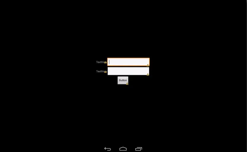
它的显示效果如下: