有没有办法为LazyColumn添加滚动条(ScrollableColumn已被弃用)。Jetpack Compose的Javadoc未提及关于滚动条方面的内容。
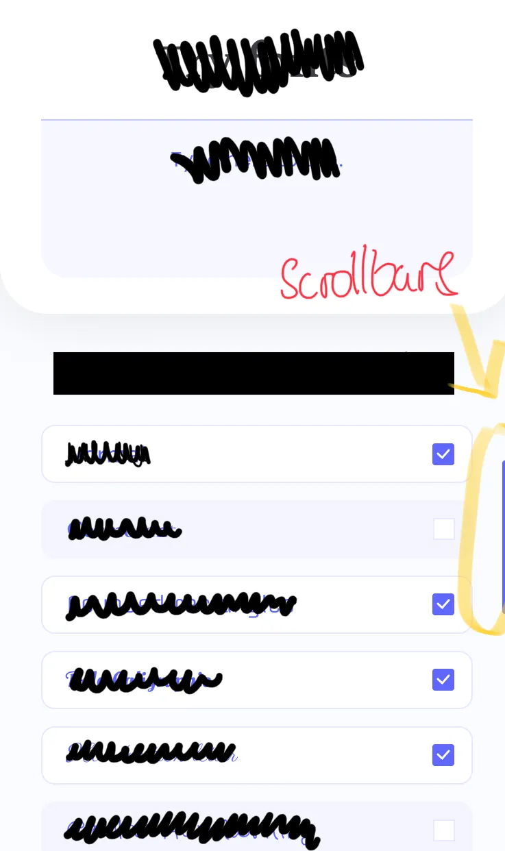
只是为了澄清,这就是我想要实现的设计:
在Jetpack Compose中是否有可能实现这一点?还是说目前不支持滚动条?
有没有办法为LazyColumn添加滚动条(ScrollableColumn已被弃用)。Jetpack Compose的Javadoc未提及关于滚动条方面的内容。
只是为了澄清,这就是我想要实现的设计:
在Jetpack Compose中是否有可能实现这一点?还是说目前不支持滚动条?
现在实际上是可以做到的(他们已经在LazyListState中添加了更多内容),并且这很容易实现。 这是一个相当原始的滚动条(始终可见/无法拖动等),它使用项目索引来确定拇指的位置,因此在仅有少量项目的列表中滚动时可能看起来不太好:
  @Composable
  fun Modifier.simpleVerticalScrollbar(
    state: LazyListState,
    width: Dp = 8.dp
  ): Modifier {
    val targetAlpha = if (state.isScrollInProgress) 1f else 0f
    val duration = if (state.isScrollInProgress) 150 else 500

    val alpha by animateFloatAsState(
      targetValue = targetAlpha,
      animationSpec = tween(durationMillis = duration)
    )

    return drawWithContent {
      drawContent()

      val firstVisibleElementIndex = state.layoutInfo.visibleItemsInfo.firstOrNull()?.index
      val needDrawScrollbar = state.isScrollInProgress || alpha > 0.0f

      // Draw scrollbar if scrolling or if the animation is still running and lazy column has content
      if (needDrawScrollbar && firstVisibleElementIndex != null) {
        val elementHeight = this.size.height / state.layoutInfo.totalItemsCount
        val scrollbarOffsetY = firstVisibleElementIndex * elementHeight
        val scrollbarHeight = state.layoutInfo.visibleItemsInfo.size * elementHeight

        drawRect(
          color = Color.Red,
          topLeft = Offset(this.size.width - width.toPx(), scrollbarOffsetY),
          size = Size(width.toPx(), scrollbarHeight),
          alpha = alpha
        )
      }
    }
  }
更新: 我已经更新了代码。 我已经找出了如何在滚动LazyColumn时显示/隐藏滚动条,并添加了淡入/淡出动画。 我还将drawBehind()更改为drawWithContent(),因为前者会在内容后面绘制,所以在某些情况下可能会在滚动条顶部绘制,这很可能不是理想的。
state.layoutInfo.visibleItemsInfo不断变化(这取决于项目高度的差异程度)所致。我认为,如果您重新计算可见项目的平均数量,而不是直接使用visibleItemsInfo.size,它应该会更加平滑。RecyclerView在内部执行类似的计算以绘制滚动条。 - Dmitryval scrollbarOffsetY = firstVisibleElementIndex * elementHeight + state.firstVisibleItemScrollOffset / 4
以及
val scrollbarHeight = elementHeight * 4 - Miguel SesmaLazyColumn/LazyRow目前还不能实现此功能。
计划在未来加入该功能,但尚未确定具体发布时间。当有相关进展时,我会更新这个答案。
我基于Dmitry的答案进行了改进:
fixedKnobRatio参数的能力,以处理项大小不均匀的情况/**
* Renders a scrollbar.
*
* <ul> <li> A scrollbar is composed of two components: a track and a knob. The knob moves across
* the track <li> The scrollbar appears automatically when the user starts scrolling and disappears
* after the scrolling is finished </ul>
*
* @param state The [LazyListState] that has been passed into the lazy list or lazy row
* @param horizontal If `true`, this will be a horizontally-scrolling (left and right) scroll bar,
* if `false`, it will be vertically-scrolling (up and down)
* @param alignEnd If `true`, the scrollbar will appear at the "end" of the scrollable composable it
* is decorating (at the right-hand side in left-to-right locales or left-hand side in right-to-left
* locales, for the vertical scrollbars -or- the bottom for horizontal scrollbars). If `false`, the
* scrollbar will appear at the "start" of the scrollable composable it is decorating (at the
* left-hand side in left-to-right locales or right-hand side in right-to-left locales, for the
* vertical scrollbars -or- the top for horizontal scrollbars)
* @param thickness How thick/wide the track and knob should be
* @param fixedKnobRatio If not `null`, the knob will always have this size, proportional to the
* size of the track. You should consider doing this if the size of the items in the scrollable
* composable is not uniform, to avoid the knob from oscillating in size as you scroll through the
* list
* @param knobCornerRadius The corner radius for the knob
* @param trackCornerRadius The corner radius for the track
* @param knobColor The color of the knob
* @param trackColor The color of the track. Make it [Color.Transparent] to hide it
* @param padding Edge padding to "squeeze" the scrollbar start/end in so it's not flush with the
* contents of the scrollable composable it is decorating
* @param visibleAlpha The alpha when the scrollbar is fully faded-in
* @param hiddenAlpha The alpha when the scrollbar is fully faded-out. Use a non-`0` number to keep
* the scrollbar from ever fading out completely
* @param fadeInAnimationDurationMs The duration of the fade-in animation when the scrollbar appears
* once the user starts scrolling
* @param fadeOutAnimationDurationMs The duration of the fade-out animation when the scrollbar
* disappears after the user is finished scrolling
* @param fadeOutAnimationDelayMs Amount of time to wait after the user is finished scrolling before
* the scrollbar begins its fade-out animation
*/
@Composable
fun Modifier.scrollbar(
state: LazyListState,
horizontal: Boolean,
alignEnd: Boolean = true,
thickness: Dp = 4.dp,
fixedKnobRatio: Float? = null,
knobCornerRadius: Dp = 4.dp,
trackCornerRadius: Dp = 2.dp,
knobColor: Color = Color.Black,
trackColor: Color = Color.White,
padding: Dp = 0.dp,
visibleAlpha: Float = 1f,
hiddenAlpha: Float = 0f,
fadeInAnimationDurationMs: Int = 150,
fadeOutAnimationDurationMs: Int = 500,
fadeOutAnimationDelayMs: Int = 1000,
): Modifier {
check(thickness > 0.dp) { "Thickness must be a positive integer." }
check(fixedKnobRatio == null || fixedKnobRatio < 1f) {
"A fixed knob ratio must be smaller than 1."
}
check(knobCornerRadius >= 0.dp) { "Knob corner radius must be greater than or equal to 0." }
check(trackCornerRadius >= 0.dp) { "Track corner radius must be greater than or equal to 0." }
check(hiddenAlpha <= visibleAlpha) { "Hidden alpha cannot be greater than visible alpha." }
check(fadeInAnimationDurationMs >= 0) {
"Fade in animation duration must be greater than or equal to 0."
}
check(fadeOutAnimationDurationMs >= 0) {
"Fade out animation duration must be greater than or equal to 0."
}
check(fadeOutAnimationDelayMs >= 0) {
"Fade out animation delay must be greater than or equal to 0."
}
val targetAlpha =
if (state.isScrollInProgress) {
visibleAlpha
} else {
hiddenAlpha
}
val animationDurationMs =
if (state.isScrollInProgress) {
fadeInAnimationDurationMs
} else {
fadeOutAnimationDurationMs
}
val animationDelayMs =
if (state.isScrollInProgress) {
0
} else {
fadeOutAnimationDelayMs
}
val alpha by
animateFloatAsState(
targetValue = targetAlpha,
animationSpec =
tween(delayMillis = animationDelayMs, durationMillis = animationDurationMs))
return drawWithContent {
drawContent()
state.layoutInfo.visibleItemsInfo.firstOrNull()?.let { firstVisibleItem ->
if (state.isScrollInProgress || alpha > 0f) {
// Size of the viewport, the entire size of the scrollable composable we are decorating with
// this scrollbar.
val viewportSize =
if (horizontal) {
size.width
} else {
size.height
} - padding.toPx() * 2
// The size of the first visible item. We use this to estimate how many items can fit in the
// viewport. Of course, this works perfectly when all items have the same size. When they
// don't, the scrollbar knob size will grow and shrink as we scroll.
val firstItemSize = firstVisibleItem.size
// The *estimated* size of the entire scrollable composable, as if it's all on screen at
// once. It is estimated because it's possible that the size of the first visible item does
// not represent the size of other items. This will cause the scrollbar knob size to grow
// and shrink as we scroll, if the item sizes are not uniform.
val estimatedFullListSize = firstItemSize * state.layoutInfo.totalItemsCount
// The difference in position between the first pixels visible in our viewport as we scroll
// and the top of the fully-populated scrollable composable, if it were to show all the
// items at once. At first, the value is 0 since we start all the way to the top (or start
// edge). As we scroll down (or towards the end), this number will grow.
val viewportOffsetInFullListSpace =
state.firstVisibleItemIndex * firstItemSize + state.firstVisibleItemScrollOffset
// Where we should render the knob in our composable.
val knobPosition =
(viewportSize / estimatedFullListSize) * viewportOffsetInFullListSpace + padding.toPx()
// How large should the knob be.
val knobSize =
fixedKnobRatio?.let { it * viewportSize }
?: (viewportSize * viewportSize) / estimatedFullListSize
// Draw the track
drawRoundRect(
color = trackColor,
topLeft =
when {
// When the scrollbar is horizontal and aligned to the bottom:
horizontal && alignEnd -> Offset(padding.toPx(), size.height - thickness.toPx())
// When the scrollbar is horizontal and aligned to the top:
horizontal && !alignEnd -> Offset(padding.toPx(), 0f)
// When the scrollbar is vertical and aligned to the end:
alignEnd -> Offset(size.width - thickness.toPx(), padding.toPx())
// When the scrollbar is vertical and aligned to the start:
else -> Offset(0f, padding.toPx())
},
size =
if (horizontal) {
Size(size.width - padding.toPx() * 2, thickness.toPx())
} else {
Size(thickness.toPx(), size.height - padding.toPx() * 2)
},
alpha = alpha,
cornerRadius = CornerRadius(x = trackCornerRadius.toPx(), y = trackCornerRadius.toPx()),
)
// Draw the knob
drawRoundRect(
color = knobColor,
topLeft =
when {
// When the scrollbar is horizontal and aligned to the bottom:
horizontal && alignEnd -> Offset(knobPosition, size.height - thickness.toPx())
// When the scrollbar is horizontal and aligned to the top:
horizontal && !alignEnd -> Offset(knobPosition, 0f)
// When the scrollbar is vertical and aligned to the end:
alignEnd -> Offset(size.width - thickness.toPx(), knobPosition)
// When the scrollbar is vertical and aligned to the start:
else -> Offset(0f, knobPosition)
},
size =
if (horizontal) {
Size(knobSize, thickness.toPx())
} else {
Size(thickness.toPx(), knobSize)
},
alpha = alpha,
cornerRadius = CornerRadius(x = knobCornerRadius.toPx(), y = knobCornerRadius.toPx()),
)
}
}
}
}
 CarouselScrollState (在  ScrollState  上添加的参数)和  LazyList 。
如果高度不同或混合项目,我建议不要添加滚动指示器。VerticalScrollbar/HorizontalScrollbar组合件。import androidx.compose.foundation.VerticalScrollbar
import androidx.compose.foundation.background
import androidx.compose.foundation.layout.Box
import androidx.compose.foundation.layout.Spacer
import androidx.compose.foundation.layout.fillMaxHeight
import androidx.compose.foundation.layout.fillMaxSize
import androidx.compose.foundation.layout.fillMaxWidth
import androidx.compose.foundation.layout.height
import androidx.compose.foundation.layout.padding
import androidx.compose.foundation.lazy.LazyColumn
import androidx.compose.foundation.lazy.rememberLazyListState
import androidx.compose.foundation.rememberScrollbarAdapter
import androidx.compose.material.Text
import androidx.compose.runtime.Composable
import androidx.compose.ui.Alignment
import androidx.compose.ui.Modifier
import androidx.compose.ui.graphics.Color
import androidx.compose.ui.unit.dp
import androidx.compose.ui.window.Window
import androidx.compose.ui.window.application
import androidx.compose.ui.window.rememberWindowState
fun main() = application {
Window(
onCloseRequest = ::exitApplication,
title = "Scrollbars",
state = rememberWindowState(width = 250.dp, height = 400.dp)
) {
LazyScrollable()
}
}
@Composable
fun LazyScrollable() {
Box(
modifier = Modifier.fillMaxSize()
.background(color = Color(180, 180, 180))
.padding(10.dp)
) {
val state = rememberLazyListState()
LazyColumn(Modifier.fillMaxSize().padding(end = 12.dp), state) {
items(1000) { x ->
TextBox("Item #$x")
Spacer(modifier = Modifier.height(5.dp))
}
}
VerticalScrollbar(
modifier = Modifier.align(Alignment.CenterEnd).fillMaxHeight(),
adapter = rememberScrollbarAdapter(
scrollState = state
)
)
}
}
@Composable
fun TextBox(text: String = "Item") {
Box(
modifier = Modifier.height(32.dp)
.fillMaxWidth()
.background(color = Color(0, 0, 0, 20))
.padding(start = 10.dp),
contentAlignment = Alignment.CenterStart
) {
Text(text = text)
}
}
AlertDialog 内正确工作。相反,通过在 Scaffold 上构建自己的对话框。将以下代码复制粘贴到一个 Kotlin 文件中。
import android.os.Build
import androidx.annotation.RequiresApi
import androidx.compose.animation.AnimatedVisibility
import androidx.compose.animation.ExperimentalAnimationApi
import androidx.compose.animation.core.LinearEasing
import androidx.compose.animation.core.tween
import androidx.compose.animation.fadeIn
import androidx.compose.animation.fadeOut
import androidx.compose.foundation.Canvas
import androidx.compose.foundation.ExperimentalFoundationApi
import androidx.compose.foundation.background
import androidx.compose.foundation.gestures.FlingBehavior
import androidx.compose.foundation.gestures.ScrollableDefaults
import androidx.compose.foundation.gestures.detectDragGestures
import androidx.compose.foundation.gestures.detectTapGestures
import androidx.compose.foundation.layout.*
import androidx.compose.foundation.lazy.*
import androidx.compose.material.ExperimentalMaterialApi
import androidx.compose.runtime.*
import androidx.compose.ui.Alignment
import androidx.compose.ui.ExperimentalComposeUiApi
import androidx.compose.ui.Modifier
import androidx.compose.ui.geometry.CornerRadius
import androidx.compose.ui.geometry.Offset
import androidx.compose.ui.geometry.Size
import androidx.compose.ui.graphics.Color
import androidx.compose.ui.input.pointer.consumeAllChanges
import androidx.compose.ui.input.pointer.pointerInput
import androidx.compose.ui.unit.dp
import kotlinx.coroutines.CoroutineScope
import kotlinx.coroutines.launch


@ExperimentalAnimationApi
@ExperimentalMaterialApi
@ExperimentalComposeUiApi
@ExperimentalFoundationApi
@RequiresApi(Build.VERSION_CODES.N)
@Composable
fun <T> LazyColumnWithScrollbar(
    data: List<T>,
    modifier: Modifier = Modifier,
    state: LazyListState = rememberLazyListState(),
    contentPadding: PaddingValues = PaddingValues(0.dp),
//                            reverseLayout: Boolean = false,
//                            verticalArrangement: Arrangement.Vertical =
//                                if (!reverseLayout) Arrangement.Top else Arrangement.Bottom,
    horizontalAlignment: Alignment.Horizontal = Alignment.Start,
    flingBehavior: FlingBehavior = ScrollableDefaults.flingBehavior(),
    content: LazyListScope.() -> Unit
) {
    val coroutineContext = rememberCoroutineScope()
    val animationCoroutineContext = rememberCoroutineScope()

    val offsetY = remember { mutableStateOf(0f) }
    val isUserScrollingLazyColumn = remember {
        mutableStateOf(true)
    }
    val heightInPixels = remember {
        mutableStateOf(0F)
    }
    val firstVisibleItem = remember {
        mutableStateOf(0)
    }
    val isScrollbarVisible = remember {
        mutableStateOf(false)
    }

    BoxWithConstraints(modifier = modifier) {
        LazyColumn(state = state,
            contentPadding = contentPadding,
//            reverseLayout = reverseLayout,
//        verticalArrangement = verticalArrangement,
            horizontalAlignment = horizontalAlignment,
            flingBehavior = flingBehavior,
            modifier = Modifier.pointerInput(Unit) {
                detectTapGestures(onPress = {
                    isUserScrollingLazyColumn.value = true
                    heightInPixels.value = maxHeight.toPx()
                },
                    onTap = {
                        isUserScrollingLazyColumn.value = true
                        heightInPixels.value = maxHeight.toPx()
                    })
            }
        ) {
            if (!state.isScrollInProgress) {
                isUserScrollingLazyColumn.value = true
                hideScrollbar(animationCoroutineContext, isScrollbarVisible)

                if (state.layoutInfo.visibleItemsInfo.isNotEmpty()) {
                    firstVisibleItem.value = state.layoutInfo.visibleItemsInfo.first().index
                }
            } else if (state.isScrollInProgress && isUserScrollingLazyColumn.value) {
                showScrollbar(animationCoroutineContext, isScrollbarVisible)

                if (heightInPixels.value != 0F) {

                    if (firstVisibleItem.value > state.layoutInfo.visibleItemsInfo.first().index || // Scroll to upper start of list
                        state.layoutInfo.visibleItemsInfo.first().index == 0 // Reached the upper start of list
                    ) {
                        if (state.layoutInfo.visibleItemsInfo.first().index == 0) {
                            offsetY.value = 0F
                        } else {
                            offsetY.value = calculateScrollbarOffsetY(state, data.size, heightInPixels)
                        }
                    } else { // scroll to bottom end of list or reach the bottom end of the list
                        if (state.layoutInfo.visibleItemsInfo.last().index == data.lastIndex) {
                            offsetY.value = heightInPixels.value - heightInPixels.value / 3F
                        } else {
                            offsetY.value = calculateScrollbarOffsetY(state, data.size, heightInPixels)
                        }
                    }

                }
            }
            content()
        }
        if (state.layoutInfo.visibleItemsInfo.size < data.size) {
            AnimatedVisibility(
                visible = isScrollbarVisible.value,
                enter = fadeIn(
                    animationSpec = tween(
                        durationMillis = 200,
                        easing = LinearEasing
                    )
                ),
                exit = fadeOut(
                    animationSpec = tween(
                        delayMillis = 1000,
                        durationMillis = 1000,
                        easing = LinearEasing
                    )
                ),
                modifier = Modifier.align(Alignment.CenterEnd)
            ) {
                Canvas(modifier = Modifier
                    .width(15.dp)
                    .height(maxHeight)
                    .align(Alignment.CenterEnd)
                    .background(Color.Transparent)
                    .pointerInput(Unit) {
                        heightInPixels.value = maxHeight.toPx()
                        detectDragGestures { change, dragAmount ->
                            change.consumeAllChanges()

                            showScrollbar(animationCoroutineContext, isScrollbarVisible)

                            isUserScrollingLazyColumn.value = false
                            if (dragAmount.y > 0) { // drag slider down
                                if (offsetY.value >= (maxHeight.toPx() - maxHeight.toPx() / 3F)) { // Bottom End
                                    offsetY.value = maxHeight.toPx() - maxHeight.toPx() / 3F
                                    coroutineContext.launch {
                                        state.scrollToItem(data.lastIndex)
                                    }
                                } else {
                                    offsetY.value = offsetY.value + dragAmount.y
                                }
                            } else { // drag slider up
                                if (offsetY.value <= 0f) { // Top Start
                                    offsetY.value = 0F
                                    coroutineContext.launch {
                                        state.scrollToItem(0)
                                    }
                                } else {
                                    offsetY.value = offsetY.value + dragAmount.y
                                }
                            }
                            val yMaxValue = maxHeight.toPx() - maxHeight.toPx() / 3F
                            val yPercentage = (100 * offsetY.value) / yMaxValue

                            /* The items which could be rendered should not be taken under account
                            otherwise you are going to show the last rendered items before
                            the scrollbar reaches the bottom.
                            Change the renderedItemsNumberPerScroll = 0 and scroll to the bottom
                            and you will understand.
                             */
                            val renderedItemsNumberPerScroll =
                                state.layoutInfo.visibleItemsInfo.size - 2
                            val index =
                                (((data.lastIndex - renderedItemsNumberPerScroll) * yPercentage) / 100).toInt()

                            coroutineContext.launch {
                                if (index > 0) {
                                    state.scrollToItem(index)
                                }
                            }
                        }
                    }
                ) {
                    drawRoundRect(
                        topLeft = Offset(0f, offsetY.value),
                        color = Color.DarkGray,
                        size = Size(size.width / 2F, maxHeight.toPx() / 3F),
                        cornerRadius = CornerRadius(20F, 20F)
                    )
                }
            }
        }
    }
}

private fun hideScrollbar(coroutineScope: CoroutineScope, state: MutableState<Boolean>) {
    coroutineScope.launch {
        state.value = false
    }
}

private fun showScrollbar(coroutineScope: CoroutineScope, state: MutableState<Boolean>) {
    coroutineScope.launch {
        state.value = true
    }
}

/* The items which are already shown on screen should not be taken
for calculations because they are already on screen!
You have to calculate the items remaining off screen as the 100%
of the data and match this percentage with the distance travelled
by the scrollbar.
*/
private fun calculateScrollbarOffsetY(
    state: LazyListState, dataSize: Int,
    height: MutableState<Float>
): Float {
    val renderedItemsNumberPerScroll =
        state.layoutInfo.visibleItemsInfo.size - 2
    val itemsToScroll = dataSize - renderedItemsNumberPerScroll
    val index = state.layoutInfo.visibleItemsInfo.first().index
    val indexPercentage = ((100 * index) / itemsToScroll)

    val yMaxValue = height.value - height.value / 3F

    return ((yMaxValue * indexPercentage) / 100)
}
然后调用可组合函数LazyColumnWithScrollbar。此函数的参数与LazyColumn类似。
   @Composable
fun ExampleLazyColumnWithScrollbar(data: List<Int>) {
    val scrollbarSettings = remember {
        mutableStateOf(LazyColumnScrollbarSettings())
    }

    Column(modifier = Modifier.fillMaxSize()) {
        LazyColumnWithScrollbar(
            data = data,
            settings = scrollbarSettings.value,
            modifier = Modifier.height(500.dp)
        ) {
            items(data) {
                Card(
                    modifier = Modifier
                        .fillMaxWidth()
                        .padding(5.dp)
                        .clickable { },
                    elevation = 10.dp
                ) {
                    Column {
                        Text(
                            text = it.toString(),
                            fontSize = 17.sp,
                            fontWeight = FontWeight.Bold,
                            fontStyle = FontStyle.Italic,
                            modifier = Modifier.padding(start = 10.dp)
                        )
                    }
                }
            }
        }

        Row() {
            Button(modifier = Modifier.fillMaxWidth(0.5F).padding(4.dp),
                contentPadding = PaddingValues(4.dp),
                onClick = {
                    scrollbarSettings.value = scrollbarSettings.value.copy(
                        thumbColor = Color.Green,
                        trailColor = Color.Transparent,
                        thumbWidth = LazyColumnScrollbarSettings.ThumbWidth.X_LARGE,
                        thumbHeight = LazyColumnScrollbarSettings.ThumbHeight.SMALL
                    )
                }
            ) {
                Text(text = "Green + Small + Thick")
            }

            Button(modifier = Modifier.fillMaxWidth(1F).padding(4.dp),
                contentPadding = PaddingValues(4.dp),
                onClick = {
                    scrollbarSettings.value = scrollbarSettings.value.copy(
                        thumbColor = Color.Red,
                        trailColor = Color.Yellow,
                        thumbWidth = LazyColumnScrollbarSettings.ThumbWidth.SMALL,
                        thumbHeight = LazyColumnScrollbarSettings.ThumbHeight.X_LARGE
                    )
                }
            ) {
                Text("Red + Yellow + XL + Thin")
            }
        }
        Button(modifier = Modifier.padding(4.dp).fillMaxWidth(),
            contentPadding = PaddingValues(4.dp),
            onClick = {
                scrollbarSettings.value = LazyColumnScrollbarSettings()
            }
        ) {
            Text("Default")
        }
    }
}
这里是一个简单的 Kotlin 代码片段,使用 Android Jetpack Compose 创建水平 ScrollBar:
import androidx.compose.foundation.ExperimentalFoundationApi
import androidx.compose.foundation.layout.Column
import androidx.compose.foundation.layout.Spacer
import androidx.compose.foundation.layout.fillMaxSize
import androidx.compose.foundation.layout.height
import androidx.compose.foundation.lazy.LazyListState
import androidx.compose.foundation.lazy.LazyRow
import androidx.compose.foundation.lazy.rememberLazyListState
import androidx.compose.material.Text
import androidx.compose.runtime.Composable
import androidx.compose.ui.Modifier
import androidx.compose.ui.draw.drawWithContent
import androidx.compose.ui.geometry.Offset
import androidx.compose.ui.geometry.Size
import androidx.compose.ui.graphics.Color
import androidx.compose.ui.unit.dp


@OptIn(ExperimentalFoundationApi::class)
@Composable
fun DemoLazyRowWithHorizontalScrollbar() {
    val lazyListState = rememberLazyListState()
    LazyRow(
        state = lazyListState, modifier = Modifier
            .fillMaxSize()
            .simpleHorizontalScrollbar(lazyListState)
    ) {
        items(20) {
            Column {
                Spacer(Modifier.height(4.dp))
                Text(text = "Item A -$it")
                Spacer(Modifier.height(4.dp))
                Text(text = "Item B -$it")
                Spacer(Modifier.height(4.dp))
                Text(text = "Item C -$it")
                Spacer(Modifier.height(4.dp))
                Text(text = "Item D -$it")
                Spacer(Modifier.height(8.dp))
            }
        }
    }
}

@Composable
fun Modifier.simpleHorizontalScrollbar(
    state: LazyListState,
    height: Float = 12f,
    backgroundColor: Color = Color.DarkGray,
    color: Color = Color.LightGray
): Modifier {

    return drawWithContent {
        drawContent()

        val firstVisibleElementIndex = state.layoutInfo.visibleItemsInfo.firstOrNull()?.index

        if (firstVisibleElementIndex != null) {

            val scrollableItems = state.layoutInfo.totalItemsCount - state.layoutInfo.visibleItemsInfo.size
            val scrollBarWidth = this.size.width / scrollableItems
            var offsetX = ((this.size.width - scrollBarWidth) * firstVisibleElementIndex) / scrollableItems

            drawRect(
                color = backgroundColor,
                topLeft = Offset(x = 0f, y = this.size.height),
                size = Size(this.size.width, height),
                alpha = 1f
            )

            drawRect(
                color = color,
                topLeft = Offset(x = offsetX, y = this.size.height),
                size = Size(scrollBarWidth, height),
                alpha = 1f
            )
        }
    }
}
    @Composable
fun DrawScrollableView(content: @Composable () -> Unit, modifier: Modifier) {
    AndroidView(
        modifier = modifier,
        factory = {
            val scrollView = ScrollView(it)
            val layout = LinearLayout.LayoutParams(MATCH_PARENT, MATCH_PARENT)
            scrollView.layoutParams = layout
            scrollView.isVerticalFadingEdgeEnabled = true
            scrollView.isScrollbarFadingEnabled = false
            scrollView.addView(ComposeView(it).apply {
                setContent {
                    content()
                }
            })
            val linearLayout = LinearLayout(it)
            linearLayout.orientation = LinearLayout.VERTICAL
            linearLayout.layoutParams = LinearLayout.LayoutParams(MATCH_PARENT, WRAP_CONTENT)
            linearLayout.addView(scrollView)
            linearLayout
        }
    )
}.
DrawScrollableView(
        modifier = Modifier
            .fillMaxWidth()
            .fillMaxHeight(),
        content = {
            Column {
                repeat(20) {
                    Row {
                        Text(text = "Jetpack scroll view")
                        Spacer(modifier = Modifier.size(20.dp))
                        Image(painter = painterResource(id = R.drawable.jetpack), contentDescription = null)
                    }
                }
            }
        }
    ).
传递给函数的修饰符是全宽和全高的,根据需求可以进行修改。
您可以按照以下代码基础进行滚动
垂直滚动
Composable
fun ScrollableColumn(
    modifier: Modifier = Modifier,
    scrollState: ScrollState = rememberScrollState(0f),
    verticalArrangement: Arrangement.Vertical = Arrangement.Top,
    horizontalGravity: Alignment.Horizontal = Alignment.Start,
    reverseScrollDirection: Boolean = false,
    isScrollEnabled: Boolean = true,
    contentPadding: InnerPadding = InnerPadding(0.dp),
    children: @Composable ColumnScope.() -> Unit
)
水平滚动
    Composable
fun ScrollableRow(
    modifier: Modifier = Modifier,
    scrollState: ScrollState = rememberScrollState(0f),
    horizontalArrangement: Arrangement.Horizontal = Arrangement.Start,
    verticalGravity: Alignment.Vertical = Alignment.Top,
    reverseScrollDirection: Boolean = false,
    isScrollEnabled: Boolean = true,
    contentPadding: InnerPadding = InnerPadding(0.dp),
    children: @Composable RowScope.() -> Unit
)