在R中绘制双变量地图

5

我正在尝试在R中绘制从栅格数据集获取的两个变量,以在地图上生成类似于这样的东西:

enter image description here

然而,理想情况下,我希望从左下角到右上角的比例是灰度的(从浅灰色到黑色),从而突出显示两个变量差异很小的区域。
到目前为止,我使用 colorplaner 包得到了以下结果:
#load packages
require(raster)
require(colorplaner)
require(ggplot2)


#here's some dummy data
r1<- raster(ncol=10, nrow=10)
set.seed(0)
values(r1) <- runif(ncell(r1))
r2<- raster(ncol=10, nrow=10)
values(r2) <- runif(ncell(r2))

#here I create a grid with which I can  extract information on the raster datasets
grid<-raster(ncol=10, nrow=10)
grid[] <- 1:ncell(grid)
grid.pdf<-as(grid, "SpatialPixelsDataFrame")
grid.pdf$r1<-(extract(r1,grid.pdf))
grid.pdf$r2<-(extract(r2,grid.pdf))

#here I convert the grid to a dataframe for plotting in ggplot2
grid.df<-as.data.frame(grid.pdf)
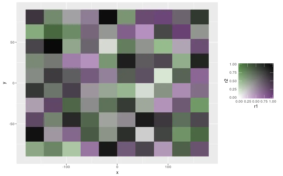
ggplot(data=grid.df,aes(x,y,fill=r1,fill2=r2))+geom_raster()+scale_fill_colourplane("")
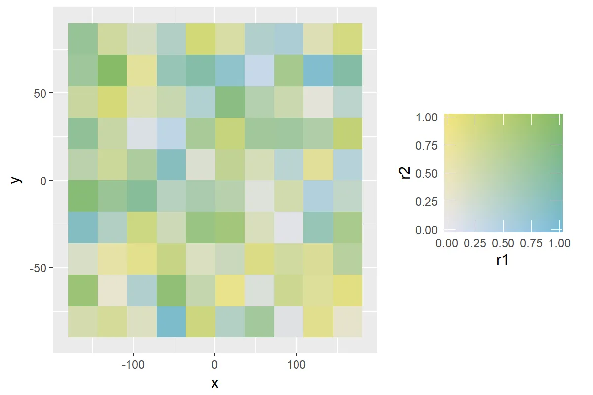
这给了我这个:

在此输入图片描述 
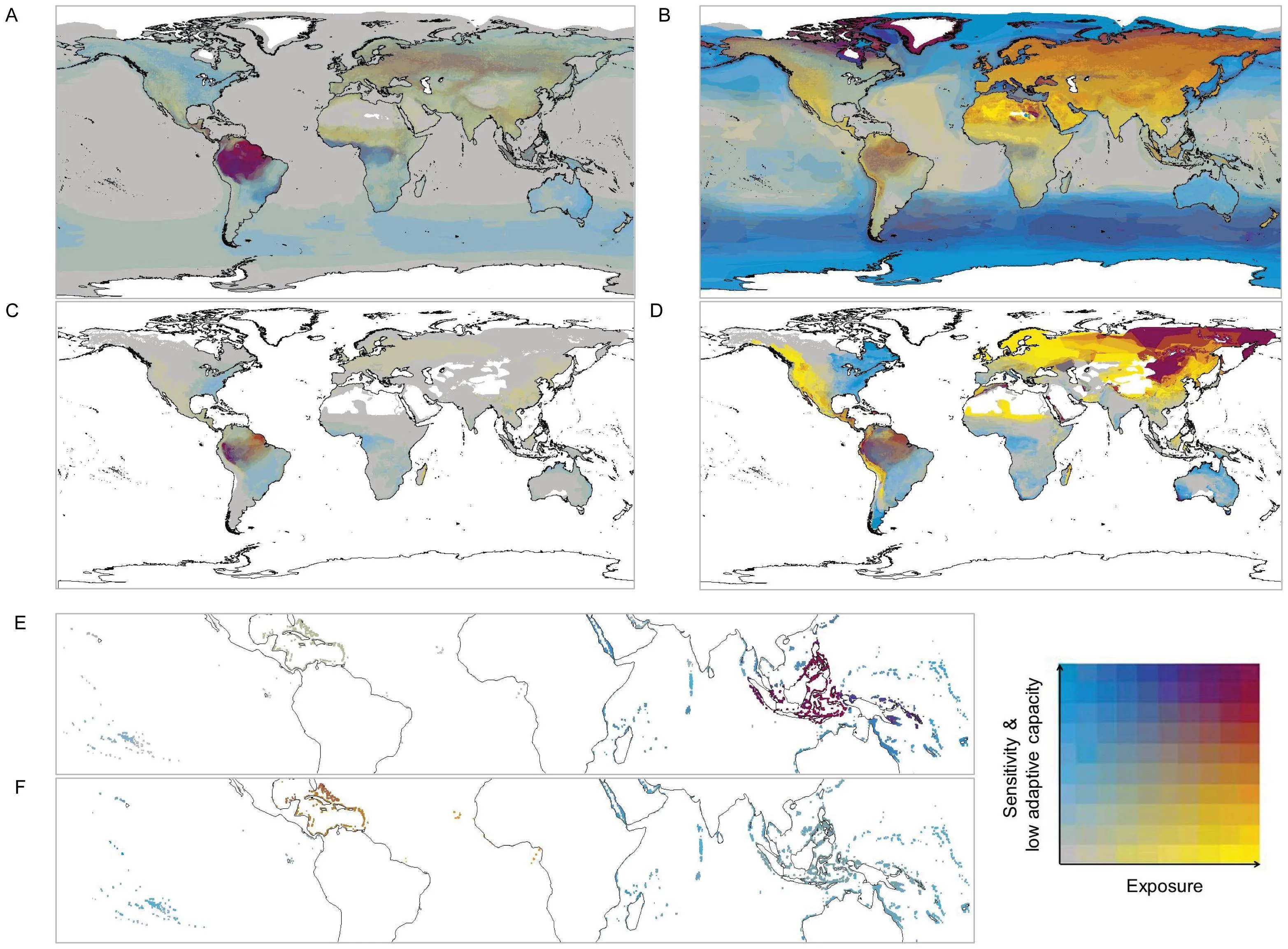
这种默认的颜色比例尺并不符合我的需求 - 我更喜欢看起来像这个网站中的比例尺:

enter image description here

然而,我发现修改scale_fill_colourplane函数的颜色方案有些棘手。
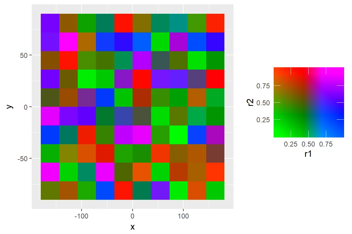
我能够接近我想要的颜色比例尺:

ggplot(data=grid.df,aes(x,y,fill=r1,fill2=r2))+
geom_raster()+
scale_fill_colourplane(name = "",na.color = "white",
color_projection = "interpolate",vertical_color = "#FAE30C",
horizontal_color = "#0E91BE", zero_color = "#E8E6F2",
limits_y = c(0,1),limits=c(0,1))

这个代码给了我这样的结果,但并不是我想要的: enter image description here

scale_fill_colourplane函数中有修改颜色比例尺的信息here,这使我觉得我应该能够做到我想要的,但我还不能完全理解。

有人知道我如何实现我想要的吗?如果可能的话,我更喜欢使用ggplot2绘图包,以便图形与我目前正在从事的其他图形保持一致。

1个回答

10

通过在HSV空间中思考,您可以做到这一点。https://en.wikipedia.org/wiki/HSL_and_HSV

沿着45度线的距离是值(从浅到深)。

从那条线的距离是饱和度(单色到彩色)。

这两种不同的颜色只是色调的两种选择。

# hsv
# Position along diagonal is value
# Distance from the diagonal is saturation
# upper triangle or lower triangle is hue.

col_func <- function(x, y){

  x[x == 0] <- 0.000001
  y[y == 0] <- 0.000001
  x[x == 1] <- 0.999999
  y[y == 1] <- 0.999999

  # upper or lower triangle?
  u <- y > x

  # Change me for different hues.
  hue <- ifelse(u, 0.3, 0.8)


  # distace from (0,0) to (x,y)
  hyp <- sqrt(x^2 + y^2) 

  # Angle between x axis and line to our point
  theta <- asin(y / hyp)

  # Angle between 45 degree line and (x,y)
  phi <- ifelse(u, theta - pi/4, pi/4 - theta)
  phi <- ifelse(phi < 0, 0, phi)

  # Distance from 45 degree line and (x,y)
  s <- hyp * sin(phi) / sqrt(2)

  # Draw line from (x, y) to 45 degree line that is at right angles.
  # How far along 45 degree line, does that line join.
  v <- 1 - hyp * cos(phi) / sqrt(2)

  # Get hsv values.
  sapply(seq_along(x), function(i) hsv(hue[i], s[i], v[i]))

}


ggplot(data=grid.df,aes(x,y,fill=r1,fill2=r2))+
  geom_raster()+
  scale_fill_colourplane(name = "",
                         na.color = "white",
                         color_projection = col_func,
                         limits_y = c(0,1),limits=c(0,1))

输入图片描述


网页内容由stack overflow 提供, 点击上面的
可以查看英文原文,
原文链接