我能否在自定义的选项卡视图中使用默认的选项卡样式?

11
我的主要活动是一个TabActivity,但我的选项卡不需要图标。如在此问题中所答复的那样,我知道可以通过使用重载的TabHost.TabSpec.setIndicator(CharSequence label)方法来省略图标。
但图标应该放置的空间仍然被保留下来,浪费了很多空间。如这个问题中已经指出的那样。看起来我不能简单地减少选项卡高度。我必须提供自己的View以及带有TabHost.TabSpec.setIndicator(View view) 重载的方法。
好的,但我想确保其余的样式(背景/着色)在所有设备上都保持一致的“Android”风格,就像使用默认选项卡指示器一样。因此,我不想提供自己的颜色。
我发现对于TextView文本颜色,可以使用@android:color/tab_indicator_text,它似乎可以按预期工作。但我不知道从哪里获取默认的选项卡背景颜色。我还发现了@android:style/Widget.TabWidget风格,但将其应用于TextView或周围的LinearLayout也似乎没有帮助。
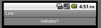
这是我的选项卡指示器视图xml文件,来自一些教程:
<?xml version="1.0" encoding="utf-8"?>
<LinearLayout xmlns:android="http://schemas.android.com/apk/res/android"
    android:id="@+id/tabLayout"
    android:layout_width="fill_parent"
    android:layout_height="fill_parent"
    android:gravity="center"
    android:padding="12dip" >

    <TextView
        android:id="@+id/tabText"
        android:layout_width="wrap_content"
        android:layout_height="wrap_content"
        android:textColor="@android:color/tab_indicator_text" />
</LinearLayout>
我该如何在自定义的视图上获得“Android默认”选项卡样式?
编辑: 接下来,我尝试通过 setIndicator(CharSequence) 添加默认选项卡,获取其指示器视图的 getBackground drawable ,清除所有选项卡,添加我的自定义视图(见上文),然后将检索到的 drawable 放置在新指示器的 setBackground 中。
结果看起来有点对又有点错。首先,它们又太高了,所以我没有获得任何东西。其次,现在所有选项卡的背景状态都链接在一起(活动、突出显示、已选等)。使用 drawable 上的 mutate() 一点用也没有。下一个技巧是:我添加了三个默认选项卡,获取了它们的所有背景,清除了它们,并为我的三个选项卡分别设置了一个背景。
好的,这解决了第二个问题。它们的状态不再链接。但它们仍然太高。所以我使用 updateViewLayout 减小了 TabWidget 的高度。这样可以正常工作,但会在选项卡标识符顶部留下一个不匹配的条。
实际上,最终我就像使用 TabHost.TabSpec.setIndicator(CharSequence label) 方法时一样。而且,所有这些 hack 让我感到很不好。没有一种优雅的方法可以在自定义视图上获取默认的 Android 样式吗?

你能否贴出具体问题的图片吗?我真的很倾向于认为这可能是因为所有边缘都是12dp的填充,尽管这可能是一个非常愚蠢的答案。我基本上使用了与你描述的几乎相同的方法,但我从来没有遇到过这样的问题。然而,我没有使用填充。 - Sander van't Veer
你已经使用了哪些相同的方法多次?而且你确切地没有哪些问题呢? :-) 我已经描述了几种可能的方法和几个问题。 - mhelvens
嗯,读完我的评论和你的原始问题后,我必须承认我真的不知道我当时在指什么。可能是我熬夜发的帖子之一。请忽略它,对你没有任何帮助;) 希望你能解决问题! - Sander van't Veer
5个回答

10

这段代码来自于Android源码中的tab_indicator.xml

<RelativeLayout xmlns:android="http://schemas.android.com/apk/res/android"
    android:layout_width="0dip"
    android:layout_height="64dip"
    android:layout_weight="1"
    android:layout_marginLeft="-3dip"
    android:layout_marginRight="-3dip"
    android:orientation="vertical"
    android:background="@android:drawable/tab_indicator">

    <ImageView android:id="@+id/icon"
        android:layout_width="wrap_content"
        android:layout_height="wrap_content"
        android:layout_centerHorizontal="true"
    />

    <TextView android:id="@+id/title"
        android:layout_width="wrap_content"
        android:layout_height="wrap_content"
        android:layout_alignParentBottom="true"
        android:layout_centerHorizontal="true"
        style="?android:attr/tabWidgetStyle"
    />

</RelativeLayout>
你可以尝试使用以下代码:删除 ImageView,将 TextView 中的 layout_centerHorizontal 改为 layout_center,减小 RelativeLayout 的高度,并在 TabHost.TabSpec.setIndicator(View view) 中提供此视图。 只有对 @android 资源的引用,因此您不需要创建任何可绘制项或文本样式。 编辑 标签指示器的标准 Android 可绘制背景在应用中不可见,但是可以按照以下方法实现:
TabSpec tc = getTabHost().newTabSpec("tag");
tc.setIndicator("indicator1");
tc.setContent(content);
getTabHost().addTab(tc);
getTabHost().findViewById(android.R.id.icon).setVisibility(View.GONE);
TextView tv = (TextView) getTabHost().findViewById(android.R.id.title);
RelativeLayout.LayoutParams rllp = new RelativeLayout.LayoutParams(LayoutParams.WRAP_CONTENT, LayoutParams.WRAP_CONTENT);
rllp.addRule(RelativeLayout.CENTER_IN_PARENT);
tv.setLayoutParams(rllp);

那么可以通过以下方式减小选项卡的高度:

RelativeLayout parent = ((RelativeLayout) tv.getParent());
ViewGroup.LayoutParams vglp = parent.getLayoutParams();
vglp.height = android.view.ViewGroup.LayoutParams.WRAP_CONTENT;
parent.setLayoutParams(vglp);
结果将是:this

没错,你说得对。还有另外一个方法可以实现 - 使用setIndicator(CharSequence)函数,然后将TabSpec添加到TabHost中,在TabHost中查找视图,为ImageView设置setVisibility(View.GONE)(findViewById(android.R.id.icon) - 此id可见),并更改TextView的gravity,但这似乎太复杂了。 - Jin35
我认为这也会导致我的选项卡顶部出现一个变色的条,就像我尝试重用标准选项卡指示器的背景可绘制对象并调整其大小一样。无论如何,我现在没有尝试它的位置。如果你尝试并在赏金到期之前报告结果,你可以得到它。;-) - mhelvens
可能可以实现,但这是一个补救措施,也许有更好的方法。 - Jin35
让我们在聊天中继续这个讨论:http://chat.stackoverflow.com/rooms/5772/discussion-between-mhelvens-and-jin35 - mhelvens
1
这是错误的答案!在Holo中,指示器甚至不再是RelativeLayout,而是Linear。 - AsafK
显示剩余4条评论

2
我认为最好的选择是使用名为“selectors”的XML文件来自定义选项卡的外观(您需要将它们放在“drawable”文件夹中),在“layout”文件夹中创建一个自定义的tab_indicator.xml文件,为文本创建一种样式,并使用该样式创建主题。
以下是tab_indicator_selector.xml文件,它需要放在“drawable”文件夹中,并由tab_indicator.xml文件使用:
<?xml version="1.0" encoding="utf-8"?>
<selector xmlns:android="http://schemas.android.com/apk/res/android">
    <!-- Non focused states ... -->
    <!-- Focused states ... -->
    <!-- Pressed -->
    <item android:state_selected="true" android:state_pressed="true"    android:drawable="@drawable/tab_pressed" />
    <item android:state_pressed="true" android:drawable="@drawable/tab_pressed" />
</selector>

这是tab_pressed.xml状态选择器:

<?xml version="1.0" encoding="utf-8"?>
<layer-list xmlns:android="http://schemas.android.com/apk/res/android">
    <item android:top="53dp">
        <shape android:shape="rectangle">
            <solid android:color="@color/white" />
        </shape>
    </item>
    <item android:top="53dp" android:bottom="1dp">
        <shape android:shape="rectangle">
            <solid android:color="@color/white" />
        </shape>
    </item>
    <item android:left="2dp" android:right="2dp"> 
        <shape android:shape="rectangle">
            <gradient android:angle="90" 
                android:startColor="@color/black"
                android:endColor="@color/white" />
            <stroke android:width="2dp" android:color="@color/red" />
        </shape>
    </item>
</layer-list>

创建tab_focused.xml、 tab_selected.xml和tab_unseleceted.xml 文件,并设置正确的android:state_XXX组合即可实现其他状态。
tab_indicator应该像这样:
<?xml version="1.0" encoding="utf-8"?>
<RelativeLayout xmlns:android="http://schemas.android.com/apk/res/android"
    android:layout_width="0dip" 
    android:layout_height="52dip" <!-- Control the height of the Tab here! -->
    android:layout_weight="1"
    android:orientation="vertical"
    android:background="@drawable/tab_indicator_selector" 
    android:layout_marginTop="2dp"
    android:padding="2dp">

   <!-- Generally here goes an ImageView, but you said you don't want it. -->

    <TextView android:id="@+id/tab_title"
        android:layout_width="wrap_content"
        android:layout_height="wrap_content" 
        android:textSize="11dp" 
        android:textStyle="bold" 
        android:layout_alignParentBottom="true"
        android:layout_centerHorizontal="true"
        style="?android:attr/tabWidgetStyle"
    />    
</RelativeLayout>

在实现方面,应该像这样:
private void setTabs(){
    tabHost = getTabHost();
    addTab(R.string.tab_title_something, R.drawable.tab_something_selector, new Intent().setClass(this, PlacesNearbyTab.class));
}

private void addTab(int labelId, int drawableId, Intent intent) {
    TabHost.TabSpec spec = tabHost.newTabSpec("tab" + labelId);
    View tabIndicator = LayoutInflater.from(this).inflate(R.layout.tab_indicator, getTabWidget(), false);
    TextView title = (TextView) tabIndicator.findViewById(R.id.tab_title);
    title.setText(labelId);
    spec.setIndicator(tabIndicator);
    spec.setContent(intent);
    tabHost.addTab(spec);

}

我希望能够帮到你。这是一个长期的解决方案,但是当应用程序增长或者想要在第二个版本中改变外观时,使用主题和样式非常方便。
最后,我建议您查看新的SDK版本14和Holo主题。在Holo上的选项卡适用于平板电脑和手机,并且可以带有或不带有图标。

好的,我已经做了类似的事情。但我担心这并没有解决我的问题,即:如何在自定义选项卡指示器上获取默认的Android选项卡样式,而不提供自己的颜色?你在那里使用了@drawable/tab_indicator_selector。但我不知道该如何编写它以实现我的目标。 - mhelvens
我希望你能再多研究一下选择器的相关知识...但是现在就先让我回答吧。(我会修改我的回答来包含它)。 - Oscar Salguero
我知道如何使用选择器。但你仍然提供自己的颜色。 :-) 我已经基本掌握了这个,但我遇到的问题是查询系统应该具有的默认选项卡颜色。我希望我的应用程序在操作系统的所有版本/皮肤中看起来都是本地化的。因此,我不能只将我的选项卡设置为白色、黑色和红色。 - mhelvens

0

你可以在 /path-to-android-sdk/platforms/ 下找到每个平台的 res 颜色文件,你可以使用 @android:style/ 或者 @android:color/ 来从 XML 中访问默认资源...

但正如你所提到的,你知道 TabWidgets 和其他 Android UI 视图的颜色和样式会随着版本和设备品牌的不同而改变。

即使你能做到你想做的事情,你的选项卡在不同版本和品牌的设备上看起来也会不同...这并不是常见的情况。

我会使用给定的解决方案之一来实现自己的选项卡样式。祝你好运!


其实,这正是重点。 :-) 我不需要我的应用程序有自己的“风格”。它不是那种类型的应用程序。我希望它在任何设备上运行时看起来都是本地化的。 - mhelvens

0

我不确定这是否会居中文本,但您可以在不更改默认的Android背景的情况下更改选项卡的高度。

试试这个:

TabHost tabs = //initialize your TabHost here
tabs.setup();
TabSpec tspec1 = tabs.newTabSpec("First Tab");
tspec1.setIndicator("Actions");
tabs.addTab(tspec1);


tabs.getTabWidget.getChildAt(0).getLayoutParams().height = (int) (35 * 1.5);

其中35是像素高度,乘以1.5后高度变为35dp。

祝好运。


谢谢,但我已经尝试过这个方法了,它存在以下问题:
  • 它无法垂直居中文本。
  • 它会在选项卡顶部留下一个变色的条。
- mhelvens

0

您可以尝试以下示例代码,这些代码取自默认的tab_indicator.xml文件,并根据您的需求进行轻微修改。 谢谢!

<LinearLayout
xmlns:android="http://schemas.android.com/apk/res/android"
android:layout_width="0dip"
android:layout_height="64dip"
android:layout_weight="1"
android:layout_marginLeft="-3dip"
android:layout_marginRight="-3dip"
android:gravity="center"
android:background="@android:drawable/tab_indicator">

    <TextView
        android:id="@+id/title"
        android:layout_width="wrap_content"
        android:layout_height="wrap_content"
        style="?android:attr/tabWidgetStyle">
    </TextView>

</LinearLayout>

Jin35刚刚提出了同样的建议,但我担心它不起作用。请看一下我在他/她的帖子上的评论。 - mhelvens

网页内容由stack overflow 提供, 点击上面的
可以查看英文原文,
原文链接