在R中垂直堆叠多个图表,它们具有相同的x轴但不同的y轴。

16

我有一个数据框(data.frame),其中包含多个时间序列向量和一个日期:时间向量。我想绘制所有相关向量,垂直叠放在单独的图表中,这些图表具有相同的X轴但唯一的Y轴。类似于这个图表:
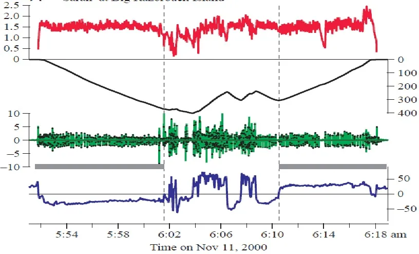
enter image description here

我的数据看起来像这样:

 dt <- structure(list(DEPTH = c(156, 156.5, 157.4, 158.15, 158.8, 159.2, 
159.75, 160.35, 160.85, 161.1, 161.6, 162.05, 162.5, 162.65, 
163.15, 163.45, 163.55, 163.8, 163.65, 163.75, 163.8, 163.8, 
163.75, 164.45, 164.8, 165.35, 165.65, 165.75, 166.1, 166.75, 
167, 167.2, 167.65, 168, 168.8, 169.3, 169.7, 170.2, 170.65, 
170.9, 171.45, 171.65, 172, 172.1, 172.25, 173, 173.4, 173.9, 
174.2, 174.6, 175, 175.25, 175.45, 175.9, 176.25, 176.7, 177, 
177.15, 177.5, 178, 178.5, 179.05, 179.2, 180.7, 181.05, 181.25, 
181.5, 181.7, 182.1, 182.3, 182.35, 182.75, 183.1, 183.65, 184.3, 
184.6, 185.1, 185.15, 185.3, 185.15, 185.25, 185.3, 185.15), 
    Smooth.Vert.Speed = c(-0.550000000000011, -0.5, -0.900000000000006, 
    -0.75, -0.650000000000006, -0.399999999999977, -0.550000000000011, 
    -0.599999999999994, -0.5, -0.25, -0.5, -0.450000000000017, 
    -0.449999999999989, -0.150000000000006, -0.5, -0.299999999999983, 
    -0.100000000000023, -0.25, 0.150000000000006, -0.0999999999999943, 
    -0.0500000000000114, 0, 0.0500000000000114, -0.699999999999989, 
    -0.350000000000023, -0.549999999999983, -0.300000000000011, 
    -0.0999999999999943, -0.349999999999994, -0.650000000000006, 
    -0.25, -0.199999999999989, -0.450000000000017, -0.349999999999994, 
    -0.800000000000011, -0.5, -0.399999999999977, -0.5, -0.450000000000017, 
    -0.25, -0.549999999999983, -0.200000000000017, -0.349999999999994, 
    -0.0999999999999943, -0.150000000000006, -0.75, -0.400000000000006, 
    -0.5, -0.299999999999983, -0.400000000000006, -0.400000000000006, 
    -0.25, -0.199999999999989, -0.450000000000017, -0.349999999999994, 
    -0.449999999999989, -0.300000000000011, -0.150000000000006, 
    -0.349999999999994, -0.5, -0.5, -0.550000000000011, -0.149999999999977, 
    -1.5, -0.350000000000023, -0.199999999999989, -0.25, -0.199999999999989, 
    -0.400000000000006, -0.200000000000017, -0.049999999999983, 
    -0.400000000000006, -0.349999999999994, -0.550000000000011, 
    -0.650000000000006, -0.299999999999983, -0.5, -0.0500000000000114, 
    -0.150000000000006, 0.150000000000006, -0.0999999999999943, 
    -0.0500000000000114, 0.150000000000006), DIVE_SURF = c("dive21", 
    "dive21", "dive21", "dive21", "dive21", "dive21", "dive21", 
    "dive21", "dive21", "dive21", "dive21", "dive21", "dive21", 
    "dive21", "dive21", "dive21", "dive21", "dive21", "dive21", 
    "dive21", "dive21", "dive21", "dive21", "dive21", "dive21", 
    "dive21", "dive21", "dive21", "dive21", "dive21", "dive21", 
    "dive21", "dive21", "dive21", "dive21", "dive21", "dive21", 
    "dive21", "dive21", "dive21", "dive21", "dive21", "dive21", 
    "dive21", "dive21", "dive21", "dive21", "dive21", "dive21", 
    "dive21", "dive21", "dive21", "dive21", "dive21", "dive21", 
    "dive21", "dive21", "dive21", "dive21", "dive21", "dive21", 
    "dive21", "dive21", "dive21", "dive21", "dive21", "dive21", 
    "dive21", "dive21", "dive21", "dive21", "dive21", "dive21", 
    "dive21", "dive21", "dive21", "dive21", "dive21", "dive21", 
    "dive21", "dive21", "dive21", "dive21"), X = c(2050L, 2062L, 
    2026L, 2078L, 2058L, 2076L, 2050L, 2068L, 2060L, 2078L, 2058L, 
    2088L, 2080L, 2065L, 2088L, 2076L, 2084L, 2105L, 2084L, 2102L, 
    2123L, 2096L, 2074L, 2054L, 2090L, 2089L, 2080L, 2078L, 2068L, 
    2092L, 2084L, 2082L, 2094L, 2056L, 2062L, 2067L, 2082L, 2084L, 
    2091L, 2058L, 2076L, 2098L, 2104L, 2090L, 2058L, 2050L, 2080L, 
    2074L, 2074L, 2082L, 2070L, 2088L, 2062L, 2062L, 2082L, 2086L, 
    2070L, 2081L, 2092L, 2058L, 2060L, 2076L, 2094L, 2083L, 2072L, 
    2107L, 2104L, 2066L, 2110L, 2104L, 2072L, 2076L, 2065L, 2042L, 
    2066L, 2093L, 2080L, 2083L, 2108L, 2107L, 2086L, 2096L, 2126L
    ), Y = c(2036L, 2000L, 2049L, 1966L, 2042L, 2078L, 2072L, 
    2055L, 2036L, 2128L, 2044L, 2112L, 2066L, 2051L, 2102L, 2060L, 
    2054L, 2043L, 2034L, 2086L, 1980L, 2076L, 2003L, 2033L, 2107L, 
    1992L, 2028L, 2027L, 2024L, 2005L, 2050L, 2010L, 1944L, 2010L, 
    2046L, 2020L, 2088L, 2086L, 2034L, 2066L, 2060L, 2152L, 2044L, 
    2078L, 2040L, 2067L, 2080L, 2072L, 2073L, 2028L, 2066L, 2082L, 
    2030L, 2042L, 1990L, 2076L, 2054L, 2064L, 2016L, 2048L, 2029L, 
    2008L, 2090L, 2038L, 2026L, 2096L, 2002L, 2025L, 2001L, 2098L, 
    2061L, 2022L, 2054L, 2064L, 2043L, 2090L, 2042L, 2086L, 2073L, 
    2066L, 2040L, 2081L, 2087L), Z = c(2488L, 2484L, 2490L, 2486L, 
    2488L, 2492L, 2498L, 2490L, 2492L, 2484L, 2491L, 2494L, 2497L, 
    2493L, 2488L, 2493L, 2494L, 2484L, 2486L, 2487L, 2478L, 2490L, 
    2478L, 2493L, 2490L, 2486L, 2488L, 2486L, 2488L, 2482L, 2488L, 
    2480L, 2480L, 2488L, 2490L, 2490L, 2490L, 2489L, 2492L, 2490L, 
    2486L, 2480L, 2488L, 2491L, 2486L, 2488L, 2488L, 2494L, 2490L, 
    2488L, 2492L, 2498L, 2484L, 2491L, 2480L, 2491L, 2497L, 2487L, 
    2482L, 2490L, 2490L, 2478L, 2488L, 2492L, 2492L, 2482L, 2484L, 
    2489L, 2482L, 2484L, 2485L, 2492L, 2488L, 2493L, 2487L, 2490L, 
    2492L, 2488L, 2490L, 2487L, 2484L, 2486L, 2478L)), .Names = c("DEPTH", 
"Smooth.Vert.Speed", "DIVE_SURF", "X", "Y", "Z"), row.names = 7222:7304, class = "data.frame")

我想要在不同的图表上分别绘制深度(DEPTH)、X、Y和Z,它们共享相同的X轴。
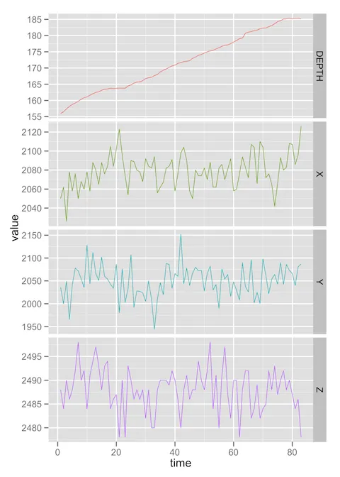
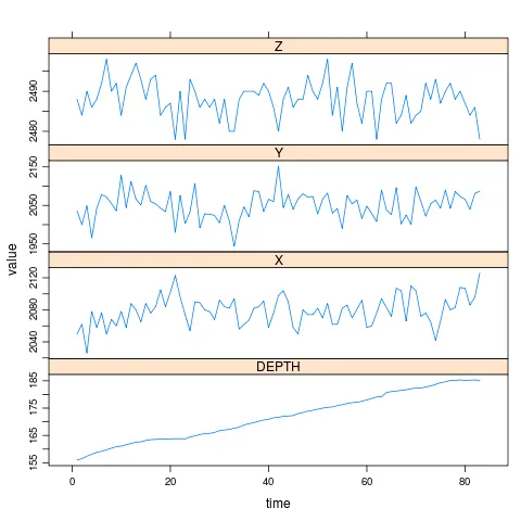
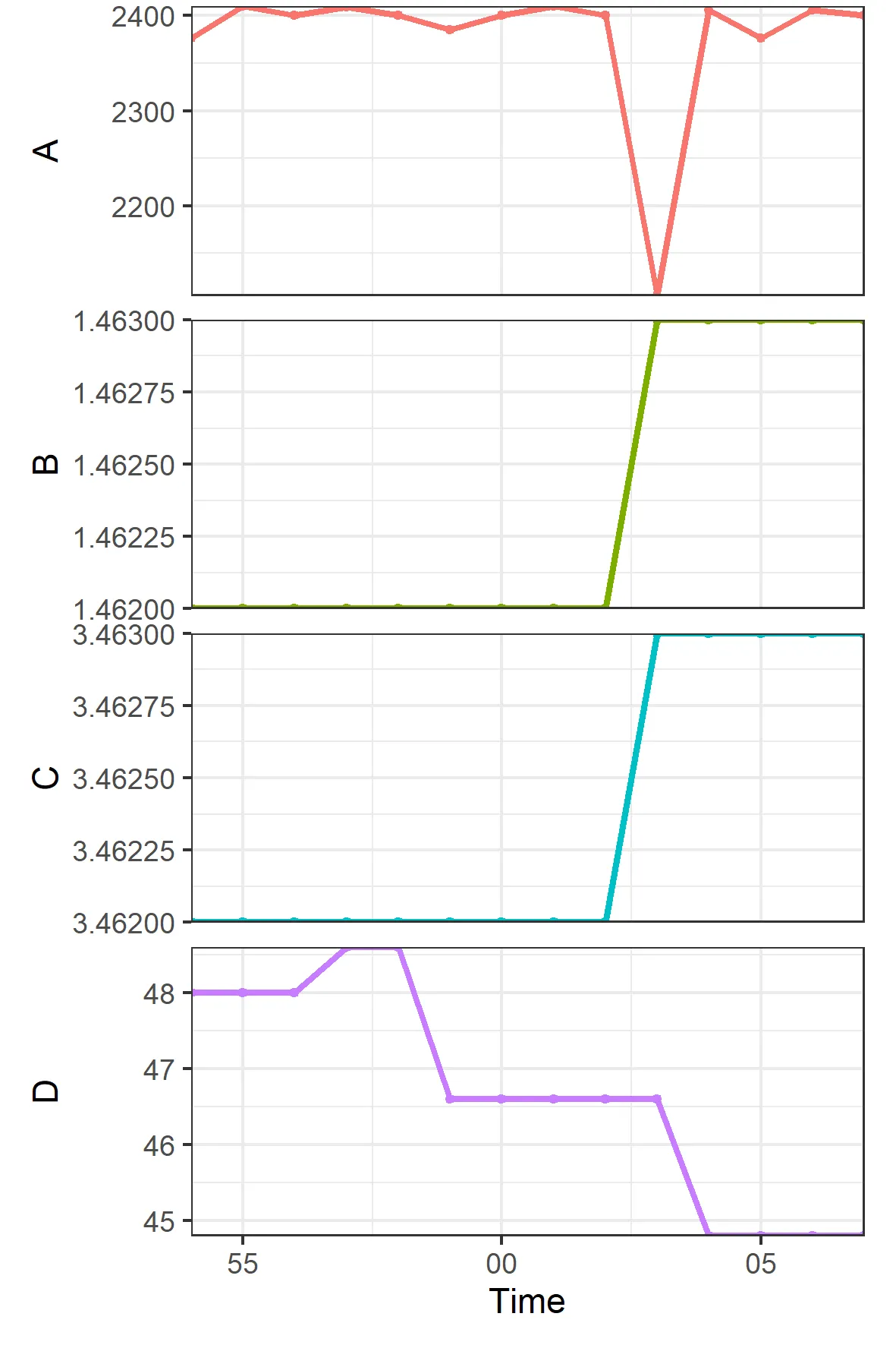
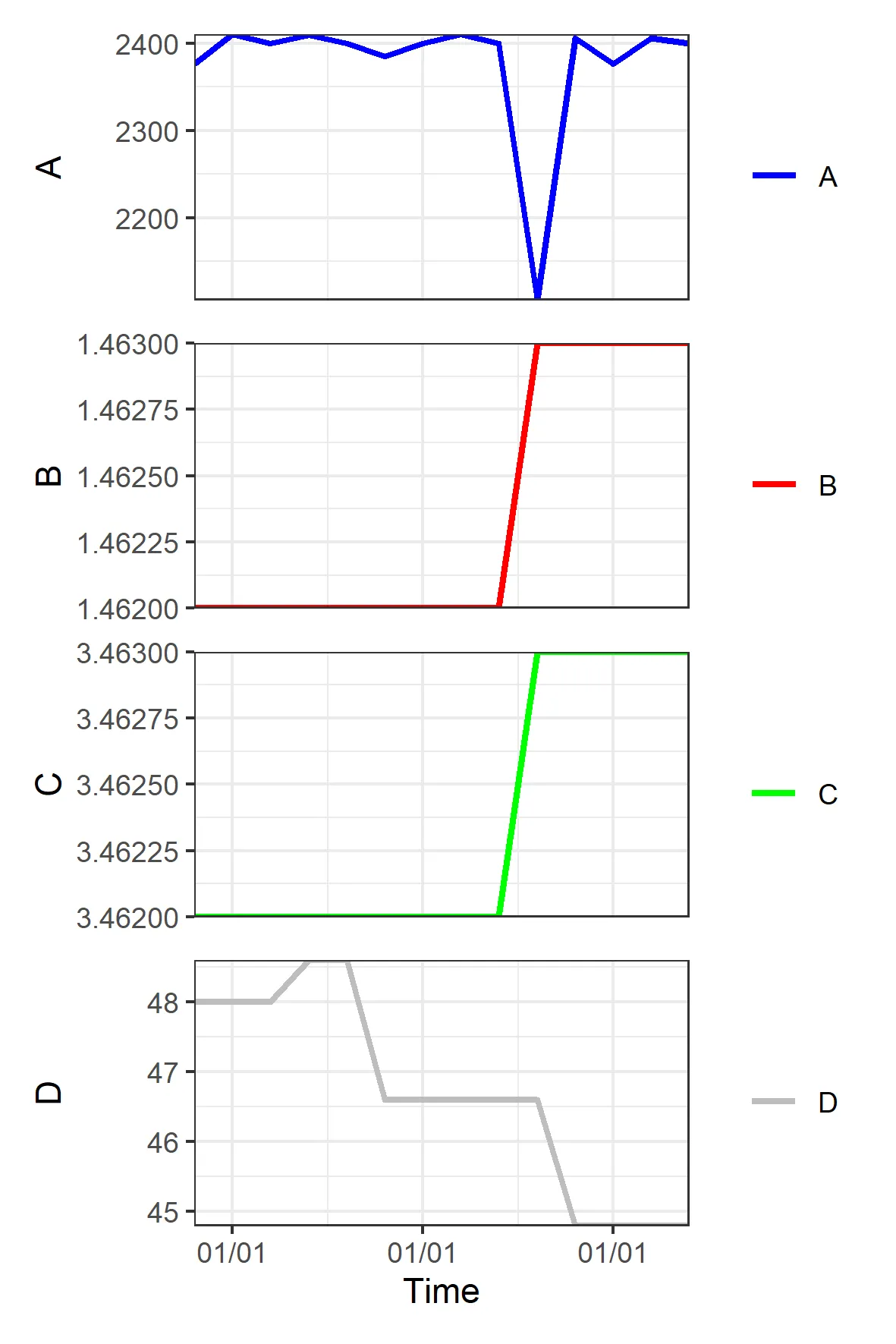

如果您使用ggplot2,请查看facet_wrap,并使用ncol = 1scales = "free_y" - Paul Hiemstra
@PaulHiemstra 我在尝试使用ggplot2中的ggplot绘图函数时遇到的问题是错误: Error: ggplot2不知道如何处理数值类数据 人们不断告诉我这是由于我的数据不是data.frame引起的。你有任何想法吗? - Jojo
只需提供一个可重现的示例,我们就可以看到出了什么问题。 - Paul Hiemstra
5个回答

14

我同意@PaulHiemstra的观点,ggplot2是一个不错的选择。

假设Smooth.Vert.Speed是你想要绘制DEPTHXYZ的共同x轴变量...

library(ggplot2)
library(reshape2)

# Add time variable as per @BenBolker's suggestion
dt$time <- seq(nrow(dt))

# Use melt to reshape data so values and variables are in separate columns
dt.df <- melt(dt, measure.vars = c("DEPTH", "X", "Y", "Z"))

ggplot(dt.df, aes(x = time, y = value)) +
  geom_line(aes(color = variable)) +
  facet_grid(variable ~ ., scales = "free_y") +
  # Suppress the legend since color isn't actually providing any information
  opts(legend.position = "none")

Plotting multiple y-variables against a common x-variable


这段代码运行得非常好。有没有办法为每个图形更改颜色并为此图形获取单独的y轴标签? - Jojo
3
改变颜色非常容易(将color=variable作为参数添加到aes()函数中;如果您想手动分配颜色而不是自动分配,请参见?scale_colour_manual)。单独的y轴标签会更难,但右侧的条形标签可能是一个可接受的替代品。我喜欢使用theme_update(theme_bw()),导入library(grid)并在ggplot调用中添加+opts(panel.margin=unit(0,"lines")),出于美学原因。正如我上面所说,@DirkEddelbuettel的方法将是最可定制化的。 - Ben Bolker
@BenBolker 谢谢,这非常有帮助。最后一个问题,有没有办法更改右侧的条形标签? - Jojo
条形标签来自您的数据框,因此在那里重命名将更改图表中的标签:dt.df$variable <- factor(dt.df$variable, levels = c("DEPTH", "X", "Y", "Z"), labels = c("depth-var", "x-var", "y-var", "z-var")) - aaronwolen
你也可以使用 + facet_wrap(variable ~ ., ncol = 1) 进行变化。请参阅 http://docs.ggplot2.org/0.9.3.1/facet_wrap.html。 - Matt

8

说点不同的,让我提到一个既不涉及lattice也不涉及ggplot2的解决方案——几年前我在Romain的R Graph Gallery上发布了这个方案,作为第65篇文章,其中代码在此处。它只是将图形叠放起来,使用par()设置来保持它们的叠放顺序。

请注意,由于选择不同,垂直尺寸也有所不同,它们也可以很容易地具有相同的高度。

enter image description here


这很棒,但对于我的目的有点复杂,我发现很难分离出适合我在示例中使用的部分。哪一部分代码是特定于“垂直连接”图形并创建共同的x轴的?为这个数据可视化的绝妙示例点赞。 - Jojo
是的,这段代码对于您的目的来说做了太多的计算(和数据收集)工作。请查看最终函数,它使用出色的“layout()”函数,并调用各个图形。我在家里还有另一个(更简单的)示例,类似地设置了规则网格并绘制多个函数;希望我能在某个时候记得添加它。 - Dirk Eddelbuettel
2
尝试使用我的网站上的此链接。不过这段代码已经有九年了... - Dirk Eddelbuettel

6

如果你想保守一点,你可以使用 lattice。与 @aaronwolen 不同的是,我假设数据集中缺少一个 time 变量,所以我自己创造了一个:

dt$time <- seq(nrow(dt))
library(reshape2)
mm <- melt(subset(dt,select=c(time,DEPTH,X,Y,Z)),id.var="time")
library(lattice)
xyplot(value~time|variable,data=mm,type="l",
       scales=list(y=list(relation="free")),
       layout=c(1,4))

enter image description here


好的,那可能更有意义。 - aaronwolen
@BenBolker 啊,太完美了,谢谢。使用这个图表,有没有办法让每个变量都有不同的颜色,并分别命名每个y轴? 你是对的,我忘记了时间变量,因为它是一个日期时间变量,我还没有想出如何使用POSIXct函数正确绘制它的方法。 - Jojo
如果可能的话,我也想反转深度轴的y轴? - Jojo
(1) 对于分配颜色和命名轴,最好的方法是像@aaronwolen的答案一样。 (2) 我认为latticeggplot2都应该可以处理POSIXct轴。 (3) 反转深度可能会很棘手:@DirkEddelbuettel的答案将为您提供最大的灵活性。 - Ben Bolker
@aaronwolen 你有什么建议,我应该如何处理每个图形的格式、颜色/ y 轴标签等方面? - Jojo
2
我更新了代码,使每个变量的颜色不同。我不知道如何为每个y轴添加单独的标签或仅反转深度的y轴。ggplot2的分面函数的意图是将数据的子集放置在单独的面板中,同时针对相同的x和y变量进行绘制。因此,每个轴只有一个标签。考虑到您想要做的事情,也许最好只生成4个单独的图表,堆叠在彼此上,并仅为底部图表的x轴加标签。 - aaronwolen

5

我实际上已经用zoo库找到了另一种有趣的方法来做这件事:

library(zoo)
z <- with(dt, zoo(cbind(DEPTH, X, Y, Z),as.POSIXct(time))) 
plot.zoo(z,  ylab=c("Depth (m)", "Pitch Angle (degrees)", "Swaying Acceleration (m/s^2)", "Heaving Acceleration (m/s^2)"), col=c("black", "blue", "darkred", "darkgreen"), 
     xlab = c("Time"), lwd=2, ylim=list((rev(range(dt$DEPTH))), c(-90,90), c(-10,10), c(-10,10)))

在动物园图中,您可以将新的轴标签创建为列表形式,并且所有绘图可以具有不同的颜色。


您可以在绘图函数中输入一系列连续的 ylim 值,这些值将按顺序应用于每个单独的图。我已经更新了答案中的代码。 感谢@BenBolker提供的所有帮助! - Jojo
1
你可以接受你自己的答案而不是我的,因为你更接近完全回答了你的问题。也许你可以编辑你的答案来展示结果的图片? - Ben Bolker

0
请阅读以下示例:
生成样例数据:
dt = read_table("Time        A       B       C       D
10:12:54    2376.2  1.462   3.462   48
10:12:55    2410    1.462   3.462   48
10:12:56    2400    1.462   3.462   48
10:12:57    2409    1.462   3.462   48.6
10:12:58    2400    1.462   3.462   48.6
10:12:59    2385.1  1.462   3.462   46.6
10:13:00    2400    1.462   3.462   46.6
10:13:01    2410    1.462   3.462   46.6
10:13:02    2400    1.462   3.462   46.6
10:13:03    2106    1.463   3.463   46.6
10:13:04    2406    1.463   3.463   44.8
10:13:05    2376.2  1.463   3.463   44.8
10:13:06    2406    1.463   3.463   44.8
10:13:07    2400    1.463   3.463   44.8")
dt$Time=as.POSIXct(dt$Time)

如果您想快速绘制它,请尝试这个:
library(foqat)
geom_ts_batch(dt, panelgap=4)

enter image description here

如果您想以更高的自由度绘制它,请尝试这样做:
library(foqat)
library(patchwork)
blankx=theme(axis.title.x=element_blank(),axis.text.x=element_blank(),axis.ticks.x=element_blank())
p2=geom_ts(dt, yl=2, llist=2, lcc="blue", yllab="A")+blankx
p3=geom_ts(dt, yl=3, llist=3, lcc="red", yllab="B")+blankx
p4=geom_ts(dt, yl=4, llist=4, lcc="green", yllab="C")+blankx
p5=geom_ts(dt, yl=5, llist=5, lcc="grey", yllab="D", xlab="Time")
p2/p3/p4/p5

enter image description here


网页内容由stack overflow 提供, 点击上面的
可以查看英文原文,
原文链接