为了获得所需的规范,请在负数和正数两侧设置相同数量的颜色。
或者,您可以使用未修改的规范,并创建特殊的颜色地图。这样的颜色地图将有1/3的蓝白色和2/3的白红色。好处是颜色条看起来更漂亮。这种方法仅在负数和正数之间的平衡不是太极端时才有效。
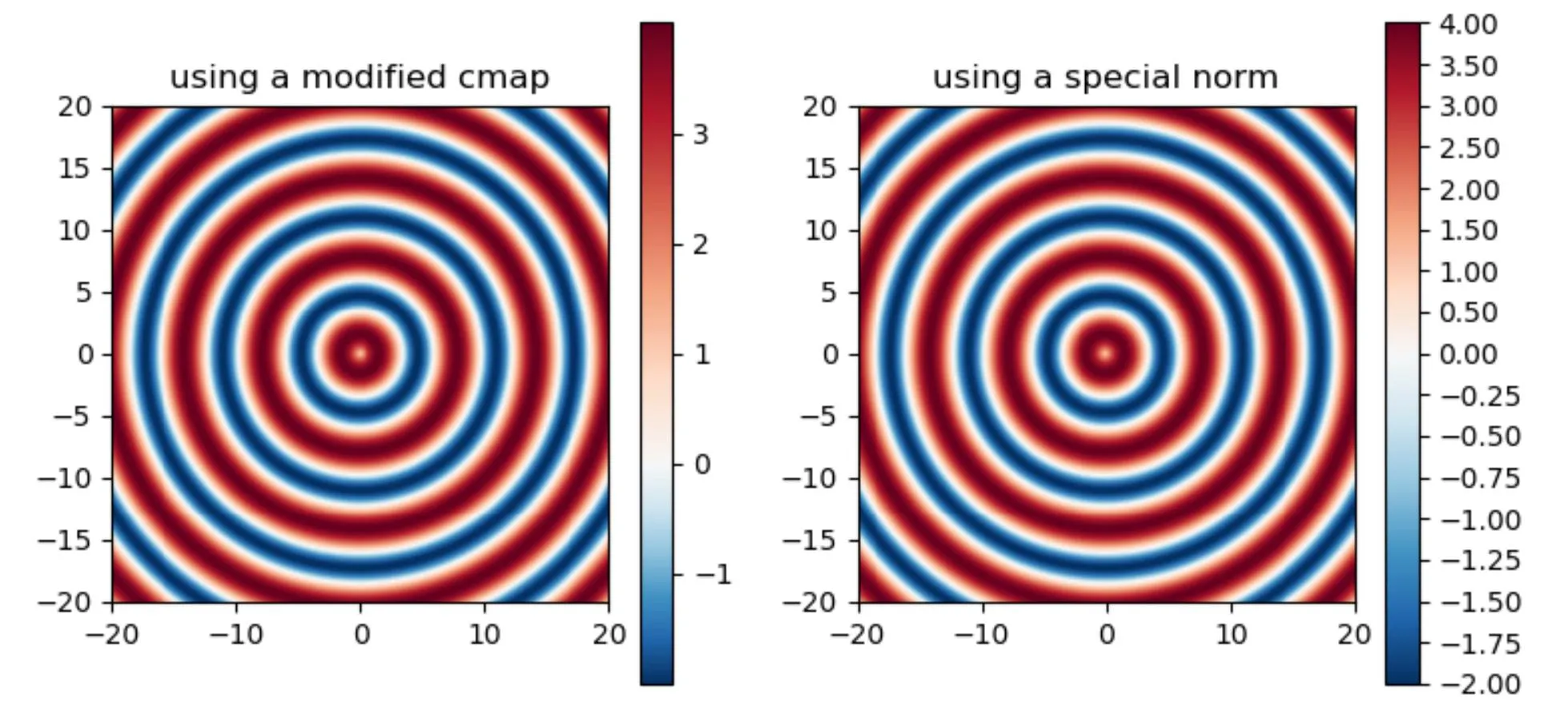
这是带有生成数据的演示代码。选择zz作为绕中心旋转的正弦,并缩放为-2到4,因此在1周围对称。在左侧显示带有修改的颜色地图的图像。在右侧,规范被更改以强制零为白色。
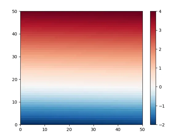
由于所有正值都是红色的,所以红色带比蓝色带宽。在没有改变规范或颜色地图的图像中,带宽将相等。颜色条指示零为白色。
import numpy as np
import matplotlib.colors as colors
from matplotlib import pyplot as plt
x = np.linspace(-20, 20, 500)
y = np.linspace(-20, 20, 500)
xx, yy = np.meshgrid(x, y)
zz = np.sin(np.sqrt(xx * xx + yy * yy)) * 3 + 1
negatives = -2.0
positives = 4.0
bounds_min = np.linspace(negatives, 0, 129)
bounds_max = np.linspace(0, positives, 129)[1:]
bounds = np.concatenate((bounds_min, bounds_max), axis=None)
norm = colors.BoundaryNorm(boundaries=bounds, ncolors=256)
num_neg_colors = int(256 / (positives - negatives) * (-negatives))
num_pos_colors = 256 - num_neg_colors
cmap_BuRd = plt.cm.RdBu_r
colors_2neg_4pos = [cmap_BuRd(0.5*c/num_neg_colors) for c in range(num_neg_colors)] +\
[cmap_BuRd(1-0.5*c/num_pos_colors) for c in range(num_pos_colors)][::-1]
cmap_2neg_4pos = colors.LinearSegmentedColormap.from_list('cmap_2neg_4pos', colors_2neg_4pos, N=256)
fig, (ax1, ax2) = plt.subplots(1, 2, figsize=(12, 5))
mesh1 = ax1.pcolormesh(xx, yy, zz, cmap=cmap_2neg_4pos)
ax1.set_aspect('equal')
ax1.set_title('using a modified cmap')
fig.colorbar(mesh1, ax=ax1)
mesh2 = ax2.pcolormesh(xx, yy, zz, norm=norm, cmap='RdBu_r')
ax2.set_aspect('equal')
ax2.set_title('using a special norm')
ticks = np.append(np.arange(-2.0, 0, 0.25), np.arange(0, 4.001, 0.5))
fig.colorbar(mesh2, ax=ax2, ticks=ticks)
plt.show()
以下代码绘制了范数,看起来像一个阶跃函数。只有在257个边界处,这个阶跃函数才在任何地方具有正确的形状(缩放到x=-2,0和4)。
nx = np.linspace(-3,5,10000)
plt.plot(nx, norm(nx))
PS:有一种替代方法可以创建类似的颜色地图。但尝试后,很明显RdBu颜色地图是经过精调的,可以产生更好的图表效果。
norm_2neg_4pos = mcolors.Normalize(negatives, positives)
colors_2neg_4pos = [[0, 'blue'],
                    [norm_2neg_4pos(0.0), "white"],
                    [1, 'red']]
cmap_2neg_4pos = mcolors.LinearSegmentedColormap.from_list("", colors_2neg_4pos)
另一个简单的解决方案是将所有内容重新缩放在-4到4之间。然而,这样会失去较深的蓝色。与“RdBu_r”相比,一种替代方案是使用“seismic”,其从红色到白色再到蓝色的方式不同。
ax.pcolormesh(xx, yy, zz, vmin=-positives, vmax=positives, cmap='RdBu_r')