我想制作一个圆形按钮,但是我不知道如何做到。我能够制作带有圆角的按钮,但是如何让它变成圆形呢?这不是一样的。请问,在Android中是否可能实现?谢谢。
如何制作一个圆形按钮?
169
- user1166635
2
1在这里有一个很好的解释:https://dev59.com/22kw5IYBdhLWcg3wdKMv - Milon
Google推出了新的框架,其中最好的新技术是Jetpack Compose。Jetpack Compose - Ucdemir
24个回答
311
在drawable文件夹中创建名为roundedbutton.xml的xml文件。
<?xml version="1.0" encoding="utf-8"?>
<shape xmlns:android="http://schemas.android.com/apk/res/android"
android:shape="rectangle">
    <solid android:color="#eeffffff" />
    <corners android:bottomRightRadius="8dp"
        android:bottomLeftRadius="8dp"
        android:topRightRadius="8dp"
        android:topLeftRadius="8dp"/>
</shape>
最后将它设置为您的 Button 的背景,使用 android:background = "@drawable/roundedbutton"
如果您想完全圆形化它,请更改半径并选择适合您的尺寸。
- Arif Nadeem
9
2你不需要在单词"drawable"前加上'@'符号吗? - shim
这个解决方案与仅使用圆形图像作为背景有不同的结果吗? - Siavash
8另外,为什么不使用android:shape="oval"呢? - Siavash
1你也可以为所有角落设置一个半径大小
<corners android:radius="8dp"/> - com2ghz
1将半径设置为90dp以制作完全圆形的按钮。 - Lucky_girl
显示剩余4条评论
58
如果你使用Android Studio,你只需要使用:
<?xml version="1.0" encoding="utf-8"?>
    <shape xmlns:android="http://schemas.android.com/apk/res/android"
    android:shape="oval">
        <solid android:color="#FFFFFF"/>

    </shape>
这对我来说运作良好,希望能帮助到别人。
- Shaun Jones
2
2那应该是被接受的答案,使用角落值不会超出圆角,而这个问题是关于一个圆的。感谢 Shaun 提供这个答案。 - Don
16使用“ring”没有显示任何内容。最好使用“椭圆形(oval)”。 - CopsOnRoad
35
创建一个包含drawable/button_states.xml的文件:
<?xml version="1.0" encoding="utf-8"?>
<selector xmlns:android="http://schemas.android.com/apk/res/android">
    <item android:state_pressed="false">
        <shape android:shape="rectangle">
        <corners android:radius="1000dp" />
        <solid android:color="#41ba7a" />
        <stroke
            android:width="2dip"
            android:color="#03ae3c" />
        <padding
            android:bottom="4dp"
            android:left="4dp"
            android:right="4dp"
            android:top="4dp" />
        </shape>
    </item>
    <item android:state_pressed="true">
        <shape android:shape="rectangle">
        <corners android:radius="1000dp" />
        <solid android:color="#3AA76D" />
        <stroke
            android:width="2dip"
            android:color="#03ae3c" />
        <padding
            android:bottom="4dp"
            android:left="4dp"
            android:right="4dp"
            android:top="4dp" />
        </shape>
    </item>
</selector>
在任何布局文件中将其用于按钮标签
<Button
    android:layout_width="220dp"
    android:layout_height="220dp"
    android:background="@drawable/button_states"
    android:text="@string/btn_scan_qr"
    android:id="@+id/btn_scan_qr"
    android:textSize="15dp"
/>
- Mohit
4
它完美地运作了,谢谢。你能帮我画一个从圆心到圆外的矩形,看起来像一个“Q”吗? - CLIFFORD P Y
工作正常,但我们为什么将半径设为1000dp?你能解释一下吗? - Jamshaid K.
@JamshaidKamran 1000dp是一个任意的大小,足够大使按钮变成圆形。 - rraallvv
有没有一种Android维度资源可以代替1000dp的使用? - rraallvv
13
如果您想要一个漂亮的圆形浮动操作按钮并且正在使用官方的Material Component库,您可以轻松地按照以下方式完成:
<com.google.android.material.button.MaterialButton
    style="@style/Widget.MaterialComponents.ExtendedFloatingActionButton"
    app:cornerRadius="28dp"
    android:layout_width="56dp"
    android:layout_height="56dp"
    android:text="1" />
结果:
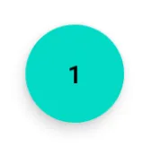
如果您更改按钮的大小,请注意使用按钮大小的一半作为app:cornerRadius。
- Roberto Leinardi
1
我们如何减少FAB的默认填充?对我来说,我只能看到我输入的文本的第一个字符。 - skafle
8
<?xml version="1.0" encoding="utf-8"?>
<shape xmlns:android="http://schemas.android.com/apk/res/android"
android:shape="oval">
<solid
    android:color="#ffffff"
    />
</shape>
将其设置在您的XML可绘制资源上,并使用圆形图像的图像按钮,使用您的可绘制作为背景。
- Giovanny Piñeros
7
2021年更新:
只需使用MaterialButton即可。
<com.google.android.material.button.MaterialButton
    app:cornerRadius="30dp"
    android:layout_width="60dp"
    android:layout_height="60dp"
    android:text="test" />
- 宽度等于高度
- 圆角半径是宽度或高度的一半
- Rasoul Miri
1
1你应该给出一个完整的答案,对于那些从以上代码中遇到错误的人将这行代码
implementation 'com.google.android.material:material:1.6.1' 添加到 build.gradle(:app) 中。 - daksh6
<corners android:bottomRightRadius="180dip"
    android:bottomLeftRadius="180dip"
    android:topRightRadius="180dip"
    android:topLeftRadius="180dip"/>

<solid android:color="#6E6E6E"/> <!-- this one is ths color of the Rounded Button -->
并将此代码添加到按钮代码中。
    android:layout_width="50dp"
    android:layout_height="50dp"
- user4512768
5
使用椭圆形作为形状。这将使按钮成为椭圆形。
<item>
    <shape android:shape="oval" >
        <stroke
            android:height="1.0dip"
            android:width="1.0dip"
            android:color="#ffee82ee" />

        <solid android:color="#ffee82ee" />

        <corners
            android:bottomLeftRadius="12.0dip"
            android:bottomRightRadius="12.0dip"
            android:radius="12.0dip"
            android:topLeftRadius="12.0dip"
            android:topRightRadius="12.0dip" />
    </shape>
</item>
- Rohit Goyal
4
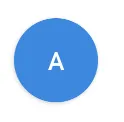
你可以使用一个
MaterialButton: <com.google.android.material.button.MaterialButton
android:layout_width="48dp"
android:layout_height="48dp"
android:insetTop="0dp"
android:insetBottom="0dp"
android:text="A"
app:shapeAppearanceOverlay="@style/ShapeAppearanceOverlay.App.Rounded"
/>
并应用一个带有以下内容的圆形ShapeAppearanceOverlay:
<style name="ShapeAppearanceOverlay.App.rounded" parent="">
    <item name="cornerSize">50%</item>
</style>
- Gabriele Mariotti
网页内容由stack overflow 提供, 点击上面的可以查看英文原文,
原文链接
原文链接