有没有一种使用CSS3创建内阴影圆角边框的方法?(不需要图片)
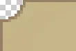
我需要这样的圆角边框:
有没有一种使用CSS3创建内阴影圆角边框的方法?(不需要图片)
我需要这样的圆角边框:
我发现实现这个最好的方法是使用CSS3渐变(而不是图片等所有CSS和HTML),参考Lea Verou的方案。她的解决方案如下:
div.round {
    background:
        -moz-radial-gradient(0 100%, circle, rgba(204,0,0,0) 14px, #c00 15px),
        -moz-radial-gradient(100% 100%, circle, rgba(204,0,0,0) 14px, #c00 15px),
        -moz-radial-gradient(100% 0, circle, rgba(204,0,0,0) 14px, #c00 15px),
        -moz-radial-gradient(0 0, circle, rgba(204,0,0,0) 14px, #c00 15px);
    background:
            -o-radial-gradient(0 100%, circle, rgba(204,0,0,0) 14px, #c00 15px),
            -o-radial-gradient(100% 100%, circle, rgba(204,0,0,0) 14px, #c00 15px),
            -o-radial-gradient(100% 0, circle, rgba(204,0,0,0) 14px, #c00 15px),
            -o-radial-gradient(0 0, circle, rgba(204,0,0,0) 14px, #c00 15px);
    background:
            -webkit-radial-gradient(0 100%, circle, rgba(204,0,0,0) 14px, #c00 15px),
            -webkit-radial-gradient(100% 100%, circle, rgba(204,0,0,0) 14px, #c00 15px),
            -webkit-radial-gradient(100% 0, circle, rgba(204,0,0,0) 14px, #c00 15px),
            -webkit-radial-gradient(0 0, circle, rgba(204,0,0,0) 14px, #c00 15px);
    background-position: bottom left, bottom right, top right, top left;
        -moz-background-size: 50% 50%;
        -webkit-background-size: 50% 50%;
    background-size: 50% 50%;
    background-repeat: no-repeat;
}
最终的效果是一组具有曲线的透明渐变。查看完整的JSFiddle以获取演示并调整外观。
显然,这取决于对rgba和gradient的支持程度,并且因此应视为渐进增强,或者如果它对设计很重要,则应为旧浏览器(尤其是IE,即使通过IE9也不支持gradient)提供基于图像的备用方案。
查看我的example。
这是您开始所需的基本HTML和CSS:
a {
  display: inline-block;
  width: 250px;
  height: 100px;
  background: #ccc;
  border: 2px solid #000;
  position: relative;
  margin: 10px;
}

a div {
  position: absolute;
  top: 0;
  overflow: hidden;
  width: 15px;
  height: 100%;
}

a div:after {
  content: '';
  background: #000;
  width: 2px;
  height: 75px;
  position: absolute;
  top: 12.5px;
}

a div:first-of-type {
  left: -14px;
}

a div:first-of-type:after {
  left: 0;
}

a div:last-of-type {
  right: -14px;
}

a div:last-of-type:after {
  right: 0;
}

a span {
  display: block;
  width: 30px;
  height: 30px;
  background: transparent;
  position: absolute;
  bottom: -20px;
  right: -20px;
  border: 2px solid #000;
  border-radius: 25px;
  box-shadow: 0 0 0 60px #ccc;
}

a div:first-of-type span {
  left: -20px;
}

a div:first-of-type span:first-child {
  top: -20px;
}

a div:first-of-type span:last-child {
  bottom: -20px;
}

a div:last-of-type span {
  right: -20px;
}

a div:last-of-type span:first-child {
  top: -20px;
}

a div:last-of-type span:last-child {
  bottom: -20px;
}<a href="">
<div>
<span></span>
<span></span>
</div>
<div>
<span></span>
<span></span>
</div>
</a>如果角落需要透明,我认为这是不可能的。但是,如果背景已知,您可以在每个角落创建一个带有圆角边框的div。然后将这些div赋予与页面背景相同的背景颜色,效果就可以实现。
您可以在这里查看我的示例 http://jsfiddle.net/TdDtX/
#box {
    position: relative;
    margin: 30px;
    width: 200px;
    height: 100px;
    background: #ccc;
    border: 1px solid #333;
}

.corner {
    position: absolute;
    height: 10px;
    width: 10px;
    border: 1px solid #333;
    background-color: #fff;
}

.top-left {
    top: -1px;
    left: -1px;
    border-radius: 0 0 100% 0;
    border-width: 0 1px 1px 0;
}

.top-right {
    top: -1px;
    left: 190px;
    border-radius: 0 0 0 100%;
    border-width: 0 0 1px 1px;
}

.bottom-left {
    top: 90px;
    left: -1px;
    border-radius: 0 100% 0 0;
    border-width: 1px 1px 0 0;
}

.bottom-right {
    top: 90px;
    left: 190px;
    border-radius: 100% 0 0 0;
    border-width: 1px 0 0 1px;
}<div id="box">
<div class="corner top-left"></div>
<div class="corner top-right"></div>
<div class="corner bottom-left"></div>
<div class="corner bottom-right"></div>
</div>看起来似乎不可能。我尝试使用负值的border-radius,只是为了看看会发生什么,但它没有任何效果。
编辑:
即使你将框分解成较小的部分,最终你仍然需要创建一个透明的内嵌角。透明度是棘手的部分,这可能会阻止这种方法在没有图像的情况下实现。基本上,你必须能够呈现一个带有非透明周围背景的透明圆形(如果在CSS中可以实现这一点,我会很高兴知道如何做到这一点:)
如果您不需要透明度,则有方法可以实现。
body {
    background: #fff;
}

.div{
 position:relative;
}
.box {
background: #f7f7f7;
height: 178px;
width: 409px;
margin: 25px;
/*padding: 20px;*/
position: relative;
overflow: hidden;
border: 1px solid #ccc;
border-left: 0px;
}
.box:before {
content: "";
display: block;
background: #fff;
position: absolute;
top: -33px;
left: -263px;
width: 300px;
height: 242px;
border-radius: 300px;
border: 1px solid #ccc;
}<div class="div">
<div class="box"></div>
</div>
</body>
</html>body {
background: #fff;
}
.div{
position:relative;
}
.box {
background: #f7f7f7;
height: 178px;
width: 409px;
margin: 25px;
/*padding: 20px;*/
position: relative;
overflow: hidden;
border: 1px solid #ccc;
border-left: 0px;
}
.box:before {
content: "";
display: block;
background: #fff;
position: absolute;
top: -33px;
left: -263px;
width: 300px;
height: 242px;
border-radius: 300px;
border: 1px solid #ccc;
}<div class="div">
<div class="box"></div>
</div>
</body>
</html>嗯,你可以可能利用这个小技巧来创建内嵌边框半径。
然后要支持透明度,你可能需要在其中添加其他块元素。就像以前制作圆角图片的方式一样,每个角都有一个 span 元素和透明图片。并且在侧面和顶部使用 span 元素填充空白区域。而不是使用图片,你可以使用这个 CSS 技巧来实现。