使用JavaScript在圆形中定位div元素

24

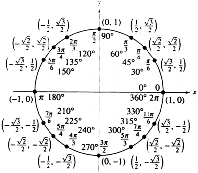
我正在尝试将15个div元素均匀地放置在一个半径为150px的圆中。我正在使用以下代码,但看起来给出了一个奇怪的偏心椭圆,重叠在一起。

Fiddle

(请注意,此为原始文本未进行翻译)

// Hold a global reference to the div#main element.  Initially assign it ... somewhere useful :)
var main = document.getElementById('main');
var circleArray = [];

// Move a circle based on the distance of the approaching mouse
var moveCircle = function(circle, dx, dy) {

};

// Look at all the circle elements, and figure out if any of them have to move.
var checkMove = function() {

};
var setup = function() {
  for (var i = 0; i < 15; i++) {
    //create element, add it to the array, and assign it's coordinates trigonometrically.
    //Then add it to the "main" div
    var circle = document.createElement('div');
    circle.className = 'circle number' + i;
    circleArray.push(circle);
    circleArray[i].posx = Math.round((150 * Math.cos(i * (2 * Math.PI / 15)))) + 'px';
    circleArray[i].posy = Math.round((150 * Math.sin(i * (2 * Math.PI / 15)))) + 'px';
    circleArray[i].style.position = "relative";
    circleArray[i].style.top = circleArray[i].posy;
    circleArray[i].style.left = circleArray[i].posx;
    main.appendChild(circleArray[i]);
  }
};
setup();
window.addEventListener('load', function() {

});
div {
  box-sizing: border-box;
}
div#main {
  position: absolute;
  left: 50%;
  top: 50%;
}
div.circle {
  position: absolute;
  width: 20px;
  height: 20px;
  border: 2px solid black;
  border-radius: 10px;
  -webkit-border-radius: 10px;
  -moz-border-radius: 10px;
}
<div id="main"></div>

有什么建议,我可能做错了什么吗?

4个回答

79

首先,一个圆上坐标的方程式很简单:

(x, y) = (r * cos(θ), r * sin(θ))

其中,r代表圆的半径,θ代表弧度角。


你的代码创建偏心椭圆的原因是你在赋值.top.left CSS属性时没有考虑到它实际上会以左上角作为参考点。我已经更正了你的代码,现在它创建了一个完美的圆。

对你的代码所做的更改:

  1. Added an array theta that holds all the angles.

    var theta = [0, Math.PI / 6, Math.PI / 4, Math.PI / 3, Math.PI / 2, 2 * (Math.PI / 3), 3 * (Math.PI / 4), 5 * (Math.PI / 6), Math.PI, 7 * (Math.PI / 6), 5 * (Math.PI / 4), 4 * (Math.PI / 3), 3 * (Math.PI / 2), 5 * (Math.PI / 3), 7 * (Math.PI / 4), 11 * (Math.PI / 6)];
    

    The image below shows all the angles I've used.

    enter image description here

  2. Added an array colors that holds different colors.

    var colors = ['red', 'green', 'purple', 'black', 'orange', 'yellow', 'maroon', 'grey', 'lightblue', 'tomato', 'pink', 'maroon', 'cyan', 'magenta', 'blue', 'chocolate', 'DarkSlateBlue'];
    
  3. Made changes to your trigonometric equations.

    circleArray[i].posx = Math.round(radius * (Math.cos(theta[i]))) + 'px';
    circleArray[i].posy = Math.round(radius * (Math.sin(theta[i]))) + 'px';
    
  4. Changed the way .top and .left are assigned.

    circleArray[i].style.top = ((mainHeight / 2) - parseInt(circleArray[i].posy.slice(0, -2))) + 'px';
    circleArray[i].style.left = ((mainHeight / 2) + parseInt(circleArray[i].posx.slice(0, -2))) + 'px';
    

    where mainHeight is the height of the #main div.

[1] 16个div

Fiddle上的演示


var setup = function() {
  var radius = 150;
  var main = document.getElementById('main');
  var mainHeight = parseInt(window.getComputedStyle(main).height.slice(0, -2));
  var theta = [0, Math.PI / 6, Math.PI / 4, Math.PI / 3, Math.PI / 2, 2 * (Math.PI / 3), 3 * (Math.PI / 4), 5 * (Math.PI / 6), Math.PI, 7 * (Math.PI / 6), 5 * (Math.PI / 4), 4 * (Math.PI / 3), 3 * (Math.PI / 2), 5 * (Math.PI / 3), 7 * (Math.PI / 4), 11 * (Math.PI / 6)];
  var circleArray = [];
  var colors = ['red', 'green', 'purple', 'black', 'orange', 'yellow', 'maroon', 'grey', 'lightblue', 'tomato', 'pink', 'maroon', 'cyan', 'magenta', 'blue', 'chocolate', 'DarkSlateBlue'];
  for (var i = 0; i < 16; i++) {
    var circle = document.createElement('div');
    circle.className = 'circle number' + i;
    circleArray.push(circle);
    circleArray[i].posx = Math.round(radius * (Math.cos(theta[i]))) + 'px';
    circleArray[i].posy = Math.round(radius * (Math.sin(theta[i]))) + 'px';
    circleArray[i].style.position = "absolute";
    circleArray[i].style.backgroundColor = colors[i];
    circleArray[i].style.top = ((mainHeight / 2) - parseInt(circleArray[i].posy.slice(0, -2))) + 'px';
    circleArray[i].style.left = ((mainHeight / 2) + parseInt(circleArray[i].posx.slice(0, -2))) + 'px';
    main.appendChild(circleArray[i]);
  }
};
setup();
div#main {
  height: 300px;
  width: 300px;
  position: absolute;
  margin: 0 auto;
  transform: translate(-50%, -50%);
  top: 50%;
  left: 50%;
}
div.circle {
  position: absolute;
  width: 20px;
  height: 20px;
  border: 2px solid black;
  border-radius: 50%;
}
body {
  margin: 0 auto;
  background: papayawhip;
}
<div id="main"></div>

[2] 15个div均匀定位
Fiddle上查看演示

var setup = function() {
  var radius = 150;
  var main = document.getElementById('main');
  var mainHeight = parseInt(window.getComputedStyle(main).height.slice(0, -2));
  var theta = [0, (2 * (Math.PI / 15)), (4 * (Math.PI / 15)), (2 * (Math.PI / 5)), (8 * (Math.PI / 15)), (2 * (Math.PI / 3)), (4 * (Math.PI / 5)), (14 * (Math.PI / 15)), (16 * (Math.PI / 15)), (6 * (Math.PI / 5)), (4 * (Math.PI / 3)), (22 * (Math.PI / 15)), (8 * (Math.PI / 5)), (26 * (Math.PI / 15)), (28 * (Math.PI / 15))];
  var circleArray = [];
  var colors = ['red', 'green', 'purple', 'black', 'orange', 'yellow', 'maroon', 'grey', 'lightblue', 'tomato', 'pink', 'maroon', 'cyan', 'magenta', 'blue', 'chocolate', 'DarkSlateBlue'];
  for (var i = 0; i < 15; i++) {
    var circle = document.createElement('div');
    circle.className = 'circle number' + i;
    circleArray.push(circle);
    circleArray[i].posx = Math.round(radius * (Math.cos(theta[i]))) + 'px';
    circleArray[i].posy = Math.round(radius * (Math.sin(theta[i]))) + 'px';
    circleArray[i].style.position = "absolute";
    circleArray[i].style.backgroundColor = colors[i];
    circleArray[i].style.top = ((mainHeight / 2) - parseInt(circleArray[i].posy.slice(0, -2))) + 'px';
    circleArray[i].style.left = ((mainHeight / 2) + parseInt(circleArray[i].posx.slice(0, -2))) + 'px';
    main.appendChild(circleArray[i]);
  }
};
setup();
div#main {
  height: 300px;
  width: 300px;
  position: absolute;
  margin: 0 auto;
  transform: translate(-50%, -50%);
  top: 50%;
  left: 50%;
}
div.circle {
  position: absolute;
  width: 20px;
  height: 20px;
  border: 2px solid black;
  border-radius: 50%;
}
body {
  margin: 0 auto;
  background: papayawhip;
}
<div id="main"></div>


[3] 在椭圆/圆上动态定位任意数量的

椭圆上的坐标方程为:

(x, y) = (rx * cos(θ), ry * sin(θ))

其中,rx是沿X轴的半径,ry是沿Y轴的半径。


在这种情况下,函数 generate(n, rx, ry, id) 接受四个参数。其中,n<div> 的数量,rxry分别是X轴和Y轴的半径,最后id是你想要将你的按椭圆形排列的 <div> 添加到的 <div> 的ID。

演示在Fiddle上查看

var theta = [];

var setup = function(n, rx, ry, id) {
  var main = document.getElementById(id);
  var mainHeight = parseInt(window.getComputedStyle(main).height.slice(0, -2));
  var circleArray = [];
  var colors = ['red', 'green', 'purple', 'black', 'orange', 'yellow', 'maroon', 'grey', 'lightblue', 'tomato', 'pink', 'maroon', 'cyan', 'magenta', 'blue', 'chocolate', 'darkslateblue', 'coral', 'blueviolet', 'burlywood', 'cornflowerblue', 'crimson', 'darkgoldenrod', 'olive', 'sienna', 'red', 'green', 'purple', 'black', 'orange', 'yellow', 'maroon', 'grey', 'lightblue', 'tomato', 'pink', 'maroon', 'cyan', 'magenta', 'blue', 'chocolate', 'darkslateblue', 'coral', 'blueviolet', 'burlywood', 'cornflowerblue', 'crimson', 'darkgoldenrod', 'olive', 'sienna'];
  for (var i = 0; i < n; i++) {
    var circle = document.createElement('div');
    circle.className = 'circle number' + i;
    circleArray.push(circle);
    circleArray[i].posx = Math.round(rx * (Math.cos(theta[i]))) + 'px';
    circleArray[i].posy = Math.round(ry * (Math.sin(theta[i]))) + 'px';
    circleArray[i].style.position = "absolute";
    circleArray[i].style.backgroundColor = colors[i];
    circleArray[i].style.top = ((mainHeight / 2) - parseInt(circleArray[i].posy.slice(0, -2))) + 'px';
    circleArray[i].style.left = ((mainHeight / 2) + parseInt(circleArray[i].posx.slice(0, -2))) + 'px';
    main.appendChild(circleArray[i]);
  }
};

var generate = function(n, rx, ry, id) {
  var frags = 360 / n;
  for (var i = 0; i <= n; i++) {
    theta.push((frags / 180) * i * Math.PI);
  }
  setup(n, rx, ry, id)
}
generate(16, 150, 75, 'main');
div#main {
  height: 300px;
  width: 300px;
  position: absolute;
  margin: 0 auto;
  transform: translate(-50%, -50%);
  top: 50%;
  left: 50%;
}
div.circle {
  position: absolute;
  width: 20px;
  height: 20px;
  border: 2px solid black;
  border-radius: 50%;
}
body {
  margin: 0 auto;
  background: papayawhip;
}
<div id="main"></div>


编辑[2015年12月9日]:

这里是一个更加灵活的版本,具有起始偏移、顺时针和逆时针功能。


/*
Usage: Position.ellipse(n, rx, ry, so, wh, idd, cls, cw);

where n = number of divs,
      rx = radius along X-axis,
      ry = radius along Y-axis,
      so = startOffset,
      wh = width/height of divs,
      idd = id of main div(ellipse),
      cls = className of divs;
      cw = clockwise(true/false)
*/

var Position = {
  ellipse: function(n, rx, ry, so, wh, idd, cls, cw) {
    var m = document.createElement('div'),
      ss = document.styleSheets;
    ss[0].insertRule('#' + idd + ' { position: absolute; left: 50%; top: 50%; transform: translate(-50%, -50%); border-radius: 50%; box-shadow: inset 0 0 ' + wh + 'px ' + wh / 4 + 'px black; background: rgba(0, 0, 0, 0.2); width: ' + String((rx * 2) + wh) + 'px; height: ' + String((ry * 2) + wh) + 'px; }', 1);
    ss[0].insertRule('.' + cls + '{ position: absolute; background: black; color: papayawhip; text-align: center; font-family: "Open Sans Condensed", sans-serif; border-radius: 50%; transition: transform 0.2s ease; width: ' + wh + 'px; height: ' + wh + 'px; line-height: ' + wh + 'px;}', 1);
    ss[0].insertRule('.' + cls + ':hover { transform: scale(1.2); cursor: pointer; background: rgba(0, 0, 0, 0.8); }', 1);
    m.id = idd;
    for (var i = 0; i < n; i++) {
      var c = document.createElement('div');
      c.className = cls;
      c.innerHTML = i + 1;
      c.style.top = String(ry + -ry * Math.cos((360 / n / 180) * (i + so) * Math.PI)) + 'px';
      c.style.left = String(rx + rx * (cw ? Math.sin((360 / n / 180) * (i + so) * Math.PI) : -Math.sin((360 / n / 180) * (i + so) * Math.PI))) + 'px';
      m.appendChild(c);
    }
    document.body.appendChild(m);
  }
}

Position.ellipse(20, 150, 150, 0, 42, 'main', 'circle', true);
@import url(http://fonts.googleapis.com/css?family=Open+Sans+Condensed:300);
 body {
  margin: 0 auto;
  background: rgb(198, 193, 173);
}


1
这很完整,谢谢!我对你使用的切片方法很好奇。我认为我误解了它的功能(我以为它更与字符串有关?) - Araymer
.slice(0, -2) 简单地从 500px 中提取出 500。您也可以在数组上使用 .slice() 方法。 - Weafs.py
2
很棒的帖子,非常有信息量!在http://jsfiddle.net/Lq7tkxj3/上使用随机圆形数字和直径分叉Fiddle [5]。 - Antoine
我们能用椭圆形做同样的事情吗? - Varada
1
这看起来不正确,请查看这里的圆圈:http://jsfiddle.net/s3pgwcth/小圆圈没有正确地对齐在大圆圈外面。x和y需要考虑到小圆圈的大小,如果我们从x中减去10并将10加到y中,我们就可以得到一个完美的位置:http://jsfiddle.net/cL68os91/ - AntonB

17

无需JS的另一种方法

chipChocolate.py的回答很完整,但是还有另一种方法可以实现您的目标。这种方法更简单,不需要使用JS。

关键在于考虑"圆形"和旋转,而不是依赖于[x,y]坐标:

您需要嵌套所有元素并对它们应用旋转。由于它们被嵌套,因此第n + 1个元素将根据其直接父元素的旋转进行旋转。这里是一个演示:DEMO

.circle, .circle div {
    width:24px; height:300px;
    position:absolute;
    left:50%; top:50px;
}
.circle:before, .circle div:before {
    content:'';
    display:block;
    width:20px; height:20px;
    border: 2px solid black;
    border-radius: 100%;
}
.circle div {
    top:0; left:0;
    -webkit-transform : rotate(24deg);
    -ms-transform : rotate(24deg);
    transform : rotate(24deg);
}
<div class="circle">
    <div><div><div><div><div><div><div><div><div><div><div><div><div><div><div>
    </div></div></div></div></div></div></div></div></div></div></div></div></div></div></div>
</div>

圆的直径受元素高度控制(在演示中为height:300px),您可以将其设置为百分比以使圆响应式(见下文)。

旋转必须根据您想要围绕圆周的元素数量进行设置。在演示中有15个元素,因此rotation = 360 / 15 = 24deg

如果您具有动态数量的元素,则可以使用JS添加它们并计算所需的旋转角度。


响应式示例

DEMO

.circle{
    position:relative;
    width:5%;padding-bottom:50%;
    margin-left:47.5%;
}
.circle div {
    position:absolute;
    top:0; left:0;
    width:100%; height:100%;
    -webkit-transform : rotate(24deg);
    -ms-transform : rotate(24deg);
    transform : rotate(24deg);
}
.circle:before, .circle div:before {
    content:'';
    position:absolute;
    top:0; left:0;
    width:100%; padding-bottom:100%;
    border-radius: 100%;
    border: 2px solid teal;
    background:gold;
}
<div class="circle">
    <div><div><div><div><div><div><div><div><div><div><div><div><div><div><div>
    </div></div></div></div></div></div></div></div></div></div></div></div></div></div></div>
</div>


我必须在JavaScript中定位它们,因为我将编写代码根据mousemove来操作位置,并且需要脚本首先了解它们的位置。 - Araymer
3
好的,如果有人需要没有JS的相同内容,我会将这个答案保留下来。 - web-tiki
1
对我来说也很好。新的本地CSS功能可以减少使用复杂的javascript的需求,因此在可能的情况下,我更喜欢坚持使用本地而不是javascript。尽管如此,在javascript答案中有大量的知识。 - Paulo Janeiro

2

这是另一种解决方案,基于我看过的其他解决方案的思路。

链接地址

(function() {
  var radians, radius;

  radius = 150;
    
  var totalItems = 48
  var item = 0;
  function positionTarget() 
  {
    var x, y, angle = 0, step = (2*Math.PI) / totalItems;
    var width = $('#container').width()/2;
    var height = $('#container').height()/2;
    var itemW = 20, itemH = 2;
    var deg = 0;    
 while(item <= totalItems)
 {        
  x = Math.round(width + radius * Math.cos(angle) - itemW/2);
  y = Math.round(height + radius * Math.sin(angle) - itemH/2);        
        //console.log(x + "," + y);
     
  $('#container').append('<div id="'+ item +'"/>')
  $('div#'+item).css('position', 'absolute')
        .css('width', itemW+'px').css('height', itemH+'px')      
        .css('left', x+'px').css('top', y+'px')
        .css('background-color', 'blue')
        .css('transform-origin', x+'px' -y+'px')        
        .css('transform', 'rotate('+ deg +'deg)')
        .css('border', 'solid 1px #000');
     
        angle += step;
        ++item;
        deg += 360/totalItems;
     
        //console.log(deg)
    }
  }

  $('#theButton').on('click', function()
  {
        positionTarget();
  })
    
})();
#container { width: 600px; height: 600px; border: 1px solid #000; position: relative; }
<script src="https://ajax.googleapis.com/ajax/libs/jquery/2.1.1/jquery.min.js"></script>
<input type="button" id="theButton" value="Draw">    
<div id="container">
</div>


0
  1. 将位置设置为"absolute"。这将允许"top"和"left"从(0, 0)的位置定位divs。使用"relative"将从它们通常布局的位置定位divs。

  2. 将圆的中心点从(0, 0)更改为其他位置,例如(250, 250)。

    circleArray[i].posx = 250 + Math.round((150*Math.cos(i*(2*Math.PI/15)))) + 'px';
    circleArray[i].posy = 250 + Math.round((150*Math.sin(i*(2*Math.PI/15)))) + 'px';
    circleArray[i].style.position = "absolute";
    

我希望它们相对于它们通常的位置进行定位(这是作为“main” div的子元素在页面中心定位,因此它们基本上都围绕页面中心旋转)。 - Araymer

网页内容由stack overflow 提供, 点击上面的
可以查看英文原文,
原文链接