ggplot:使用管道传递数据来子集化层

7

我正在尝试对通过管道传递数据到 ggplot 的绘图层进行子集筛选。

以下是一个示例:

library(dplyr)
library(ggplot2)
library(scales)

set.seed(12345)
df_example = data_frame(Month = rep(seq.Date(as.Date("2015-01-01"),
                                             as.Date("2015-12-31"), by = "month"), 2),
                        Value = sample(seq.int(30, 150), size = 24, replace = TRUE),
                        Indicator = as.factor(rep(c(1, 2), each = 12)))

df_example %>% 
  group_by(Month) %>% 
  mutate(`Relative Value` = Value/sum(Value)) %>% 
  ungroup() %>% 
  ggplot(aes(x = Month, y = Value, fill = Indicator, group = Indicator)) + 
  geom_bar(position = "fill", stat = "identity") + 
  theme_bw()+ 
  scale_y_continuous(labels = percent_format()) + 
  geom_line(aes(x = Month, y = `Relative Value`))
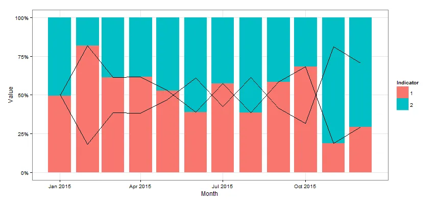
这样做会得到以下结果:

enter image description here

我希望只出现其中一条线,如果在 
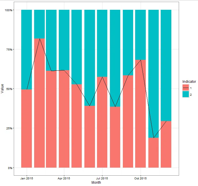
geom_line 层中像这样操作将会起作用:
  geom_line(subset = .(Indicator == 1), aes(x = Month, y = `Relative Value`))

编辑:

会话信息:

R版本3.2.1(2015-06-18),平台:x86_64-w64-mingw32/x64(64位),运行于Windows Server 2012 x64(版本9200)

语言环境:2 LC_COLLATE=English_United States.1252 LC_CTYPE=English_United States.1252 [3] LC_MONETARY=English_United States.1252 LC_NUMERIC=C [5] LC_TIME=English_United States.1252

附加的基础包:2 stats graphics grDevices utils
datasets methods base

其他附加包:2 scales_0.3.0 lubridate_1.3.3 ggplot2_1.0.1 lazyeval_0.1.10 dplyr_0.4.3 RSQLite_1.0.0
readr_0.2.2 [8] RJDBC_0.2-5 DBI_0.3.1 rJava_0.9-7

通过命名空间加载(而不是附加)的程序包:2 Rcpp_0.12.2
knitr_1.11 magrittr_1.5 MASS_7.3-40 munsell_0.4.2
lattice_0.20-31 [7] colorspace_1.2-6 R6_2.1.1 stringr_1.0.0 plyr_1.8.3 tools_3.2.1 parallel_3.2.1 [13] grid_3.2.1
gtable_0.1.2 htmltools_0.2.6 yaml_2.1.13 assertthat_0.1
digest_0.6.8 [19] reshape2_1.4.1 memoise_0.2.1
rmarkdown_0.8.1 labeling_0.3 stringi_1.0-1 zoo_1.7-12
[25] proto_0.3-10


1
我得到的图形与你不同,我的线条缩放得相当不同。此外,您应该设置一个随机种子,这样我们就可以使用相同的图形进行工作。 - Mike Wise
@MikeWise 添加了 sessionInfo 和种子。 - tchakravarty
@MikeWise 刚刚完成了这个。 - tchakravarty
好的,我重新初始化了我的工作区,比例问题消失了。这是之前 ggplot 调用的一些奇怪副作用。 - Mike Wise
1
@MikeWise 是的,我也是这么想的。管道传输的数据应该明确地可用于后续与“subset”一起使用,但通常的操作符,如“.”似乎不起作用。@Hadley 求助? - tchakravarty
3个回答

15

简而言之: 将数据传递给该层作为一个函数,根据您的条件对图形的数据进行子集化。


根据ggplots关于图层的文档, 当将数据传递给新的图层时,您有三个选项:
  1. 如果为NULL,则默认情况下从调用ggplot()时指定的绘图数据中继承数据。
  2. 数据框或其他对象将覆盖绘图数据。所有对象将被加强以生成数据框。有关将创建哪些变量,请参见fortify()。
  3. 函数将使用单个参数(即绘图数据)进行调用。返回值必须是数据框,并将用作图层数据。
前两个选项是最常见的选项,但当数据通过pyps修改时,第三个选项非常适合我们的需求。
在您的示例中,向geom_line添加data = function(x) subset(x,Indicator == 1)即可解决问题。
library(dplyr)
library(ggplot2)
library(scales)

set.seed(12345)
df_example = data_frame(Month = rep(seq.Date(as.Date("2015-01-01"),
                                             as.Date("2015-12-31"), by = "month"), 2),
                        Value = sample(seq.int(30, 150), size = 24, replace = TRUE),
                        Indicator = as.factor(rep(c(1, 2), each = 12)))

df_example %>% 
  group_by(Month) %>% 
  mutate(`Relative Value` = Value/sum(Value)) %>% 
  ungroup() %>% 
  ggplot(aes(x = Month, y = Value, fill = Indicator, group = Indicator)) + 
  geom_bar(position = "fill", stat = "identity") + 
  theme_bw()+ 
  scale_y_continuous(labels = percent_format()) + 
  geom_line(data = function(x) subset(x,Indicator == 1), aes(x = Month, y = `Relative Value`))

这是生成的图表


3
我不知道这个功能选项怎么会没被我发现! - geotheory

2
library(dplyr)
library(ggplot2)
library(scales)

set.seed(12345)
df_example = data_frame(Month = rep(seq.Date(as.Date("2015-01-01"),
                                             as.Date("2015-12-31"), by = "month"), 2),
                        Value = sample(seq.int(30, 150), size = 24, replace = TRUE),
                        Indicator = as.factor(rep(c(1, 2), each = 12)))

df_example %>% 
  group_by(Month) %>% 
  mutate(`Relative Value` = Value/sum(Value)) %>% 
  ungroup() %>% 
  ggplot(aes(x = Month, y = Value, fill = Indicator, group = Indicator)) + 
  geom_bar(position = "fill", stat = "identity") + 
  theme_bw()+ 
  scale_y_continuous(labels = percent_format()) + 
  geom_line(aes(x = Month, y = `Relative Value`,linetype=Indicator)) +
  scale_linetype_manual(values=c("1"="solid","2"="blank"))

产生:

enter image description here


哈哈,只需隐藏其中一行。我喜欢这个。让我看看是否还有其他方法来做这个,否则就会标记这个。对于如何在ggplot图层中访问管道数据(基本上是未明确命名的数据),我仍然很好奇。 - tchakravarty
管道不太给你机会在运行时修改数据。 - Mike Wise
踩票并不能提供太多反馈 - 特别是18个月之后。不妨留下一条评论,这样我就有机会修复你所困扰的问题了。 - Mike Wise
这个回答没有回答问题的本质。它适用于他特定的情况,但不适用于普遍情况。 - kmace
“Spirit of the question” 究竟是什么意思?看起来像是问题的提出者比你更清楚。实际上,对我来说好像是某个东西的变化(无论是 ggplot 还是 R)破坏了我的答案 - 它现在就像以前那样不起作用。也许我会在周末解决它。如果你真的尝试了我的代码,你就会发现这一点。 - Mike Wise

0

你可能会从stat_subset()受益,这是我为个人使用而创建的一种统计方法,可在metR中使用:https://eliocamp.github.io/metR/articles/Visualization-tools.html#stat_subset

它有一个名为subset的美学,可以接受逻辑表达式并相应地对数据进行子集处理。


library(dplyr)
library(ggplot2)
library(scales)

set.seed(12345)
df_example = data_frame(Month = rep(seq.Date(as.Date("2015-01-01"),
                                             as.Date("2015-12-31"), by = "month"), 2),
                        Value = sample(seq.int(30, 150), size = 24, replace = TRUE),
                        Indicator = as.factor(rep(c(1, 2), each = 12)))

df_example %>% 
   group_by(Month) %>% 
   mutate(`Relative Value` = Value/sum(Value)) %>% 
   ungroup() %>% 
   ggplot(aes(x = Month, y = Value, fill = Indicator, group = Indicator)) + 
   geom_bar(position = "fill", stat = "identity") + 
   theme_bw()+ 
   scale_y_continuous(labels = percent_format()) + 
   metR::stat_subset(aes(x = Month, y = `Relative Value`, subset = Indicator == 1), 
               geom = "line")


网页内容由stack overflow 提供, 点击上面的
可以查看英文原文,
原文链接