修改Seaborn水平条形图的颜色

5

我正在尝试绘制一个水平条形图。它能够工作,但是颜色是彩虹样式的。如何将每个条形的颜色更改为相同的颜色?

%pyspark
import seaborn as sns
import matplotlib
matplotlib.use('agg')
import matplotlib.pyplot as plt
plt.clf()

sns.set_context("notebook", font_scale=0.5)

# plot barchart by x axis and use different color for day
sns.barplot(x = "scaled_importance", 
        y = "variable", 
        data = best_gbm_varimp[:10],
        orient = "h")

show(plt)  
1个回答

3
您可以使用参数:seaborn.barplot
color: matplotlib color, optional

Color for all of the elements, or seed for a gradient palette.

用于可视化示例的例子:水平条形图

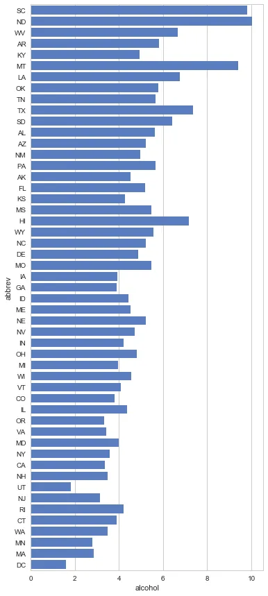
这是一个没有颜色的例子,因此结果是“彩虹”:

import seaborn as sns
import matplotlib.pyplot as plt
sns.set(style="whitegrid")

# Initialize the matplotlib figure
f, ax = plt.subplots(figsize=(6, 15))

# Load the example car crash dataset
crashes = sns.load_dataset("car_crashes").sort_values("total", ascending=False)


# Plot the crashes where alcohol was involved
sns.set_color_codes("muted")
sns.barplot(x="alcohol", y="abbrev", 
            data=crashes,
            label="Alcohol-involved", 
            orient = "h")

所有颜色的样例输出

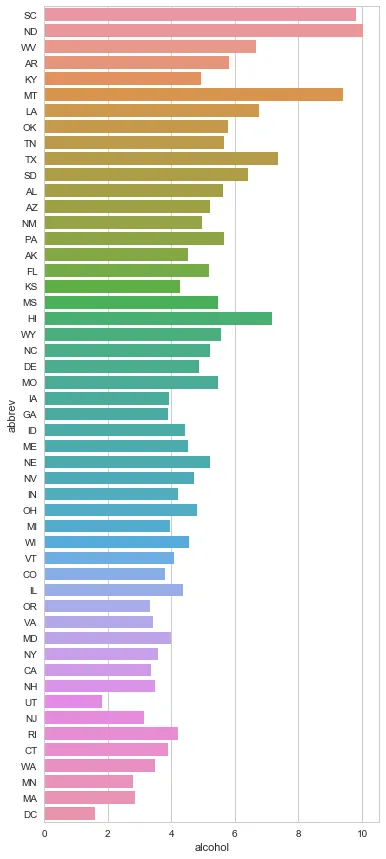
现在我们指定 color='b' #蓝色:

import seaborn as sns
import matplotlib.pyplot as plt
sns.set(style="whitegrid")

# Initialize the matplotlib figure
f, ax = plt.subplots(figsize=(6, 15))

# Load the example car crash dataset
crashes = sns.load_dataset("car_crashes").sort_values("total", ascending=False)


# Plot the crashes where alcohol was involved
sns.set_color_codes("muted")
sns.barplot(x="alcohol", y="abbrev", 
            data=crashes,
            label="Alcohol-involved", 
            orient = "h",
            color='b')

with bars colored **blue**


网页内容由stack overflow 提供, 点击上面的
可以查看英文原文,
原文链接