CSS高度100%使元素高度超过100%

5
以下HTML非常简单并且做到了我想要的效果。绿色背景会向下延伸填满整个窗口。
<body style="margin:0">
    <div style="height:100%;display:flex;flex-direction:column">
        <div style="background:#d0d0ff">
            This is a header
        </div>
        <div style="background:#d0ffd0;flex-grow:1">
            This is the body.
        </div>
    </div>
</body>

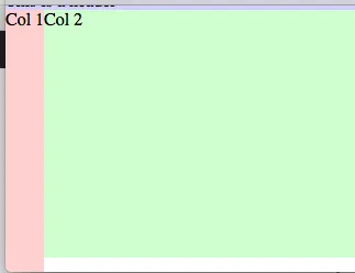
但是,如果我使用一些弹性列替换正文,并给它们设置height:100%,因为我想让它们延伸到底部,那么newdiv实际上会获得大于其容器的100%的高度,并导致所有内容滚动。 为什么这里的100%不是100%呢?

<body style="margin:0">
    <div style="height:100%;display:flex;flex-direction:column">
        <div style="background:#d0d0ff">
            This is a header
        </div>
        <div style="background:#d0ffd0;flex-grow:1">
            <!-- The new part -->
            <div id='newdiv' style="display:flex;flex-direction:row; height:100%">
                <div style="background:#ffd0d0"> Col 1 </div>
                <div> Col 2 </div>
            </div>
        </div>
    </div>
</body>

enter image description here


1
你能提供一个 Fiddle 吗?谢谢。 - Louie Almeda
1
你的代码与截图产生了不同的输出:https://jsfiddle.net/ok20071g/1/ - Maximillian Laumeister
非常抱歉...我忘记了<!doctype html>,所以我处于怪异模式。不要紧... - Rob N
4个回答

4
你之所以出现垂直滚动条,是因为你告诉了包含 col1col2 的 div 父元素使用 height: 100%。这本身就给它赋予了视口的完整高度。 从你的代码来看:
<div id='newdiv' style="display:flex; flex-direction:row; height:100%">
    <div style="background:#ffd0d0"> Col 1 </div>
    <div> Col 2 </div>
</div>

除此之外,这个div还有一个兄弟元素:头部div,它也占用空间。
因此,当浏览器进行高度计算时,结果如下:
100% + (computed height of header div) > viewport height = vertical scrollbar

不要使用固定高度,考虑让flexbox自动适应。默认情况下,flex项目沿着交叉轴展开以填充整个容器的长度。

因此,只需声明display: flex,子元素将扩展到填充所有可用空间(无垂直滚动条)。但是,由于height规则会覆盖此flex设置,因此我们需要从任何flex项目中删除height: 100%

html, body { height: 100%; }
<body style="margin:0">
    <div style="height:100%;display:flex;flex-direction:column">
        <div style="background:#d0d0ff">
            This is a header
        </div>
        <div style="background:#d0ffd0;flex-grow:1; display: flex;"><!--adjustment here-->
            <div id='newdiv' style="display:flex;"><!--adjustment here-->
                <div style="background:#ffd0d0; display: flex;"> Col 1 </div>
                <div> Col 2 </div>
            </div>
        </div>
    </div>
</body>

对原代码进行了两项调整。

  • 添加了display: flex
  • 移除了height: 100%

Fiddle Demo


你的代码是有效的,但我的问题实际上是关于“为什么”,所以让我理解一下:你说height:100%使其成为视口的100%。这很有道理,但我认为height:100%意味着父块元素的100%?http://www.w3schools.com/cssref/pr_dim_height.asp - Rob N
百分比高度是基于父元素的高度工作的。你说得对。除非父元素也是一个百分比高度,它必须寻找它的父元素。这个循环会一直持续到达根元素(html { height: 100%; })。那就是视口高度。所以,除非你把height:250px设置给父级元素,否则所有百分比高度都会一直向上查找树形结构以获取指导。 - Michael Benjamin
抱歉,我的朋友。在这个由浏览器驱动的fiddle中没有bug。它在Chrome、FF和IE11中的行为是相同的。它遵循标准。请看我在这里的回答:https://dev59.com/51wZ5IYBdhLWcg3wM97Z#31728799 - Michael Benjamin
也许你正在使用的 HTML 或 CSS 文件中已经声明了 html,body { height: 100%} - Michael Benjamin
让我们在聊天中继续这个讨论 - Michael Benjamin
显示剩余3条评论

0
我会这样做。演示
<body>
   <header>Header</header>
   <div class="body">
     <aside>abc</aside>
     <div class='inner'>content here</div>
   </div>
</body>

在你的CSS中

html,body{
  height: 100%;
}

body{
  display: flex;
  flex-direction: column;

}


.body{
  flex-grow:1;
  display: flex;
  align-items: stretch;

}

.inner{
  flex-grow: 1;
}

这样做可以让你拥有更好的HTML结构和可维护性。


0

这个怎么样?- http://codepen.io/arianalynn/pen/WragJP?editors=1010

<style>
 body, html {margin:0;height:100%;width:100%;padding:0}
</style>
<body>
  <div style="height:100%;display:flex;flex-direction:column">
    <div style="background:#d0d0ff">
      This is a header
    </div>
    <div style="background:#d0ffd0;flex-grow:1;display:flex;flex-direction:row; height:100%;-webkit-align-items:stretch">
      <div style="background:#ffd0d0"> Col 1 </div>
      <div style="background:red"> Col 2 </div>
    </div>
  </div>
</body>

0

网页内容由stack overflow 提供, 点击上面的
可以查看英文原文,
原文链接