Bootstrap 4 可滚动的 Div 占据剩余中间屏幕高度

3

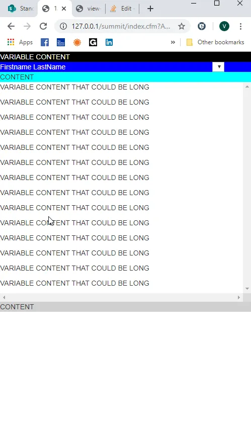
我正尝试使用Bootstrap 4设计一个页面,其中包括6个div,并且我需要DIV#4占据剩余的高度并可滚动。

Divs 1-3将略有动态并且高度不是固定的。Div 5和6也一样。Div 4应该占据屏幕的其余部分,但内容可能很长,因此需要滚动。

<!DOCTYPE html>
<html lang="en">
<head>
    <meta charset="utf-8">
    <meta http-equiv="X-UA-Compatible" content="IE=edge">
    <meta name=viewport content="width=device-width,initial-scale=1">
    <meta name="apple-mobile-web-app-capable" content="yes" />

    <link rel="stylesheet" href="https://maxcdn.bootstrapcdn.com/bootstrap/3.3.7/css/bootstrap.min.css">

    <script src="https://code.jquery.com/jquery-3.3.1.min.js" crossorigin="anonymous"></script>
    <script src="https://cdnjs.cloudflare.com/ajax/libs/popper.js/1.14.7/umd/popper.min.js" crossorigin="anonymous"></script>
    <script src="https://stackpath.bootstrapcdn.com/bootstrap/4.3.1/js/bootstrap.min.js" crossorigin="anonymous"></script>

    <style>
        html, body {
            height: 100%;
            margin: 0px;
        }
    </style>
</head>
<body>
<div class="d-flex flex-column h-100">
    <div style="background-color: #000000; width:100%; margin: 0 auto; color: white;">
        VARIABLE CONTENT
    </div>

    <div style="background-color: blue; width:100%; margin: 0 auto;">
        <table width="100%">
            <tr>
                <td style="color: white;">Firstname LastName</td>
                <form name="RankingForm" id="RankingForm">
                    <td>
                        <select name="Ranking" id="Ranking">
                            <option>
                        </select>
                    </td>
                </form>
            </tr>
        </table>
    </div>

    <div style="background-color: cyan; width:100%; margin: 0 auto;" class="flex-grow-0">
        CONTENT
    </div>

    <div class="flex-grow-1" style="width:100%; overflow:scroll; margin: 0 auto;">
        <div style="width:100%;">
            <p>VARIABLE CONTENT THAT COULD BE LONG
            <p>VARIABLE CONTENT THAT COULD BE LONG
            <p>VARIABLE CONTENT THAT COULD BE LONG
            <p>VARIABLE CONTENT THAT COULD BE LONG
            <p>VARIABLE CONTENT THAT COULD BE LONG
            <p>VARIABLE CONTENT THAT COULD BE LONG
            <p>VARIABLE CONTENT THAT COULD BE LONG
            <p>VARIABLE CONTENT THAT COULD BE LONG
            <p>VARIABLE CONTENT THAT COULD BE LONG
            <p>VARIABLE CONTENT THAT COULD BE LONG
            <p>VARIABLE CONTENT THAT COULD BE LONG
            <p>VARIABLE CONTENT THAT COULD BE LONG
            <p>VARIABLE CONTENT THAT COULD BE LONG
            <p>VARIABLE CONTENT THAT COULD BE LONG
        </div>
    </div>

    <div class="w-100" style="background-color: #d0d0d0; margin: 0 auto;">
        CONTENT
    </div>
</body>
</html>

生成的用户界面,底部的区块没有在底部

欢迎提供任何帮助。


1
你应该看一下flexbox:https://css-tricks.com/snippets/css/a-guide-to-flexbox/ - Sercan özen
我认为这个问题已经在这里这里这里得到了解答。请记住,除非其容器(body、html)有定义的高度,否则height:100%是无效的。 - Carol Skelly
谢谢。您是在暗示这不能没有Flexbox完成吗? - CFCeltic
谢谢Zim,但我已经看过那些例子了,它们都不是在尝试达到我想要的目标。它们想要填充某个DIV后剩余的高度。而我想让中间的DIV在夹在其他DIV之间时填充剩余的高度。另外,我的HTML和BODY确实设置为100%,我只是没有在写作中包含它,但现在我已经添加了它。 - CFCeltic
1个回答

3
如评论所述,flexbox是您想要制作三明治样式的内容。但是,我相信它是在4.1之后引入的。因此,如果您的bootstrap版本>= 4.1,则只能使用此解决方案。
您的代码中有一些错误。您将内联样式用作类(class),例如class="flex-grow: 0",您可以将其放到style="flex-grow:0"class="flex-grow-0"中。
要保持上一个<div>的固定高度,或者任何您想要的<div>,您可以为其设置height: somenumberhere pxheight: somenumberhere vh

<head>
<link rel="stylesheet" href="https://stackpath.bootstrapcdn.com/bootstrap/4.3.1/css/bootstrap.min.css" integrity="sha384-ggOyR0iXCbMQv3Xipma34MD+dH/1fQ784/j6cY/iJTQUOhcWr7x9JvoRxT2MZw1T" crossorigin="anonymous">
<script src="https://code.jquery.com/jquery-3.3.1.slim.min.js" integrity="sha384-q8i/X+965DzO0rT7abK41JStQIAqVgRVzpbzo5smXKp4YfRvH+8abtTE1Pi6jizo" crossorigin="anonymous"></script>
<script src="https://cdnjs.cloudflare.com/ajax/libs/popper.js/1.14.7/umd/popper.min.js" integrity="sha384-UO2eT0CpHqdSJQ6hJty5KVphtPhzWj9WO1clHTMGa3JDZwrnQq4sF86dIHNDz0W1" crossorigin="anonymous"></script>
<script src="https://stackpath.bootstrapcdn.com/bootstrap/4.3.1/js/bootstrap.min.js" integrity="sha384-JjSmVgyd0p3pXB1rRibZUAYoIIy6OrQ6VrjIEaFf/nJGzIxFDsf4x0xIM+B07jRM" crossorigin="anonymous"></script>


    <style>
        html, body {
            height: 100%;
        }
    </style>
</head>

<body>
<div class="d-flex flex-column h-100">

    <div style="background-color: #000000; width:100%; margin: 0 auto; color: white;">
        VARIABLE CONTENT
    </div>

    <div style="background-color: blue; width:100%; margin: 0 auto;">
        <table width="100%">
            <tr>
                <td style="color: white;">Firstname LastName</td>
                <form name="RankingForm" id="RankingForm">
                    <td>
                        <select name="Ranking" id="Ranking">
                            <option>
                        </select>
                    </td>
                </form>
            </tr>
        </table>
    </div>

    <div style="background-color: cyan; width:100%; margin: 0 auto;" class="flex-grow: 0">
        CONTENT
    </div>

    <div class="flex-grow-1" style="width:100%; overflow:scroll; margin: 0 auto;">
        <div style="width:100%;">
            <p>VARIABLE CONTENT THAT COULD BE LONG
            <p>VARIABLE CONTENT THAT COULD BE LONG
            <p>VARIABLE CONTENT THAT COULD BE LONG
            <p>VARIABLE CONTENT THAT COULD BE LONG
            <p>VARIABLE CONTENT THAT COULD BE LONG
            <p>VARIABLE CONTENT THAT COULD BE LONG
            <p>VARIABLE CONTENT THAT COULD BE LONG
            <p>VARIABLE CONTENT THAT COULD BE LONG
            <p>VARIABLE CONTENT THAT COULD BE LONG
            <p>VARIABLE CONTENT THAT COULD BE LONG
            <p>VARIABLE CONTENT THAT COULD BE LONG
            <p>VARIABLE CONTENT THAT COULD BE LONG
            <p>VARIABLE CONTENT THAT COULD BE LONG
            <p>VARIABLE CONTENT THAT COULD BE LONG
        </div>
    </div>

    <div class="w-100" style="background-color: #d0d0d0; margin: 0 auto;">
        CONTENT
    </div>
</body>


感谢您的反馈。我已经从事HTML和软件开发很长时间了,当我犯错时,我会接受反馈,因为我们都会犯错。我相对于Bootstrap和包含的类还比较新,并且我也在参考4.3.1版本。至于DIV的固定高度,它将由放置在DIV中的图像大小确定,因此我不想指定绝对高度。我会尝试您的建议。 - CFCeltic
谢谢,但这个建议并没有起作用。网页在加载时并没有占满整个高度。我已经更新了我的问题中的代码。 - CFCeltic
@CFCeltic 没问题。如果您感到冒犯,我会编辑我的回答。您是否在其他地方尝试过代码片段,还是只是更改了自己代码中的一些样式?我已经更改了您自己代码中的一些冗余样式,并将高度设置为“row”。 - Yunhai
我已经在其他多个地方试过了这段代码,包括一个简单的HTML页面。我正在尝试将其与动态内容配合使用,但出现了一个中间DIV,它不会在没有更长的DIV内容时扩展。 - CFCeltic
云海,谢谢你的回应,问题不在代码本身,而是Bootstrap的版本。你提到了它,我看了JS行,但是CSS行不匹配。这就是解决办法。谢谢。 - CFCeltic

网页内容由stack overflow 提供, 点击上面的
可以查看英文原文,
原文链接