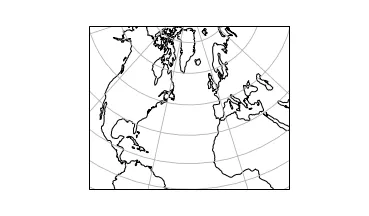
我有一些数据,其经度范围为-100o至30o,纬度范围为0o至80o。
我想使用一个投影来仅显示这个区域。
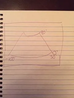
在我的脑海中,我想展示一个像这样的图:
然而,当我尝试使用AlbersEqualArea投影如下:
plt.figure(figsize=(5.12985642927, 3))
ax = plt.axes(projection=ccrs.AlbersEqualArea(central_longitude=-35, central_latitude=40, standard_parallels=(0, 80)))
ax.set_extent([lon180[0], lon180[-1], lat[0], lat[-1]], ccrs.Geodetic())
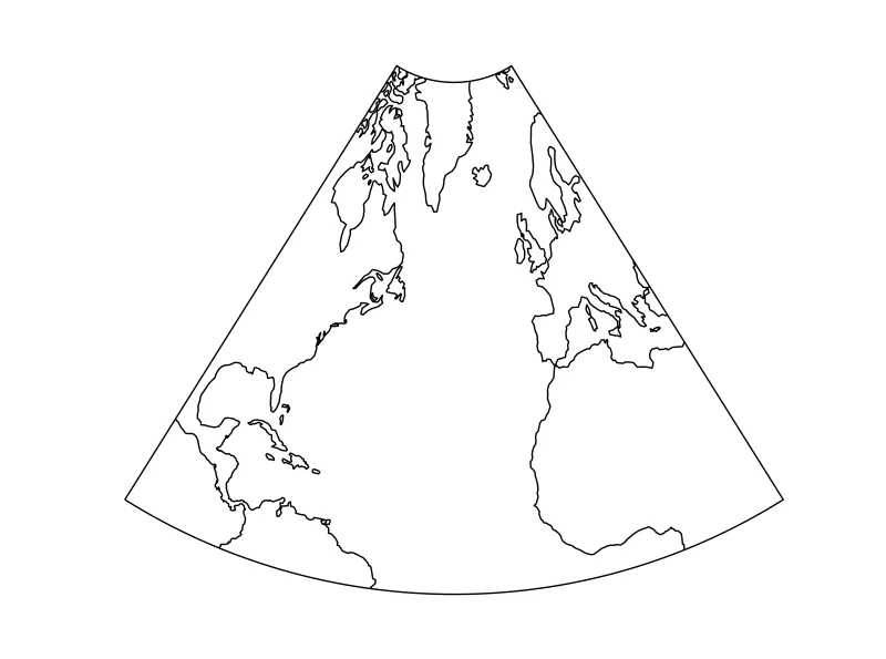
我得到了一张显示:
我该如何显示我拥有数据的区域?