粘性页脚导航栏和居中登录面板

4

以下每个组件都已经有过多次提问:

  • 如何固定导航栏
  • 如何固定页脚
  • 如何将div居中于页面中央

我想要实现的是同时拥有以上所有功能

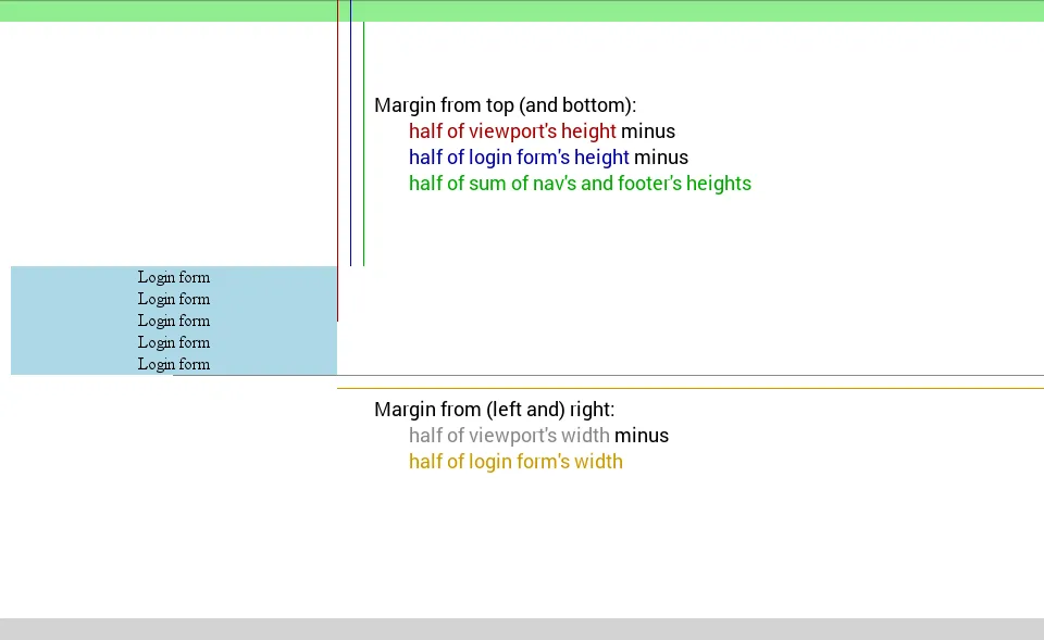
我想要在页面中央(水平和垂直方向)居中一个登录面板,但是我遇到了一些页脚问题

  • 我希望页面在手机上正确显示。登录区域不应该位于页眉或页脚下方。
  • 当页面被显示时,我希望页脚也能被显示。目前需要向下滚动才能看到页脚。登录表单与页脚之间的空间太大。页脚需要保持固定在底部。
  • 如果可能的话,登录表单应该更宽、更高

谢谢你的帮助

这是我需要解决的关键部分

/* Wrapper for page content to push down footer */
#wrap {
  min-height: 100%;
  height: 100%;
  /* Negative indent footer by its height */
  margin: 140px 0 -200px 0;
  /* Pad bottom by footer height */
  padding: 0;
}

请查看此处的jfiddle,了解相关的it技术内容。

目前

___________________________________________________     _ Visible Page 
|Navbar                                           |      |
|                                                 |      |
|_________________________________________________|      |
|                                                 |      |
|                                                 |      |
|                                                 |      |
|                      ^                          |      |
|                      |  Too much space          |      |
|                      |                          |      |
|                                                 |      |
|                _______________                  |      |    
|               |               |                 |      |
|               |  Login Area   |                 |      |  
|               |_______________|                 |      |
|                                                 |      |
|                                                 |      |
|                                                 |      |
|                                                 |      |
|                      ^                          |     _| 
|                      |  Too much space          |
|                      |                          |
|                                                 |
|                                                 |
|                                                 |
|                                                 |
|                                                 |
|_________________________________________________|
| Footer                                          |
|_________________________________________________|

What I want

___________________________________________________     _ Visible Page 
|Navbar                                           |      |
|                                                 |      |
|_________________________________________________|      |
|                                                 |      |
|                                                 |      |
|                                                 |      |
|                                                 |      |
|              _____________________              |      |    
|             |                     |             |      |
|             |                     |             |      |
|             |    Login Area       |             |      |  
|             |                     |             |      |
|             |_____________________|             |      |
|                                                 |      |
|                                                 |      |
|                                                 |      |
|                                                 |      |
|_________________________________________________|      |
| Footer                                          |      |
|_________________________________________________|     _|

我对媒体查询和您的原始CSS进行了一些尝试。这是否更接近您想要实现的效果:https://jsfiddle.net/gn1sk3ne/4/ - tohood87
2个回答

2
这是如何实现的。在这里可以看到一个工作的bootply示例

/* Sticky footer styles
-------------------------------------------------- */

html,
body {
  height: 100%;
  /* The html and body elements cannot have any padding or margin. */
}

/* Wrapper for page content to push down footer */
#wrap {
  min-height: 100%;
  height: auto !important;
  height: 100%;
  /* Negative indent footer by its height */
  margin: 0 auto -60px;
  /* Pad bottom by footer height */
  padding: 0 0 60px;
}

/* Set the fixed height of the footer here */
#footer {
  height: 60px;
  background-color: #f5f5f5;
}


/* Custom page CSS
-------------------------------------------------- */


#wrap > .container {
  padding: 60px 15px 0;
}
.container .credit {
  margin: 20px 0;
}

#footer > .container {
  padding-left: 15px;
  padding-right: 15px;
}

#footer {
 position: fixed;
    width: 100%;
    display: block;
    bottom: 0;
}

.center{
    position: absolute;
    height: 50px;
    width: 50px;
    background:red;
    top:calc(50% - 50px/2); /* height divided by 2*/
    left:calc(50% - 50px/2); /* width divided by 2*/
}
<!-- Wrap all page content here -->
<div id="wrap">
  
  <!-- Fixed navbar -->
  <div class="navbar navbar-default navbar-fixed-top">
    <div class="container">
      <div class="navbar-header">
        <button type="button" class="navbar-toggle" data-toggle="collapse" data-target=".navbar-collapse">
          <span class="icon-bar"></span>
          <span class="icon-bar"></span>
          <span class="icon-bar"></span>
        </button>
        <a class="navbar-brand" href="#">Project name</a>
      </div>
      <div class="collapse navbar-collapse">
        <ul class="nav navbar-nav">
          <li class="active"><a href="#">Home</a></li>
          <li><a href="#about">About</a></li>
        </ul>
      </div><!--/.nav-collapse -->
    </div>
  </div>
  
  <!-- Begin page content -->
  <div class="container">
    <div class="center">
     login goes here
    </div>
  </div>
</div>

<div id="footer">
  <div class="container">
    <p class="text-muted credit">Centered login footer.</p>
  </div>
</div>


你如何在主体内垂直和水平居中登录区域? - QGA
我更新了我的示例。请查看类.center或在bootply 这里 - herrh

1
有趣的方法基于CSS3的calc和与视口相关的单位:vhvw

/* In the below @media queries I set body's background to red, in real application appropriate steps should be taken to fit the key elements of webpage and exclude all others */
/* Minimum width we need is 300px (width of login form) */
@media all and (max-width: 300px){
  body {
    background-color: red;
  }
}
/* Minimum height we need is 140px (height of login form plus heights of nav and footer) */
@media all and (max-height: 140px){
  body {
    background-color: red;
  }
}
html, body {
  height: 100%;
}
body {
  margin: 0;
}
nav {
  background-color: lightgreen;
  height: 20px;
}
main {
  background-color: lightblue;
  height: 100px;
  /*
  Margin from top and bottom:
    half of viewport's height minus
    half of login form's height minus
    half of sum of nav's and footer's heights
  Margin from left and right:
    half of viewport's width minus
    half of login form's width
  */
  margin: calc(50vh - 50px - 20px) calc(50vw - 150px);
  text-align: center;
  width: 300px;
}
footer {
  background-color: lightgrey;
  bottom: 0;
  height: 20px;
  position: absolute;
  width: 100%;
}
<nav>
  <a href="#">Link 1</a>
  <a href="#">Link 2</a>
</nav>
<main>
  Login form<br/>
  Login form<br/>
  Login form<br/>
  Login form<br/>
  Login form
</main>
<footer>Footer</footer>

在 codepen.com 中查看.


支持还是相当不错的:

  • calc 被 IE9+、Edge、Firefox 16+(带前缀的话是4+)、Chrome 26+(带前缀的话是19+)、Opera 15+ 和 Safari 6.1+(带前缀的话是6+)所支持(caniuse.comMDN)。
  • vhvw 被 IE9+、Edge、Firefox 19+、Chrome 20+、Opera 15+ 和 Safari 6+ 所支持(caniuse.comMDN)。

calc的值的图形解释:

enter image description here

这种方法并不是最优雅的,但也许会满足您的需求。

网页内容由stack overflow 提供, 点击上面的
可以查看英文原文,
原文链接