扩大CSS圆形的悬停区域

8

我有一个页面,其中有一些元素的border-radius设置为50%,因此它们显示为小点:
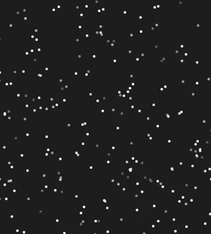
Said dots look like this

CSS:
.star {
    width: 5px;
    height: 5px;
    background-color: rgb(236, 236, 236);
    position: absolute;
    border-radius: 50%;
    transform: scale(1);
    display: block;
    transition: 0.25s ease-in background-color, 0.25s ease-in opacity, 0.25s ease-out transform;
    cursor: pointer;
}

每个圆点都有一个悬停操作,会弹出特定的弹出窗口。但是现在,在我测试的浏览器中,悬停变成了一个寻找像素的游戏,存在问题。
是否有一种“技巧”可以给这些圆点添加一个无形边框之类的东西,使它们更容易选择而不需要寻找像素?
border设置为2px solid transparent只会使圆点变大,在我的测试中CSS outline没有产生:hover状态或mouseenter事件。
4个回答

15
使用伪元素来增加“命中区域”。

body {
  background: #000;
}

.star {
  width: 5px;
  height: 5px;
  background-color: rgb(236, 236, 236);
  position: absolute;
  left: 50%;
  top: 50%;
  border-radius: 50%;
  transform: scale(1);
  display: block;
  transition: 0.25s ease-in background-color, 0.25s ease-in opacity, 0.25s ease-out transform;
  cursor: pointer;
}

.star::before {
  content: '';
  position: absolute;
  border-radius: 50%;
  width: 500%;
  height: 500%;
  left: 50%;
  top: 50%;
  transform: translate(-50%, -50%);
  z-index:-1;
  border:1px solid green; /* for demo purposes */
  
}

.star:hover {
  background: #f00;
}
<div class="star"></div>


1
不是:before,而是::before,因为它是伪元素,而不是伪类。 - c-smile
1
我是老派的...两种语法都被支持,但没问题。 - Paulie_D
4
实际上,在IE8中是不支持::before的。 - Mi-Creativity
1
我尽量避免使用双冒号(::),因为它只会让人感到困惑,而且在任何地方都没有必要(目前输入占位符文本是个例外)。 - seahorsepip
@Mi-Creativity 是啊...但那是IE8...谁在乎呢。 :) - Paulie_D
1
仍然有1.18%的浏览器使用率:P - Mi-Creativity

6

试试这个:

.star {
    width: 10px;
    height: 10px;
    padding:10px;
    background:#000;
    border-radius:50%;
    background-clip:content-box; /* <- key point*/
}   

.star:hover { background-color:#f00; }
    
<div class="star"></div>

增加填充会使您的点击范围更大。


1
好的答案!需要注意的是,background-clip属性也可以解决OP最初的意图(添加透明边框,而不是添加填充)。 - vals

1
你的透明边框方法很好,在所有浏览器中都能正常工作;) 只需添加:
background-clip: padding-box;

为了确保背景不会显示在边框下面。

0
在每个星号下面添加一个圆圈,并给它黑色背景,例如:
<div class="starWrapper">
    <div class="star"></div>
</div>

.star {  top:3px;
      left:3px;
      width: 5px;
      height: 5px;
      background-color: rgb(236, 236, 236);
      position: absolute;
      border-radius: 50%;
      transform: scale(1);
      display: block;
      cursor: pointer;}

 .startWrapper{
         position:absolute;
         background:#000;
         width:8px;
         height:8px;
         border-radius: 50%;}

肉眼可见的星星数量大约为5,000颗,您的解决方案将使所需的DOM元素数量翻倍。我认为浏览器不会对此感到满意。 - c-smile
1
伪元素方法可以以非常低的成本实现这一点 ;) - G-Cyrillus
问题没有提到星号的数量,正如@GCyrillus所说,伪元素可以以低成本解决这个问题。 - Wessam El Mahdy

网页内容由stack overflow 提供, 点击上面的
可以查看英文原文,
原文链接