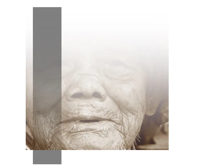
这是否可以做到呢?只用CSS,就像这张图片一样。我的意思是如果我在 <div> 标签上放置背景图像,那么我需要它从顶部到底部都是透明的。
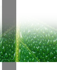
我想创造类似下面图片的东西:
这是否可以做到呢?只用CSS,就像这张图片一样。我的意思是如果我在 <div> 标签上放置背景图像,那么我需要它从顶部到底部都是透明的。
我想创造类似下面图片的东西:
正如其他答案所述:使用CSS无法使图像从上到下透明。
但是
如果您有一个纯色背景(或类似的),您可以使用CSS3插入阴影来模拟透明度。对于图像白色覆盖层和半透明黑色矩形。在下面的演示中,我使用伪元素来最小化HTML标记。
输出:
HTML:
<div class="image"></div>
CSS:
.image{
    position:relative;
    height:500px;
    width:500px;
    margin:50px auto;
    background: url('http://lorempixel.com/output/people-q-c-640-480-8.jpg');
    background-size:cover;
    -moz-box-shadow: inset 0px 850px 500px -500px #fff;
    -webkit-box-shadow: inset 0px 850px 500px -500px #fff;
    -o-box-shadow: inset 0px 850px 500px -500px #fff;
    box-shadow: inset 0px 850px 500px -500px #fff;
}
.image:before,.image:after{
    content:'';
    position:absolute;
    left:5%;
    opacity:0.5;
}
.image:before{
    top:0;
    width:20%;
    height:100%;
    -moz-box-shadow: inset 0px 850px 500px -500px #000;
    -webkit-box-shadow: inset 0px 850px 500px -500px #000;
    -o-box-shadow: inset 0px 850px 500px -500px #000;
    box-shadow: inset 0px 850px 500px -500px #000;
}
.image:after{
    width:20%;
    height:10%;
    top:100%;
    background:#000;
}
实际上,你可以在Webkit中做到这一点!Mozilla允许使用SVG遮罩,但我不会深入介绍。IE中完全不支持。
演示:JSFiddle
HTML:
<div>
    <img src="http:/www.fillmurray.com/300/200"/>
</div>
CSS:
div {
  -webkit-mask-size: 300px 200px;
  -webkit-mask-image: -webkit-gradient(linear, center top, center bottom,
  color-stop(0.00,  rgba(0,0,0,0)),
  color-stop(1.00,  rgba(0,0,0,1)));
}
-webkit-)mask-image: linear-gradient()了。https://jsfiddle.net/19ps6vry/ - Kaiido<html>
<head>
</head>
<body>
<img src="http://upload.wikimedia.org/wikipedia/meta/6/6d/Wikipedia_wordmark_1x.png" />
<div class="whatever"></div>
</body>
</html>
body {
    margin:0px;
}

img {
    height:30px;
    position:relative;
}

.whatever {
    background-image: -webkit-gradient(
        linear,
        left top,
        left bottom,
        color-stop(0, #ff00ff),
        color-stop(1, rgba(0,0,0,0))
    );
    background-image: -o-linear-gradient(bottom, #ff00ff 0%, rgba(0,0,0,0) 100%);
    background-image: -moz-linear-gradient(bottom, #ff00ff 0%, rgba(0,0,0,0) 100%);
    background-image: -webkit-linear-gradient(bottom, #ff00ff 0%, rgba(0,0,0,0) 100%);
    background-image: -ms-linear-gradient(bottom, #ff00ff 0%, rgba(0,0,0,0) 100%);
    background-image: linear-gradient(to bottom, #ff00ff 0%, rgba(0,0,0,0) 100%);
    height:30px;
    position:relative;
    width:100px;
    top:-34px;
}
你应该使用 background CSS 属性,并使用自定义的 linear-gradient 值来满足你的要求。
background: linear-gradient(to bottom, rgba(255,255,255,1) 30%,rgba(0,0,0,0) 100%);
<div class="wrapper">
    <div class="imgwrap">
    <img src="http://lorempixel.com/output/nature-q-c-200-200-2.jpg" alt=""/>
    </div>
</div>
body {
    background-color: #bada55;
}

.wrapper {
    height:240px;
    display: inline-block;
    margin: 25px;
    border:1px solid grey;
    background-color: white;
    padding:8px;
}

.imgwrap {
    display: inline-block;
    position: relative;
}

.imgwrap:after {
    position: absolute;
    content:"";
    top:0;
    left:0;
    width:100%;
    height:100%;
    background: linear-gradient(rgba(255,255,255,1) 35%, rgba(255,255,255,0) 100%);
    z-index:1;

}
使用position: absolute和z-index将渐变div覆盖在图像上:
CSS
section{
    margin:0px 0px;
    padding:0px 0px;
    width: 300px;
    display:block;
    height: auto;
    position:relative;
}
section #overlay{
    position:absolute;
    top:0;
    left:0;
    right:0;
    background: -webkit-linear-gradient(top, rgba(0,0,0,0), rgba(255,255,255,1)); /* For Safari 5.1 to 6.0 */
    background: -o-linear-gradient(bottom, rgba(255,255,255,0), rgba(255,255,255,1)); /* For Opera 11.1 to 12.0 */
    background: -moz-linear-gradient(bottom, rgba(255,255,255,0), rgba(255,255,255,1)); /* For Firefox 3.6 to 15 */
    background: linear-gradient(to bottom, rgba(255,255,255,0), rgba(255,255,255,1)); /* Standard syntax (must be last) */
width:100%;
height:100%;
z-index:2;
}
section #imgContainer{
    width: 300px;
    height: auto;
    margin: 0px 0px;
    padding: 0px 0px;
    overflow: hidden;
    display: inline-block;

}
section #imgContainer img{
    width: 300px;
    padding: 0;
    margin: 0;
    display: block;

}
HTML
  <section>
        <div id="overlay">
        </div>
        <div id="imgContainer">
           <img src="" />
        </div>
    </section>