最近我写了一些JavaScript代码来生成随机的虚拟股票数据,因为我想展示一个图表,一开始看起来像真实的股票数据 - 但我得到的只是相当简单的结果。我想知道是否有一些资源可以解释如何“正确”地完成此操作,即获取具有与真实股票数据相同模式的逼真数据?
12个回答
74
一个简单的算法是使用一个简单的波动率数值,限制股票在给定时间内(比如一天)内可以变化的幅度。数值越高,波动性越强。因此,您每天可以通过以下方式计算新价格:
rnd = Random_Float(); // generate number, 0 <= x < 1.0
change_percent = 2 * volatility * rnd;
if (change_percent > volatility)
    change_percent -= (2 * volatility);
change_amount = old_price * change_percent;
new_price = old_price + change_amount;
一个稳定的股票波动率可能只有2%。而10%的波动率将会表现出相当大的波动。
不是完美的,但它看起来可能相当真实。
样本
- Jim Mischel
8
10
我曾经有一本书 《分形市场分析》(最近才摆脱它),讲述了股票价格的统计特性。虽然对于投资来说没有多大用处,但它可能能帮到你。
你需要建立一个模拟具有所需统计特性的随机过程的东西。两个随机过程的例子是高斯白噪声和维纳过程(后者模拟布朗运动,并且也是小步行走的随机游走的极限)。
如果我没记错的话,《分形市场分析》中声称股票价格的对数具有类似于所谓的“1/f噪声”或“粉色噪声”的特性,因此您可以尝试寻找关于软件中生成粉色噪声的文章。(然后将结果插入e^x)(编辑:哎呀,我记错了。看起来更像分数布朗运动)
(这里有一篇很好的可读文章,讲述了研究分形随机过程背后的历史——以及尼罗河的洪水如何与股票市场相关——不幸的是它没有涉及到技术数据,但也许有像Hurst指数这样的搜索词可以帮助您入门。)
如果您需要多个系列的股票数据,问题会变得更加困难。(在这种情况下,股票之间存在一些相关性,这取决于各种共同因素,例如国家经济、行业类型等)。我不确定该如何处理,但是先从一个随机过程开始。
- Jason S
2
谢谢你。我得开始阅读了!是的,我明白你所说的多股票 - 我想如果你想模仿特定行业中倾向于一起上下的股票,那么它就更加复杂。此外,要使其在不同时间段内看起来好看 - 例如,日,月和年,那么这似乎是一个真正的挑战! - Mark Rhodes
它也可能是一条突然引向整个市场的消息。 - mouviciel
8
# The following is an adaptation from a program shown at page 140 in
# "Stochastic Simulations and Applications in Finance",
# a book written by Huynh, Lai and Soumaré.
# That program was written in MatLab and this one was written in R by me.
# That program produced many price paths and this one produces one.
# The latter is also somewhat simpler and faster.

# Y is the time period in years, for instance 1 (year)
# NbSteps is the number of steps in the simulation,
# for instance 250 (trading days in a year).
# DeltaY is the resulting time step.

# The computations shown implement the exact solution
# to the stochastic differential equation for
# the geometric Brownian motion modelling stock prices,
# with mean mu and volatility sigma, thus generating a stochastic price path
# such as that exhibited by stock prices when price jumps are rare.

PricePath <- function(Y,NbSteps,mu,sigma,InitPrice) {
    DeltaY <- Y/NbSteps; SqrtDeltaY <- sqrt(DeltaY)
    DeltaW <- SqrtDeltaY * rnorm(NbSteps)
    Increments <- (mu-sigma*sigma/2)*DeltaY + sigma*DeltaW
    ExpIncr <- exp(Increments)
    PricePath <- cumprod(c(InitPrice,ExpIncr))
    return(PricePath)
}
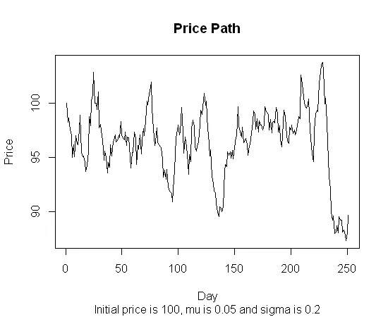
- Jean-Victor Côté
7
有几个答案给出了一个相当传统的解释:使用几何布朗运动来模拟股票价格。但有一个主要原因需要考虑这是错误的。真实的股票价格与几何布朗运动并不类似。稍后我会解释这个原因。
在教材中使用GBM来模拟股票价格过程的原因是为了简单起见。它帮助您推导出一些基本结果,这些结果似乎是“基本正确”的。然而,这并不意味着您应该认为这就是股票价格的真实模样。那就像推导出一种忽略摩擦的运动方程(理论上非常有用),然后认为这就是现实生活中的运动模式,例如每个人都像溜冰鞋一样在鞋子上滑动。
GBM理论上最有用的一个特性之一是未来的变化与过去的变化无关。股票价格也是如此吗?并非如此。序列相关性无处不在。不仅如此,大幅度的下跌通常会导致波动性增加,而大幅度的上涨通常会导致波动性降低。
我想我可能会被指责为龟毛。但这些风格化的事实对投资者和经济学家来说是常识,因此我认为可以说,对于熟悉股票市场行为的任何人来说,GBM看起来并不现实。
计量经济学家已经提出了很多股票价格模型。在许多情况下似乎有效的是一个有条件平均自回归模型和一个波动性(G)Arch类型模型的组合。对于波动性模型,一个带有fat-tail分布的非对称GARCH(例如学生t分布)似乎是各种金融市场中最有效的。
- C S
6
我写了一个简单的 JavaScript 版本,灵感来自 Peter P. 的回答。我需要创建每周、每年和总体趋势,因此它接受一组参数并将它们叠加以获得更复杂(虚假)的趋势。
  function getRandomData(numPoints, center, min, max, cycles)
{
    var result = [];
    var phase = Math.random() * Math.PI;
    var y = center;

    function randomPlusMinus() { return (Math.random() * 2) - 1; }

    $.each(cycles, function(i,thisCycle) {
        thisCycle.phase = Math.random() * Math.PI;
        thisCycle.increment = Math.PI / thisCycle.length;
    });

    for (var i = 0; i < numPoints; i++)
    {
        $.each(cycles, function(i,thisCycle) {
            thisCycle.phase += thisCycle.increment * randomPlusMinus();
            y += (Math.sin(thisCycle.phase) * (thisCycle.variance / thisCycle.length) * (randomPlusMinus() * thisCycle.noise)) + (thisCycle.trend / thisCycle.length);

        });
        if (min) y = Math.max(y,min);
        if (max) y = Math.min(y,max);
        result.push(y);
    }

    return result;
}

var data = getRandomData(365,80,20,100,
                      [{ length: 7, variance: 50, noise: 1, trend: 0},
                       { length: 365, variance: 30, noise: 1, trend: 0},
                       { length: 700, variance: 2, noise: 0, trend: 100}]);
我在那里放了一个图表来展示结果:http://jsfiddle.net/z64Jr/3/
- Andrej Kyselica
3
我想回复Jim Mischel上面的帖子(https://dev59.com/Z2oy5IYBdhLWcg3wYc4l#8597889),但由于我想加入代码,所以被迫在这里发表我的回复。
基于Jim Mischel的算法,我实现了以下Java代码,并且它很好地满足了我的需要,生成的数字在绘制图表时,能够产生外观逼真、吸引人的股票行情。
Java:
private float getNextPrice(float oldPrice)
{
    // Instead of a fixed volatility, pick a random volatility
    // each time, between 2 and 10.
    float volatility = _random.nextFloat() * 10 + 2;

    float rnd = _random.nextFloat();

    float changePercent = 2 * volatility * rnd;

    if (changePercent > volatility) {
        changePercent -= (2 * volatility);
    }
    float changeAmount = oldPrice * changePercent/100;
    float newPrice = oldPrice + changeAmount;

    // Add a ceiling and floor.
    if (newPrice < MIN_PRICE) {
        newPrice += Math.abs(changeAmount) * 2;
    } else if (newPrice > MAX_PRICE) {
        newPrice -= Math.abs(changeAmount) * 2;
    }

    return newPrice;

}
请注意,正如wiggles在他的评论中指出的那样,当声明changeAmount变量时,我需要将百分比除以100。
- Robin Zimmermann
1
看看雅虎财经,它们提供来自股票交易所的免费延迟数据和图表。
这里有一篇关于如何使用该源的文章: http://www.codeproject.com/KB/aspnet/StockQuote.aspx
您需要 JQuery 或者可以直接使用 XMLHttpRequest 来消费该服务。提示一下:JQuery 有一个用于处理 CSV 的插件:http://code.google.com/p/js-tables/
- Nickz
1
1或者,根据需要,可以下载具有长时间历史记录的实际股票价格系列(意思是:没有即时更新)。 - Predictor
1
我需要为我正在开发的模拟游戏创建一些虚拟市场数据。我需要这些数据看起来像市场数据,但仍然保持在某些范围内,以便于在起始价格、当天最高/最低价方面可以预测。
最终,我结合了不同频率的正弦波,并加入了一些随机因素,结果不仅好看,而且是一致的(你不会得到任何奇怪的东西)。即使可以感知到正弦波模式,它看起来仍然很好。
随机生成的市场数据
代码是用BASIC脚本语言编写的,但应该非常容易理解和转换成您想要的任何语言。一旦你有了归一化数据数组,将值乘以你想要的最大值就可以得到一个有界数据集。
dim values[] as float
dim offsets[] as integer
dim frequencies[] as float

function GetPoint(x#, f#, a#, o#)

    f# = 360.0 / f#

    x# = FMod(x# + o#, f#)
    angle# = (x# / f#) * 360.0

    r# = Sin(angle#) * a#

endfunction r#

function Generate()

    // Empty arrays
    offsets.Length = -1
    frequencies.Length = -1
    values.Length = -1

    offsets.Insert(Random(0, 359))
    offsets.Insert(Random(0, 359))
    offsets.Insert(Random(0, 359))

    f# = Random(100, 300)
    f# = f# / 1000.0
    frequencies.Insert(f#)
    f# = Random(500, 1000)
    f# = f# / 1000.0
    frequencies.Insert(f#)
    f# = Random(2000, 4000)
    f# = f# / 1000.0
    frequencies.Insert(f#)

    c# = 0
    for i = 0 to 1919
        v# = 0
        v# = v# + GetPoint(i, frequencies[0], 190, offsets[0])
        v# = v# + GetPoint(i, frequencies[1], 85, offsets[1])
        v# = v# + GetPoint(i, frequencies[2], 40, offsets[2])

        r# = Random(0, 40)
        r# = r# - 20.0

        c# = Clamp(c# + r#, c# - 40, c# + 40)
        v# = v# + c#

        values.Insert(v#)
    next i

    start# = values[0]
    max# = 0.0
    for i = 0 to values.Length
        values[i] = values[i] - start#
        if Abs(values[i]) > max#
            max# = Abs(values[i])
        endif
    next i

    // Normalize
    for i = 0 to values.Length
        values[i] = (values[i] / max#)
    next i

endfunction

function Clamp(v#, min#, max#)

    if v# < min#
        exitfunction min#
    elseif v# > max#
        exitfunction max#
    endif

endfunction v#
- John Stabler
2
我将它转换为ES6,但生成的数据与您的示例图不符。您能解释一下生成的数据应该如何绘制吗?谢谢。 - PRS
数据已经被归一化,因此您需要将其乘以您所寻找的最大值。然后只需迭代数据并绘制即可。 - John Stabler
0
以上算法的Golang代码,由@Jim Mischel编写。
package main

import (
    "fmt"
    "math/rand"
)

func main() {

    var (
        change_percent, change_amount, new_price, old_price float64
    )
    volatility := 0.02
    old_price = 50

    for i := 0; i < 100; i++ {
        rnd := rand.Float64() // generate number, 0 <= x < 1.0
        // fmt.Printf("rnd %v ", rnd)
        change_percent = 2 * volatility * rnd
        // fmt.Printf("change_percent %v\n", change_percent)
        if change_percent > volatility {
            change_percent = change_percent - (2 * volatility)
        }
        change_amount = old_price * change_percent
        new_price = old_price + change_amount
        fmt.Printf("new_price %f\n", new_price)
        new_price = old_price
    }

}
- JBB
0
这是我用 Ruby 的尝试! :) 这将输出一个字符串,您可以将其复制并粘贴到 Google 图表中。我允许数据呈正趋势、负趋势或无趋势。这段代码可能需要进行优化和/或调整以实现随机性/规律性。
Google 图表:https://code.google.com/apis/ajax/playground/?type=visualization#line_chart
# In order to generate a semi-realistic looking graph behavior
# we use a sine function to generate period behavior.  In order to avoid
# a graph that is too regular, we introduce randomness at two levels:
# The delta between steps across the x-axis is random, but within a range(deltavariance)
# The wavelength of the sine function is varied by randomly incrementing the index we pass
# to the sine function(sine_index)

# CONFIGURATION VARIABLES
yvalue = 1 # start value
range = 100 # y-range
deltavariance = 10 # allowable variance between changes
sine_index, wavelength = 0, 0.33 #index into our sine function that determines whether we change direction or not
i, maxi = 0, 100 # our counter and its maximum
data = {sine_index => yvalue} # seed our data structure with its first value
trend = :positive # :negative, :none # do we want the graph to trend upwards, downwards or neither
periodmin, periodmax = 0, 0 # vars to enforce trending
direction = 1 # start in a positive direction, -1 for negative

# DO NOT EDIT BELOW THIS LINE
while(i < maxi)

  olddirection = direction
  direction = Math.sin(sine_index).to_f
  direction = direction < 0 ? direction.floor : direction.ceil

  delta = rand(deltavariance)
  yvalue += delta * direction

  if trend == :positive
    yvalue = periodmin if yvalue < periodmin
    periodmin = yvalue if olddirection < direction
  elsif trend == :negative
    yvalue = periodmax if yvalue > periodmax
    periodmax = yvalue if olddirection > direction

  end

  data[sine_index] = yvalue
  sine_index += Math.sin(rand) # Math.sin(rand) will give random numbers from -1..1
  i += 1
end

code = <<-CODE
function drawVisualization() {
  // Create and populate the data table.
  var data = google.visualization.arrayToDataTable([
    ['x', 'Cats'],
    DATASTR
  ]);

  // Create and draw the visualization.
  new google.visualization.LineChart(document.getElementById('visualization')).
      draw(data, {curveType: "function",
                  width: 500, height: 400,
                  vAxis: {maxValue: 10}}
          );
}
CODE

datastr = data.collect{|k,v|  "[#{k},#{v}]"}.join(",")
code = code.gsub('DATASTR', datastr)
puts code
- Peter P.
1
抱歉,不知道为什么语法高亮没有起作用...请查看这个 pastie:http://pastie.org/8494639 - Peter P.
网页内容由stack overflow 提供, 点击上面的可以查看英文原文,
原文链接
原文链接
rnd = Random_Float() - 0.5;然后移除if (change_percent > volatility) change_percent -= (2 * volatility);- Lawrence Wagerfield