如何重复使用绘图艺术家(Line2D)?

13

如何在后续的图中重复使用.plot中的绘图线?

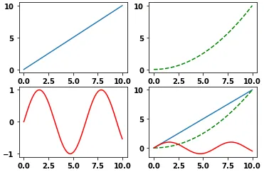
我想在4个坐标轴上制作图形,前三个坐标轴上各有一个单独的绘图,最后一个坐标轴上有所有3个图的绘图。 以下是代码:

from numpy import *
from matplotlib.pyplot import *
fig=figure()
data=arange(0,10,0.01)
ax1=fig.add_subplot(2,2,1)
ax2=fig.add_subplot(2,2,2)
ax3=fig.add_subplot(2,2,3)
ax4=fig.add_subplot(2,2,4)

line1=ax1.plot(data,data)
line2=ax2.plot(data, data**2/10, ls='--', color='green')
line3=ax3.plot(data, np.sin(data), color='red')
#could I somehow use previous plots, instead recreating them all?
line4=ax4.plot(data,data)
line4=ax4.plot(data, data**2/10, ls='--', color='green')
line4=ax4.plot(data, np.sin(data), color='red')
show()

下面是生成的图片:
输入图片描述
是否有一种方法可以先定义绘图,然后将它们添加到坐标轴上,最后再绘制它们?以下是我考虑的逻辑:

#this is just an example, implementation can be different
line1=plot(data, data)
line2=plot(data, data**2/10, ls='--', color='green')
line3=plot(data, np.sin(data), color='red')
line4=[line1, line2, line3]

现在将line1绘制在ax1上,line2绘制在ax2上,line3绘制在ax3上,将line4绘制在ax4上。

4个回答

7
  • OP中请求的实现无法工作,因为plt.plot返回的Line2D绘图Artist无法被重复使用。试图这样做将导致RuntimeError,如def set_figure(self, fig):所述。
  • 在OP中,line1与直接使用Line2D方法创建的line1不同,因为绘制的Artist具有不同的属性。
  • 关于seabornmatplotlib的API,像seaborn.lineplot这样的轴级别绘图会返回一个axes:
    • p = sns.lineplot(...)然后p.get_children()获取Artist对象。
  • 可以直接使用方法创建绘图Artist,例如matplotlib.lines.Line2D,并在多个绘图中重复使用。
  • 更新了使用标准导入实践、子图和不使用列表推导式进行副作用的代码(Python反模式)。
  • python 3.8.11matplotlib 3.4.3中测试通过
  • import numpy as np
    from copy import copy
    import matplotlib.pyplot as plt
    from matplotlib.lines import Line2D
    
    # crate the figure and subplots
    fig, axes = plt.subplots(2, 2)
    
    # flatten axes into 1-D for easy indexing and iteration
    axes = axes.ravel()
    
    # test data
    data=np.arange(0, 10, 0.01)
    
    # create test lines
    line1 = Line2D(data, data)
    line2 = Line2D(data, data**2/10, ls='--', color='green')
    line3 = Line2D(data, np.sin(data), color='red')
    lines = [line1, line2, line3]
    
    # add the copies of the lines to the first 3 subplots
    for ax, line in zip(axes[0:-1], lines):
        ax.add_line(copy(line))
    
    # add 3 lines to the 4th subplot
    for line in lines:
        axes[3].add_line(line)
        
    # autoscale all the subplots if needed
    for _a in axes:
        _a.autoscale()
    
    plt.show()
    

    enter image description here

    原始答案

    • 这里是一个可能的解决方案。我不确定它是否很漂亮,但至少它不需要重复编码。

    Translated Answer

    • 这里有一个可能的解决方案。我不确定它是否很漂亮,但至少它不需要代码重复。
    import numpy as np, copy
    import matplotlib.pyplot as plt, matplotlib.lines as ml
    
    fig=plt.figure(1)
    data=np.arange(0,10,0.01)
    ax1=fig.add_subplot(2,2,1)
    ax2=fig.add_subplot(2,2,2)
    ax3=fig.add_subplot(2,2,3)
    ax4=fig.add_subplot(2,2,4)
    
    #create the lines
    line1=ml.Line2D(data,data)
    line2=ml.Line2D(data,data**2/10,ls='--',color='green')
    line3=ml.Line2D(data,np.sin(data),color='red')
    #add the copies of the lines to the first 3 panels
    ax1.add_line(copy.copy(line1))
    ax2.add_line(copy.copy(line2))
    ax3.add_line(copy.copy(line3))
    
    [ax4.add_line(_l) for _l in [line1,line2,line3]] # add 3 lines to the 4th panel
    
    [_a.autoscale() for _a in [ax1,ax2,ax3,ax4]] # autoscale if needed
    plt.draw()
    

    1

    我在Jupyter笔记本中有一个更简单的用例。假设您已经在某个地方存储了一个图形对象,那么如何重新绘制它呢。 例如:

    代码块 1:

    f = plt.figure(figsize=(18, 6))
    f.suptitle("Hierarchical Clustring", fontsize=20)
    dendrogram(Z, color_threshold=cut_off,
               truncate_mode='lastp',
               p=20)
    

    单元格 2:

    #plot f again, the answer is really simple
    f
    plt.show()
    

    就是这样。好处在于您可以将数字存储在对象中,并在必要时随后使用它们。


    1

    我认为你的用法是正确的,但你可以像这样将所有的x,y数据对传递给plot(尽管这会使它非常难以阅读!):

    ax4.plot(data, data, data, data**2 / 10, data, np.sin(data))
    

    一个有趣的不同做法是这样的:

    graph_data = [(data, data), (data, data**2 / 10), (data, np.sin(data))]
    [ax4.plot(i,j) for i,j in graph_data]
    

    我通常会用错误的方式做事,但我一定变得更好了。 :) 我点赞了两个解决方案,选定接受的答案是随意的。 - enedene

    0

    此外,这个问题提供了一个很好的示例,展示如何引用先前的轴:

    fix, ax = plt.subplots(2, 2)
    ax[0,1].plot(data, data**2 / 10, ls='--', color='g')
    

    但也解释了如何使用以下方式在每个子图中插入标题:

    ax[0,1].set_title('Simple plot')
    

    ax的维度取决于subplot参数:如果它们只是水平或垂直平铺,ax只需要一个索引。


    网页内容由stack overflow 提供, 点击上面的
    可以查看英文原文,
    原文链接