响应式导航栏,类似于StackOverflow。

3

我正在尝试创建一个响应式的导航栏,类似于Stack Overflow上的导航栏。 我已经附加了一个布局图像,以显示我想要实现的布局。

Layout

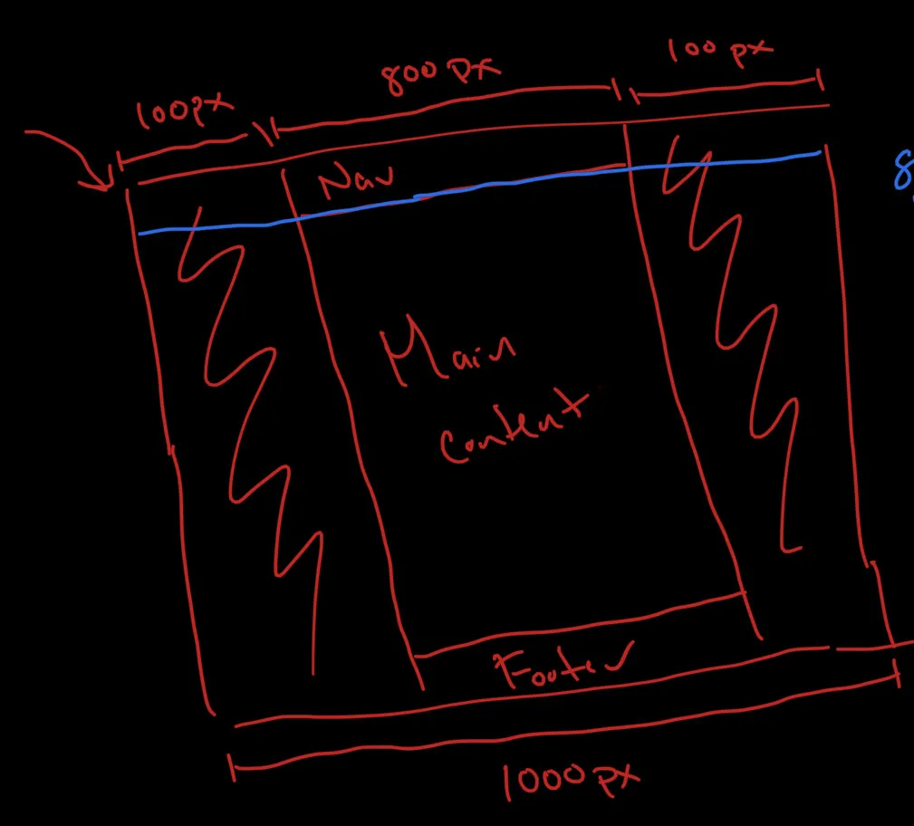
为了简单起见,我添加了一些值,使其更易于跟踪。 有一个外部div,它封装整个页面,outer-wrapper和封装主要内容(导航栏、主内容和页脚)的主div,main-wrapper

现在假设outer-wrapper宽度为1000px,main-wrapper宽度为800px,则左侧和右侧会有100px的缓冲区。 当窗口缩小时,我希望先使用缓冲区再更改任何主要内容。

CSS

    .outer-wrapper {
        width:  100%;
    }

    .main-wrapper {
        width: 800px;
        display: flex;
        flex-direction: column;
        margin-left: auto;
        margin-right: auto;
        position: relative;
    }
    .nav-home {
        position: fixed;
        top: -30px;
        left: -30px;
        height: 60px;
        width: 100%;
        padding: 20px 20px 0px 20px;
        display: flex;
        justify-content: space-around;
    }
}

HTML

    <div class='outer-wrapper'>
      <div class='main-wrapper'>
        <div class='nav-bar'>...</div>
        <div class='main-content'>...</div>
        <div class='footer'>...</div>
      </div>
    </div>

问题在于当窗口缩小到与main-wrapper的宽度匹配时,导航栏仍然具有左右边距。我该如何确保当左右边距缩小为0时,导航栏的宽度与主内容和页脚的宽度匹配?
谢谢。
2个回答

3

我从.nav-bar类中删除了部分样式,它似乎按照您的要求进行了表现-我错过了什么吗?

我添加了颜色以帮助可视化调整大小。

.outer-wrapper {
    background-color: yellow;
    width:  100%;
}

.main-wrapper {
    background-color: blue;
    width: 800px;
    display: flex;
    flex-direction: column;
    margin-left: auto;
    margin-right: auto;
    position: relative;
}

.nav-bar {
    background-color: red;
    justify-content: space-around;
}

.main-content {
  background-color: green;
}

.footer {
  background-color: purple;
}
<div class='outer-wrapper'>
  <div class='main-wrapper'>
    <div class='nav-bar'>Nav Bar</div>
    <div class='main-content'>Main Content</div>
    <div class='footer'>Footer</div>
  </div>
</div>


哦,糟糕,我意识到在导航栏项目中有一些额外的margin-left/right。不过还是谢谢你的帮助!希望这能帮助其他想做同样事情的人 :P - jeff

1

.outer-wrapper {
        width: 100%;
      }

      .main-wrapper {
        width: 800px;
        display: flex;
        flex-flow: row wrap;
        font-weight: bold;
        text-align: center;
        margin: 0 auto;
      }

      .main-wrapper > * {
        padding: 10px;
        flex: 1 100%;
      }

      .nav-bar {
        background: tomato;
      }

      .footer {
        background: lightgreen;
      }

      .main-content {
        background: deepskyblue;
      }

      .aside-1 {
        background: gold;
      }

      .aside-2 {
        background: hotpink;
      }

      @media all and (min-width: 600px) {
        .aside {
          flex: 1 0 0;
        }
      }

      @media all and (min-width: 800px) {
        .main-content {
          flex: 3 0px;
        }
        .aside-1 {
          order: 1;
        }
        .main-content {
          order: 2;
        }
        .aside-2 {
          order: 3;
        }
        .footer {
          order: 4;
        }
      }

      body {
        padding: 2em;
      }
<div class="outer-wrapper">
      <div class="main-wrapper">
        <nav class="nav-bar">Navbar</nav>
        <main class="main-content">content</main>
        <aside class="aside aside-1">aside 1</aside>
        <aside class="aside aside-2">aside 2</aside>
        <footer class="footer">footer</footer>
      </div>
    </div>

这是我编写的代码,希望它能帮助您并达到您的期望。


网页内容由stack overflow 提供, 点击上面的
可以查看英文原文,
原文链接