在R中的条形图面板中插入勾号和x轴标签

4

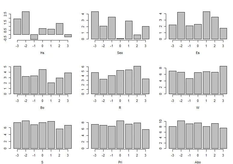
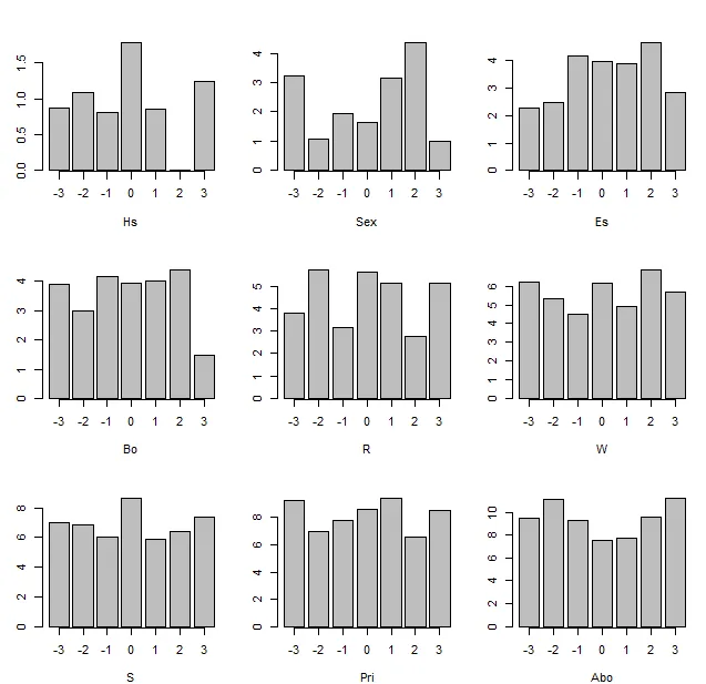
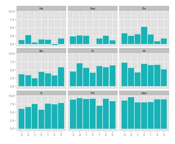
我想在3x3条形图中除了xlab之外还包括刻度线。我尝试了这个解决方案,对于单个图表它可以工作,但是我无法成功复制它。思路是用从-3到+3的单位增量标记每个条形图上的d。每个图中的第一个条表示值为-3。我尝试使用下面模拟数据演示我的问题。有什么建议吗?

# Data generation

# Populating a matrix
matrix(rnorm(63, 1:9), nrow=7, byrow=TRUE)

# Labelling the matrix
colnames(mat.s) <- c("Hs", "Sex", "Es", "Bo", "R", "W", "S", "Pri", "Abo")

# Tick mark indicator
d <- seq(-3,3,1)

# Plotting estimates
par(mfrow=c(3,3), mar = c(4,3,3,1))

for(i in 1:9) {

# Bar plot
barplot(mat.s[,i],

# X-label
xlab = colnames(mat.s)[i])

}

它必须基于R吗?你能展示你是如何实现解决方案的吗? - Heroka
要创建矩阵,可以使用 matrix(rnorm(63, 1:9), nrow=7, byrow=TRUE) - eipi10
3个回答

5

在循环中在barplot函数内指定axis.ltynames.argmgp,你就可以正常运行了:

#I haven't changed anything else before the for-loop
#only changes have taken place inside the barplot function below
for(i in 1:9) {
  # Bar plot
  barplot(mat.s[,i], xlab = colnames(mat.s)[i], 
          names.arg= as.character(-3:3), axis.lty=1, mgp=c(3,1,0.2))
}

输出:

在此输入图片描述

稍微详细一些:

  • names.arg将添加标签
  • axis.lty=1将添加x轴
  • mgp是一个长度为三的向量,按照标题、标签和轴线的顺序控制边距。我只需要将其中第三个元素更改为0.2,使轴线看起来不错(请查看?par)。

非常欢迎 @AlexRead :)。很高兴我能帮到你! - LyzandeR

3

除了LyzandeR的优秀答案之外,还可以在将barplot()调用分配给一个对象后添加axis()

for(i in 1:9) {

  # Bar plot
  temp <- barplot(mat.s[,i],

  # X-label
  xlab = colnames(mat.s)[i])
  axis(1,at=temp,labels=-3:3)
}

enter image description here


2

这是一个 ggplot 版本:

library(dplyr)
library(reshape2)
library(ggplot2)

# Add x-labels and reshape to long format then plot
ggplot(mat.s %>% mutate(x=-3:3) %>% melt(id.var="x"), 
       aes(x=x, y=value)) +
  geom_bar(stat="identity", fill=hcl(195,100,65)) +
  facet_wrap(~variable) +
  labs(x="", y="") +
  scale_x_continuous(breaks=-3:3)  

enter image description here


网页内容由stack overflow 提供, 点击上面的
可以查看英文原文,
原文链接