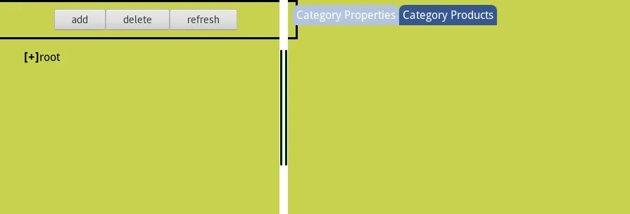
我有一个分屏HTML页面。水平flex布局中有三个DIV,左右两个窗格用于内容显示。左侧窗格上的按钮栏设置为100%宽度,但它超出了父元素。可能的原因是什么?
 以下是innerHTML的详细信息:
body {
    padding: 0px;
    margin: 0px;
    background-color: rgb(200, 210, 80);
    font-family: 'Droid Sans', sans-serif;
}

.colsplit {
    height: 12px;
    width: 100%;
    background-color: white;
    background-image: url("http://www.vitacoll.co.uk/assets/images/splitterv.png");
    background-repeat: no-repeat;
    background-position: center;
    cursor: ns-resize;
}

.rowsplit {
    height: 100%;
    width: 12px;
    background-color: white;
    background-image: url("http://www.vitacoll.co.uk/assets/images/splitterh.png");
    background-repeat: no-repeat;
    background-position: center;
    cursor: ew-resize;
}

.top {
    overflow: auto;
}

.treeul {
    list-style: none;
    user-select: none;
    -moz-user-select: none;
}

.treeli {
    margin: 3px;
    list-style-type: none;
}

.treeli span:first-of-type {
    user-select: none;
    font-weight: bold;
    cursor: pointer;
}

.folderselected {
    background-color: blue;
    color: white;
}

.fileselected {
    margin: 3px;
    background-color: blue;
    color: green;
}

.loading {
    z-index: 100;
    position: fixed;
    height: 100%;
    width: 100%;
    background-color: rgba(255, 255, 255, 1);
    cursor: wait;
}

.blankout {
    opacity: 0;
    z-index: -10;
    position: fixed;
    display: flex;
    height: 100%;
    width: 100%;
    background-color: rgba(255, 255, 255, 0.6);
    justify-content: center;
    align-items: center;
}

.square {
    padding: 15px;
    background-color: rgb(232, 123, 4);
    border: 1px solid;
}

.square p {
    display: flex;
}

.square label {
    flex-basis: 30%;
    text-align: right;
    padding: 5px;
}

.tabselected {
    -moz-user-select: none;
    background-color: #b3c3dd;
    color: white;
    flex-basis: auto;
    padding: 5px;
    border-radius: 8px 8px 0px 0px;
}

.tabnormal {
    -moz-user-select: none;
    background-color: #37588e;
    color: white;
    flex-basis: auto;
    padding: 5px;
    border-radius: 8px 8px 0px 0px;
}

#category_props {}

#category_items {
    display: none;
}

#rightpane {
    display: flex;
    flex-direction: column;
}

#content {
    background-color: #b3c3dd;
}

#tabs {
    display: flex;
    flex-direction: row;
    width: 100%;
    margin: 7px 7px 0px 7px;
}

#treepane {
    width: 100%;
    display: flex;
    flex-direction: column;
}

#treemenubuttonbar {
    border: 3px solid;
    padding: 10px;
    width: 100%;
    display: flex;
    flex-direction: row;
    justify-content: center;
}

#treemenubuttonbar button {
    display: block;
    flex-base: auto;
}

#treecontroller {
    width: 100%;
    flex-base: auto;
    overflow: auto;
}

#split1 {
    padding: 0px;
    border: 0px;
    position: absolute;
    width: 100%;
    height: 100%;
}<div id="split1" style="display: flex; flex-direction: row;">
<div id="treepane" style="display: flex; flex-basis: 406px;">
<div id="treemenubuttonbar">
<button id="buttonadd">add</button><button id="buttondelete">delete</button>
<button id="buttonrefresh">refresh</button>
</div>
<div id="treecontroller">
<ul class="treeul">
<li class="treeli" data-id="1">
<div data-closed="true"><span>[+]</span><span>root</span></div>
<ul style="display: none;">
<li class="treeli" data-id="2">Vitamins</li>
</ul>
</li>
</ul>
</div>
</div>
<div class="rowsplit" data-before="0" data-after="1"></div>
<div id="rightpane" style="display: flex; flex-basis: 948px;">
<div id="tabs">
<div data-id="1" class="tabselected">Category Properties</div>
<div data-id="2" class="tabnormal">Category Products</div>
</div>
<div id="category_props" style="display:none">
<form id="categorypropform">
<input name="base" type="hidden">
<p><label for="title2">Catergory Title:</label><input name="title2" required="" minlength="1" maxlength="50" type="text"></p>
<p><label for="shortname2">Shortname:</label><input name="shortname2" required="" minlength="1" maxlength="10" type="text"></p>
<p><button name="create2">Create</button></p>
<p><button name="cancel2">Cancel</button></p>
</form>
</div>
<div id="category_items"></div>
</div>
</div>
<div id="newcategory" class="blankout">
<div class="square">
<form id="newcategoryform">
<input name="base" value="" type="hidden">
<p><label for="title">Catergory Title:</label><input name="title" required="" minlength="1" maxlength="50" type="text"></p>
<p><label for="shortname">Shortname:</label><input name="shortname" required="" minlength="1" maxlength="10" type="text"></p>
<p><button name="create">Create</button></p>
<p><button name="cancel">Cancel</button></p>
</form>
</div>
</div>
box-sizing: border-box;是你想要的,但我认为它需要添加到#treemenubuttonbar(按钮包装器)而不是按钮本身。 - zgoodbox-sizing: border-box添加到包装器中即可。@Johnathon Hardy - 你做得很好,继续保持。 - trevorp