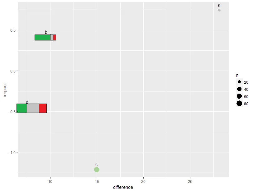
我有一个关于话题的数据,如果客户对它表达了积极、消极或中立的态度,以及这个话题的影响和与平均值的差异。
data <- data.frame(topic = c("a", "b", "c", "d"), impact = runif(4, min = -2, max = 2),
               difference = runif(4, min = -30, max = 30),n = round(runif(4, min = 1, max = 100)),
               share_positive = c(0.04, 0.9, 0.3, 0.37), share_neutral = c(0.7, 0.06, 0.48, 0.4),
               share_negative = c(0.26, 0.04, 0.22, 0.23))
我把它放在一个简单的散点图中:
ggplot(data = data, aes(x = difference, y = impact, size = n, label = topic)) +
  geom_point() +
  geom_text(size = 4, vjust = -1, colour = "black")
然后我添加了颜色来区分积极和不太积极的主题:
ggplot(data = data, aes(x = difference, y = impact, size = n, label = topic, colour = share_positive)) +
  geom_point() +
  scale_color_continuous(low = "grey", high = "green", guide = FALSE) +
  geom_text(size = 4, vjust = -1, colour = "black")
不要使用颜色,最好使用条形图来表示此主题中负面、中性和正面反馈的占比。我的想法是这样的(以b和d为例):
不幸的是,我完全不知道如何将它们组合起来,也不知道是否可能。谷歌搜索也没有帮助。你能帮我吗?
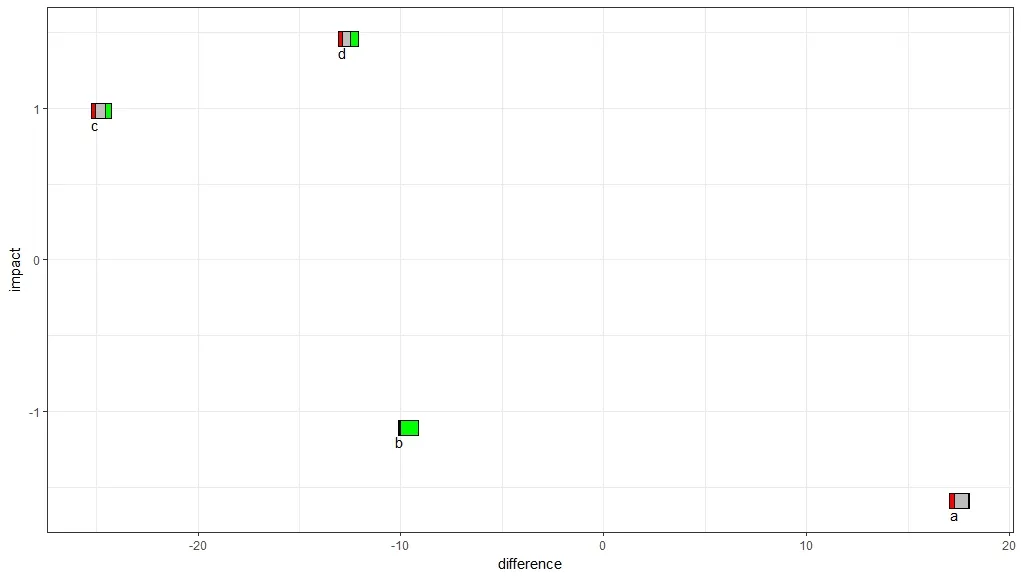
geom_rect... - abichat