请问有谁能帮忙优化在Python中使用plot函数的方法吗?我使用Matplotlib来绘制金融数据。这里是一个用于绘制OHLC数据的小函数。当我添加指标或其他数据时,时间会显著增加。
import numpy as np
import datetime
from matplotlib.collections import LineCollection
from pylab import *
import urllib2
def test_plot(OHLCV):
bar_width = 1.3
date_offset = 0.5
fig = figure(figsize=(50, 20), facecolor='w')
ax = fig.add_subplot(1, 1, 1)
labels = ax.get_xmajorticklabels()
setp(labels, rotation=0)
month = MonthLocator()
day = DayLocator()
timeFmt = DateFormatter('%Y-%m-%d')
colormap = OHLCV[:,1] < OHLCV[:,4]
color = np.zeros(colormap.__len__(), dtype = np.dtype('|S5'))
color[:] = 'red'
color[np.where(colormap)] = 'green'
dates = date2num( OHLCV[:,0])
lines_hl = LineCollection( zip(zip(dates, OHLCV[:,2]), zip(dates, OHLCV[:,3])))
lines_hl.set_color(color)
lines_hl.set_linewidth(bar_width)
lines_op = LineCollection( zip(zip((np.array(dates) - date_offset).tolist(), OHLCV[:,1]), zip((np.array(dates)).tolist(), parsed_table[:,1])))
lines_op.set_color(color)
lines_op.set_linewidth(bar_width)
lines_cl = LineCollection( zip(zip((np.array(dates) + date_offset).tolist(), OHLCV[:,4]), zip((np.array(dates)).tolist(), parsed_table[:,4])))
lines_cl.set_color(color)
lines_cl.set_linewidth(bar_width)
ax.add_collection(lines_hl, autolim=True)
ax.add_collection(lines_cl, autolim=True)
ax.add_collection(lines_op, autolim=True)
ax.xaxis.set_major_locator(month)
ax.xaxis.set_major_formatter(timeFmt)
ax.xaxis.set_minor_locator(day)
ax.autoscale_view()
ax.xaxis.grid(True, 'major')
ax.grid(True)
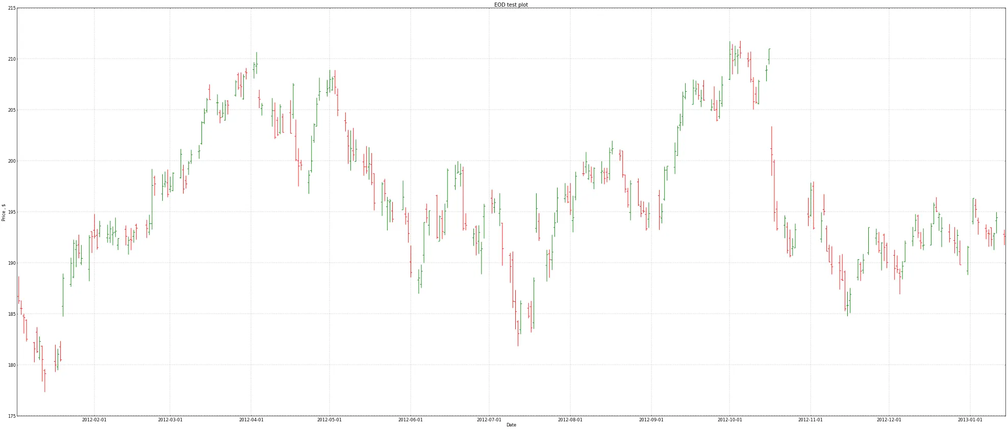
ax.set_title('EOD test plot')
ax.set_xlabel('Date')
ax.set_ylabel('Price , $')
fig.savefig('test.png', dpi = 50, bbox_inches='tight')
close()
if __name__=='__main__':
data_table = urllib2.urlopen(r"http://ichart.finance.yahoo.com/table.csv?s=IBM&a=00&b=1&c=2012&d=00&e=15&f=2013&g=d&ignore=.csv").readlines()[1:][::-1]
parsed_table = []
#Format: Date, Open, High, Low, Close, Volume
dtype = (lambda x: datetime.datetime.strptime(x, '%Y-%m-%d').date(),float, float, float, float, int)
for row in data_table:
field = row.strip().split(',')[:-1]
data_tmp = [i(j) for i,j in zip(dtype, field)]
parsed_table.append(data_tmp)
parsed_table = np.array(parsed_table)
import time
bf = time.time()
count = 100
for i in xrange(count):
test_plot(parsed_table)
print('Plot time: %s' %(time.time() - bf) / count)
结果如下所示。每个图表的平均执行时间约为2.6秒。在R中绘制图表要快得多,但我没有测量性能,也不想使用Rpy,所以我认为我的代码效率低下。
zip和拼接,但是没有太多的注释说明它实现了什么功能。作为曾经为了简洁的代码而一直这样做的人,我建议不要这样做。回来后再去审查这些代码会很痛苦... - will