使用matplotlib可视化3D聚类

3

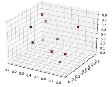
我已经将三个特征Feature1、Feature2和Feature3聚类,并得到了两个簇。我正在尝试使用matplotlib可视化一个三维簇。

在下表中,执行聚类的特征有三个。簇的数量为2。

    Feature1        Feature2    Feature3    ClusterIndex
  0 1.349656e-09    1.000000    1.090542e-09    0
  1 1.029752e-07    1.000000    6.040669e-08    0
  2 2.311729e-07    1.000000    1.568289e-11    0
  3 1.455860e-08    6.05e-08    1.000000        1
  4 3.095807e-07    2.07e-07    1.000000        1

尝试了这段代码:
   fig = plt.figure()
   ax = fig.add_subplot(111, projection='3d')
   x = np.array(df['Feature1'])
   y = np.array(df['Feature2'])
   z = np.array(df['Feature3'])
   ax.scatter(x,y,z, marker=colormap[kmeans.labels_], s=40)

然而,我遇到了错误"ValueError: could not convert string to float: red"。因此,标记部分是我遇到错误的地方。

通过在散点图中绘制点并使用聚类标签进行区分,可以很容易地进行集群的二维可视化。

只是想知道是否有一种方法可以进行三维集群可视化。

任何建议都将不胜感激!!


我遇到了一个错误:“ValueError: could not convert string to float: red”。出错的部分是标记部分。它无法将字符串转换为浮点数。强制类型转换也没有帮助。在二维绘图中,它可以工作,但不确定为什么在三维绘图中不起作用。 - user3447653
那么,colormap是什么,kmeans.labels_又是什么呢? - ImportanceOfBeingErnest
@ ImportanceOfBeingErnest :kmeans.labels 是类似于 0 和 1 的聚类索引(因为我有两个聚类)。Colormap 将标签转换为颜色。 - user3447653
1个回答

8
原则上,问题中的代码应该是有效的。但是不清楚marker=colormap[kmeans.labels_]会做什么以及为什么需要它。
3D散点图与2D版本完全相同。
marker参数期望一个标记字符串,比如"s""o"来确定标记形状。颜色可以使用参数设置。您可以提供单个颜色或颜色数组/列表。在下面的示例中,我们仅向提供聚类索引,并使用颜色映射。
import matplotlib.pyplot as plt
from mpl_toolkits.mplot3d import Axes3D
import pandas as pd
import numpy as np

v = np.random.rand(10,4)
v[:,3] = np.random.randint(0,2,size=10)
df = pd.DataFrame(v, columns=['Feature1', 'Feature2','Feature3',"Cluster"])
print (df)

fig = plt.figure()
ax = fig.add_subplot(111, projection='3d')
x = np.array(df['Feature1'])
y = np.array(df['Feature2'])
z = np.array(df['Feature3'])

ax.scatter(x,y,z, marker="s", c=df["Cluster"], s=40, cmap="RdBu")

plt.show()

enter image description here


网页内容由stack overflow 提供, 点击上面的
可以查看英文原文,
原文链接