使用flex-flow: row wrap的flex容器中,更喜欢缩小而不是增长

9

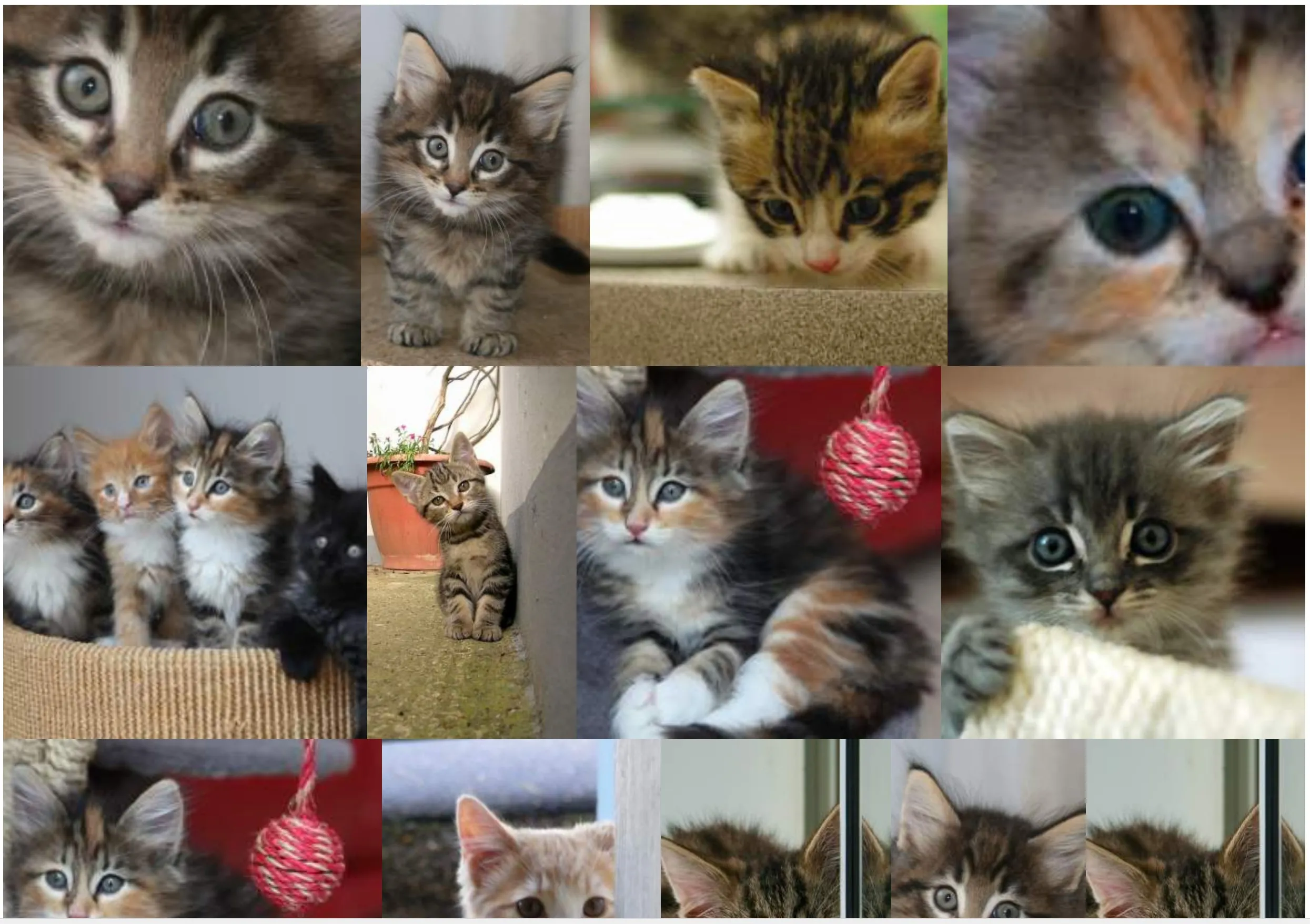
展示一个不同大小和比例的图像库,具有以下规格:

  1. 图像之间没有空白(边距)。
  2. 尽可能尊重原始比率。
  3. 图像周围有链接。
  4. 非JS解决方案。
  5. 图像可以被稍微裁剪。
  6. 可移植的解决方案。
  7. 显示的图片集是随机的。
  8. 图像必须从左到右显示(防止使用列)。

我用以下flexbox解决方案实现了这个目标:

section {
  display: flex;
  flex-flow: row wrap;
  justify-content: center;
}
section a {
  flex: auto;
}
section img {
  height: 100%;
  width: 100%;
  object-fit: cover;
}
<!DOCTYPE html>
<html lang="en">
<head>
    <title>Controlling flex growability</title>
    <meta name="viewport" content="width=device-width,initial-scale=1">
    <style>

    </style>
</head>
<body>
    <section>
        <a href="#"><img src="https://placekitten.com/400/195" width="400" height="195" alt="Kitty"></a>
        <a href="#"><img src="https://placekitten.com/256/400" width="256" height="400" alt="Kitty"></a>
        <a href="#"><img src="https://placekitten.com/400/237" width="400" height="237" alt="Kitty"></a>
        <a href="#"><img src="https://placekitten.com/400/111" width="400" height="111" alt="Kitty"></a>
        <a href="#"><img src="https://placekitten.com/400/245" width="400" height="245" alt="Kitty"></a>
        <a href="#"><img src="https://placekitten.com/400/227" width="400" height="227" alt="Kitty"></a>
        <a href="#"><img src="https://placekitten.com/250/400" width="250" height="400" alt="Kitty"></a>
        <a href="#"><img src="https://placekitten.com/400/269" width="400" height="269" alt="Kitty"></a>
        <a href="#"><img src="https://placekitten.com/400/255" width="400" height="255" alt="Kitty"></a>
        <a href="#"><img src="https://placekitten.com/288/400" width="288" height="400" alt="Kitty"></a>
        <a href="#"><img src="https://placekitten.com/234/400" width="234" height="400" alt="Kitty"></a>
        <a href="#"><img src="https://placekitten.com/194/400" width="194" height="400" alt="Kitty"></a>
        <a href="#"><img src="https://placekitten.com/222/400" width="222" height="400" alt="Kitty"></a>
        <a href="#"><img src="https://placekitten.com/400/227" width="400" height="227" alt="Kitty"></a>
        <a href="#"><img src="https://placekitten.com/192/400" width="192" height="400" alt="Kitty"></a>
        <a href="#"><img src="https://placekitten.com/400/141" width="400" height="141" alt="Kitty"></a>
        <a href="#"><img src="https://placekitten.com/400/289" width="400" height="289" alt="Kitty"></a>
        <a href="#"><img src="https://placekitten.com/400/255" width="400" height="255" alt="Kitty"></a>
        <a href="#"><img src="https://placekitten.com/210/400" width="210" height="400" alt="Kitty"></a>
        <a href="#"><img src="https://placekitten.com/400/187" width="400" height="187" alt="Kitty"></a>
    </section>
</body>
</html>

这个解决方案可以工作,但是根据窗口的大小,有些图片会被放大得太多,我更喜欢每行有更多的元素,即使这些项目需要缩小更多。

这意味着,而不是: Current solution

我更喜欢更高密度的物品,这样图像就永远不会被放大: Example of expected layout

我正在寻找解决方案,以全局增加每行的元素数量,以便图像不会被放大(或者至少不会太多:例如:最多10%)。

到目前为止,我找到的两种“hackish”解决方案是:

解决方案1

使用zoom属性:

section {
  display: flex;
  flex-flow: row wrap;
  justify-content: center;
  zoom: 50%;
}
section a {
  flex: auto;
}
section img {
  height: 100%;
  width: 100%;
  object-fit: cover;
}
<!DOCTYPE html>
<html lang="en">
<head>
    <title>Controlling flex growability</title>
    <meta name="viewport" content="width=device-width,initial-scale=1">
    <style>

    </style>
</head>
<body>
    <section>
        <a href="#"><img src="https://placekitten.com/400/195" width="400" height="195" alt="Kitty"></a>
        <a href="#"><img src="https://placekitten.com/256/400" width="256" height="400" alt="Kitty"></a>
        <a href="#"><img src="https://placekitten.com/400/237" width="400" height="237" alt="Kitty"></a>
        <a href="#"><img src="https://placekitten.com/400/111" width="400" height="111" alt="Kitty"></a>
        <a href="#"><img src="https://placekitten.com/400/245" width="400" height="245" alt="Kitty"></a>
        <a href="#"><img src="https://placekitten.com/400/227" width="400" height="227" alt="Kitty"></a>
        <a href="#"><img src="https://placekitten.com/250/400" width="250" height="400" alt="Kitty"></a>
        <a href="#"><img src="https://placekitten.com/400/269" width="400" height="269" alt="Kitty"></a>
        <a href="#"><img src="https://placekitten.com/400/255" width="400" height="255" alt="Kitty"></a>
        <a href="#"><img src="https://placekitten.com/288/400" width="288" height="400" alt="Kitty"></a>
        <a href="#"><img src="https://placekitten.com/234/400" width="234" height="400" alt="Kitty"></a>
        <a href="#"><img src="https://placekitten.com/194/400" width="194" height="400" alt="Kitty"></a>
        <a href="#"><img src="https://placekitten.com/222/400" width="222" height="400" alt="Kitty"></a>
        <a href="#"><img src="https://placekitten.com/400/227" width="400" height="227" alt="Kitty"></a>
        <a href="#"><img src="https://placekitten.com/192/400" width="192" height="400" alt="Kitty"></a>
        <a href="#"><img src="https://placekitten.com/400/141" width="400" height="141" alt="Kitty"></a>
        <a href="#"><img src="https://placekitten.com/400/289" width="400" height="289" alt="Kitty"></a>
        <a href="#"><img src="https://placekitten.com/400/255" width="400" height="255" alt="Kitty"></a>
        <a href="#"><img src="https://placekitten.com/210/400" width="210" height="400" alt="Kitty"></a>
        <a href="#"><img src="https://placekitten.com/400/187" width="400" height="187" alt="Kitty"></a>
    </section>
</body>
</html>

但这个属性在Chrome中表现很好,但在Firefox中却不行。

解决方案2

使用宽度 / 高度transform: scale来模拟zoom属性:

section {
  display: flex;
  flex-flow: row wrap;
  justify-content: center;
  width: 200% !important;
  height: 200% !important;
  transform-origin: 0 0;
  transform: scale(0.5);
  float: left;
  margin-right: -100000px;
  margin-bottom: -100000px;
}
section a {
  flex: auto;
}
section img {
  height: 100%;
  width: 100%;
  object-fit: cover;
}
<!DOCTYPE html>
<html lang="en">
<head>
    <title>Controlling flex growability</title>
    <meta name="viewport" content="width=device-width,initial-scale=1">
    <style>

    </style>
</head>
<body>
    <section>
        <a href="#"><img src="https://placekitten.com/400/195" width="400" height="195" alt="Kitty"></a>
        <a href="#"><img src="https://placekitten.com/256/400" width="256" height="400" alt="Kitty"></a>
        <a href="#"><img src="https://placekitten.com/400/237" width="400" height="237" alt="Kitty"></a>
        <a href="#"><img src="https://placekitten.com/400/111" width="400" height="111" alt="Kitty"></a>
        <a href="#"><img src="https://placekitten.com/400/245" width="400" height="245" alt="Kitty"></a>
        <a href="#"><img src="https://placekitten.com/400/227" width="400" height="227" alt="Kitty"></a>
        <a href="#"><img src="https://placekitten.com/250/400" width="250" height="400" alt="Kitty"></a>
        <a href="#"><img src="https://placekitten.com/400/269" width="400" height="269" alt="Kitty"></a>
        <a href="#"><img src="https://placekitten.com/400/255" width="400" height="255" alt="Kitty"></a>
        <a href="#"><img src="https://placekitten.com/288/400" width="288" height="400" alt="Kitty"></a>
        <a href="#"><img src="https://placekitten.com/234/400" width="234" height="400" alt="Kitty"></a>
        <a href="#"><img src="https://placekitten.com/194/400" width="194" height="400" alt="Kitty"></a>
        <a href="#"><img src="https://placekitten.com/222/400" width="222" height="400" alt="Kitty"></a>
        <a href="#"><img src="https://placekitten.com/400/227" width="400" height="227" alt="Kitty"></a>
        <a href="#"><img src="https://placekitten.com/192/400" width="192" height="400" alt="Kitty"></a>
        <a href="#"><img src="https://placekitten.com/400/141" width="400" height="141" alt="Kitty"></a>
        <a href="#"><img src="https://placekitten.com/400/289" width="400" height="289" alt="Kitty"></a>
        <a href="#"><img src="https://placekitten.com/400/255" width="400" height="255" alt="Kitty"></a>
        <a href="#"><img src="https://placekitten.com/210/400" width="210" height="400" alt="Kitty"></a>
        <a href="#"><img src="https://placekitten.com/400/187" width="400" height="187" alt="Kitty"></a>
    </section>
</body>
</html>

那个解决方案到目前为止很有效,但需要一些技巧,并且远非优雅,现在将对页面上的其他元素产生影响。有没有其他更加灵活的解决方案,更加面向flexgrid,可以实现这种控制?我尝试使用flex-grow: 0:确实禁用了增长项,但是随处可见图像周围的空白。
3个回答

1
我修改了你的初始尝试。
主要思路是将imgwidth: 100%;更改为width: auto;并指定链接的height。这将给我们带来有间隙的图像。
要消除间隙,我们可以添加到链接display: flex;flex-direction: column;。几乎完成了。
最后一步是向链接添加max-width: 100%;,它将在小屏幕中保护免受溢出,如果图像width比列宽更宽。编辑
查看片段。

section {
  display: flex;
  flex-flow: row wrap;
  justify-content: center;
}

section a {
  flex: auto;
  display: flex;
  flex-direction: column;
  height: 166px;
  max-width: 100%;
}

section img {
  height: 100%;
  width: auto;
  object-fit: cover;
}
<!DOCTYPE html>
<html lang="en">

<head>
  <title>Controlling flex growability</title>
  <meta name="viewport" content="width=device-width,initial-scale=1">
  <style>

  </style>
</head>

<body>
  <section>
    <a href="#"><img src="https://placekitten.com/400/195" width="400" height="195" alt="Kitty"></a>
    <a href="#"><img src="https://placekitten.com/256/400" width="256" height="400" alt="Kitty"></a>
    <a href="#"><img src="https://placekitten.com/400/237" width="400" height="237" alt="Kitty"></a>
    <a href="#"><img src="https://placekitten.com/400/111" width="400" height="111" alt="Kitty"></a>
    <a href="#"><img src="https://placekitten.com/400/245" width="400" height="245" alt="Kitty"></a>
    <a href="#"><img src="https://placekitten.com/400/227" width="400" height="227" alt="Kitty"></a>
    <a href="#"><img src="https://placekitten.com/250/400" width="250" height="400" alt="Kitty"></a>
    <a href="#"><img src="https://placekitten.com/400/269" width="400" height="269" alt="Kitty"></a>
    <a href="#"><img src="https://placekitten.com/400/255" width="400" height="255" alt="Kitty"></a>
    <a href="#"><img src="https://placekitten.com/288/400" width="288" height="400" alt="Kitty"></a>
    <a href="#"><img src="https://placekitten.com/234/400" width="234" height="400" alt="Kitty"></a>
    <a href="#"><img src="https://placekitten.com/194/400" width="194" height="400" alt="Kitty"></a>
    <a href="#"><img src="https://placekitten.com/222/400" width="222" height="400" alt="Kitty"></a>
    <a href="#"><img src="https://placekitten.com/400/227" width="400" height="227" alt="Kitty"></a>
    <a href="#"><img src="https://placekitten.com/192/400" width="192" height="400" alt="Kitty"></a>
    <a href="#"><img src="https://placekitten.com/400/141" width="400" height="141" alt="Kitty"></a>
    <a href="#"><img src="https://placekitten.com/400/289" width="400" height="289" alt="Kitty"></a>
    <a href="#"><img src="https://placekitten.com/400/255" width="400" height="255" alt="Kitty"></a>
    <a href="#"><img src="https://placekitten.com/210/400" width="210" height="400" alt="Kitty"></a>
    <a href="#"><img src="https://placekitten.com/400/187" width="400" height="187" alt="Kitty"></a>
  </section>
</body>

</html>


到目前为止,这是最好的答案。它与使用 zoom 不会产生相同的结果,因为它会固定所有行的高度完全相同,通过这样做:它防止自然的弹性算法“适应”尽可能“优化”的东西。就我所了解的,目前还无法以兼容且非 hacky 的方式实现我想要的东西。 - Patrick Allaert

0

这里有一个想法,您可以考虑使用高度来控制行的大小,主要技巧是依赖于min-width:100%来填充图像以占据空间。

基本上,a将定义高度,图像将遵循该高度,并计算出一个auto宽度以保持比例。图像的宽度将定义链接的宽度,然后链接将增长以填充空间(在其中创建空间)。最后,min-width:100%将使图像填充链接内部创建的空间。

section {
  display: flex;
  flex-flow: row wrap;
  justify-content: center;
}

section a {
  flex: auto;
  height: 100px;
}

section img {
  height: 100%;
  width: auto; /* we need auto to keep the ratio based on the height */
  min-width: 100%; /* we expand the image to fill the gaps */
  max-width:100%;
  object-fit: cover;
}
<section>
  <a href="#"><img src="https://placekitten.com/400/195" width="400" height="195" alt="Kitty"></a>
  <a href="#"><img src="https://placekitten.com/256/400" width="256" height="400" alt="Kitty"></a>
  <a href="#"><img src="https://placekitten.com/400/237" width="400" height="237" alt="Kitty"></a>
  <a href="#"><img src="https://placekitten.com/400/111" width="400" height="111" alt="Kitty"></a>
  <a href="#"><img src="https://placekitten.com/400/245" width="400" height="245" alt="Kitty"></a>
  <a href="#"><img src="https://placekitten.com/400/227" width="400" height="227" alt="Kitty"></a>
  <a href="#"><img src="https://placekitten.com/250/400" width="250" height="400" alt="Kitty"></a>
  <a href="#"><img src="https://placekitten.com/400/269" width="400" height="269" alt="Kitty"></a>
  <a href="#"><img src="https://placekitten.com/400/255" width="400" height="255" alt="Kitty"></a>
  <a href="#"><img src="https://placekitten.com/288/400" width="288" height="400" alt="Kitty"></a>
  <a href="#"><img src="https://placekitten.com/234/400" width="234" height="400" alt="Kitty"></a>
  <a href="#"><img src="https://placekitten.com/194/400" width="194" height="400" alt="Kitty"></a>
  <a href="#"><img src="https://placekitten.com/222/400" width="222" height="400" alt="Kitty"></a>
  <a href="#"><img src="https://placekitten.com/400/227" width="400" height="227" alt="Kitty"></a>
  <a href="#"><img src="https://placekitten.com/192/400" width="192" height="400" alt="Kitty"></a>
  <a href="#"><img src="https://placekitten.com/400/141" width="400" height="141" alt="Kitty"></a>
  <a href="#"><img src="https://placekitten.com/400/289" width="400" height="289" alt="Kitty"></a>
  <a href="#"><img src="https://placekitten.com/400/255" width="400" height="255" alt="Kitty"></a>
  <a href="#"><img src="https://placekitten.com/210/400" width="210" height="400" alt="Kitty"></a>
  <a href="#"><img src="https://placekitten.com/400/187" width="400" height="187" alt="Kitty"></a>
  <a href="#"><img src="https://placekitten.com/400/255" width="400" height="255" alt="Kitty"></a>
  <a href="#"><img src="https://placekitten.com/288/400" width="288" height="400" alt="Kitty"></a>
  <a href="#"><img src="https://placekitten.com/234/400" width="234" height="400" alt="Kitty"></a>
  <a href="#"><img src="https://placekitten.com/194/400" width="194" height="400" alt="Kitty"></a>
  <a href="#"><img src="https://placekitten.com/222/400" width="222" height="400" alt="Kitty"></a>
  <a href="#"><img src="https://placekitten.com/400/227" width="400" height="227" alt="Kitty"></a>
  <a href="#"><img src="https://placekitten.com/192/400" width="192" height="400" alt="Kitty"></a>
  <a href="#"><img src="https://placekitten.com/400/141" width="400" height="141" alt="Kitty"></a>
  <a href="#"><img src="https://placekitten.com/400/289" width="400" height="289" alt="Kitty"></a>
  <a href="#"><img src="https://placekitten.com/400/255" width="400" height="255" alt="Kitty"></a>
  <a href="#"><img src="https://placekitten.com/210/400" width="210" height="400" alt="Kitty"></a>
  <a href="#"><img src="https://placekitten.com/400/187" width="400" height="187" alt="Kitty"></a>
</section>

如果你考虑使用 vw 作为高度单位,你将拥有一个静态网格,可以在保持相同的总体结构的同时进行缩放:

section {
  display: flex;
  flex-flow: row wrap;
  justify-content: center;
}

section a {
  flex: auto;
  height: 8vw;
}

section img {
  height: 100%;
  width: auto;
  min-width: 100%;  
  max-width:100%;
  object-fit: cover;
}
<section>
  <a href="#"><img src="https://placekitten.com/400/195" width="400" height="195" alt="Kitty"></a>
  <a href="#"><img src="https://placekitten.com/256/400" width="256" height="400" alt="Kitty"></a>
  <a href="#"><img src="https://placekitten.com/400/237" width="400" height="237" alt="Kitty"></a>
  <a href="#"><img src="https://placekitten.com/400/111" width="400" height="111" alt="Kitty"></a>
  <a href="#"><img src="https://placekitten.com/400/245" width="400" height="245" alt="Kitty"></a>
  <a href="#"><img src="https://placekitten.com/400/227" width="400" height="227" alt="Kitty"></a>
  <a href="#"><img src="https://placekitten.com/250/400" width="250" height="400" alt="Kitty"></a>
  <a href="#"><img src="https://placekitten.com/400/269" width="400" height="269" alt="Kitty"></a>
  <a href="#"><img src="https://placekitten.com/400/255" width="400" height="255" alt="Kitty"></a>
  <a href="#"><img src="https://placekitten.com/288/400" width="288" height="400" alt="Kitty"></a>
  <a href="#"><img src="https://placekitten.com/234/400" width="234" height="400" alt="Kitty"></a>
  <a href="#"><img src="https://placekitten.com/194/400" width="194" height="400" alt="Kitty"></a>
  <a href="#"><img src="https://placekitten.com/222/400" width="222" height="400" alt="Kitty"></a>
  <a href="#"><img src="https://placekitten.com/400/227" width="400" height="227" alt="Kitty"></a>
  <a href="#"><img src="https://placekitten.com/192/400" width="192" height="400" alt="Kitty"></a>
  <a href="#"><img src="https://placekitten.com/400/141" width="400" height="141" alt="Kitty"></a>
  <a href="#"><img src="https://placekitten.com/400/289" width="400" height="289" alt="Kitty"></a>
  <a href="#"><img src="https://placekitten.com/400/255" width="400" height="255" alt="Kitty"></a>
  <a href="#"><img src="https://placekitten.com/210/400" width="210" height="400" alt="Kitty"></a>
  <a href="#"><img src="https://placekitten.com/400/187" width="400" height="187" alt="Kitty"></a>
  <a href="#"><img src="https://placekitten.com/400/255" width="400" height="255" alt="Kitty"></a>
  <a href="#"><img src="https://placekitten.com/288/400" width="288" height="400" alt="Kitty"></a>
  <a href="#"><img src="https://placekitten.com/234/400" width="234" height="400" alt="Kitty"></a>
  <a href="#"><img src="https://placekitten.com/194/400" width="194" height="400" alt="Kitty"></a>
  <a href="#"><img src="https://placekitten.com/222/400" width="222" height="400" alt="Kitty"></a>
  <a href="#"><img src="https://placekitten.com/400/227" width="400" height="227" alt="Kitty"></a>
  <a href="#"><img src="https://placekitten.com/192/400" width="192" height="400" alt="Kitty"></a>
  <a href="#"><img src="https://placekitten.com/400/141" width="400" height="141" alt="Kitty"></a>
  <a href="#"><img src="https://placekitten.com/400/289" width="400" height="289" alt="Kitty"></a>
  <a href="#"><img src="https://placekitten.com/400/255" width="400" height="255" alt="Kitty"></a>
  <a href="#"><img src="https://placekitten.com/210/400" width="210" height="400" alt="Kitty"></a>
  <a href="#"><img src="https://placekitten.com/400/187" width="400" height="187" alt="Kitty"></a>
</section>


-1

你可以通过在 a 中添加 line-height: 0 并使用 px 值设置 height 值来解决这个问题。

section {
  display: flex;
  flex-flow: row wrap;
  justify-content: center;
}
section a {
  flex: auto;
  line-height: 0;
}
section img {
  height: 300px;
  width: 100%;
  object-fit: cover;
}
<!DOCTYPE html>
<html lang="en">
<head>
    <title>Controlling flex growability</title>
    <meta name="viewport" content="width=device-width,initial-scale=1">
    <style>

    </style>
</head>
<body>
    <section>
        <a href="#"><img src="https://placekitten.com/400/195" width="400" height="195" alt="Kitty"></a>
        <a href="#"><img src="https://placekitten.com/256/400" width="256" height="400" alt="Kitty"></a>
        <a href="#"><img src="https://placekitten.com/400/237" width="400" height="237" alt="Kitty"></a>
        <a href="#"><img src="https://placekitten.com/400/111" width="400" height="111" alt="Kitty"></a>
        <a href="#"><img src="https://placekitten.com/400/245" width="400" height="245" alt="Kitty"></a>
        <a href="#"><img src="https://placekitten.com/400/227" width="400" height="227" alt="Kitty"></a>
        <a href="#"><img src="https://placekitten.com/250/400" width="250" height="400" alt="Kitty"></a>
        <a href="#"><img src="https://placekitten.com/400/269" width="400" height="269" alt="Kitty"></a>
        <a href="#"><img src="https://placekitten.com/400/255" width="400" height="255" alt="Kitty"></a>
        <a href="#"><img src="https://placekitten.com/288/400" width="288" height="400" alt="Kitty"></a>
        <a href="#"><img src="https://placekitten.com/234/400" width="234" height="400" alt="Kitty"></a>
        <a href="#"><img src="https://placekitten.com/194/400" width="194" height="400" alt="Kitty"></a>
        <a href="#"><img src="https://placekitten.com/222/400" width="222" height="400" alt="Kitty"></a>
        <a href="#"><img src="https://placekitten.com/400/227" width="400" height="227" alt="Kitty"></a>
        <a href="#"><img src="https://placekitten.com/192/400" width="192" height="400" alt="Kitty"></a>
        <a href="#"><img src="https://placekitten.com/400/141" width="400" height="141" alt="Kitty"></a>
        <a href="#"><img src="https://placekitten.com/400/289" width="400" height="289" alt="Kitty"></a>
        <a href="#"><img src="https://placekitten.com/400/255" width="400" height="255" alt="Kitty"></a>
        <a href="#"><img src="https://placekitten.com/210/400" width="210" height="400" alt="Kitty"></a>
        <a href="#"><img src="https://placekitten.com/400/187" width="400" height="187" alt="Kitty"></a>
    </section>
</body>
</html>


这会改变每一行的高度,但不像缩放效果或等效的技巧那样允许每行有更多的项目。 - Patrick Allaert

网页内容由stack overflow 提供, 点击上面的
可以查看英文原文,
原文链接