我需要使用CSS属性background-image在容器中展示图片。
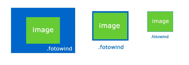
问题在于,我需要保持每张图片的宽高比,并将图片最大化地呈现在容器的height或width内,使其居中显示。
HTML:
<div class="fotowind shadow"></div>
编辑:
.fotowind 容器的初始CSS属性:
.fotowind {
    overflow:hidden;
    margin-left:10px;
    background:#333;
    margin-bottom:5px;
    z-index:30;
    background-position: center center !important;
    background-repeat: no-repeat;
}
根据窗口大小动态构建属性的代码 - 我需要调整图像的大小并保持其比例,即使存在一些空白空间也要留在两侧:
jQuery:
windowWidth = $(window).width();
windowHeight = $(window).height();

if (windowWidth <= 1200 && windowWidth > 768 || windowHeight < 900)
{
    $('.fotowind').css('width', '650px').css('height', '425px');
}
else if (windowWidth > 1200 || windowHeight > 900)
{
    $('.fotowind').css('width', '950px').css('height', '650px');
}

if (windowWidth <= 768)
{
    $('.fotowind').css('width', '450px').css('height', '425px');
}
结果的HTML:
<div class="fotowind shadow" style="background-image: url(http://localhost/AdPictures/25/2c/c2/4c/-9/77/1-/4b/77/-b/ff/a-/57/e5/10/2b/31/b1/7516_1_xl.jpg); background-size: 100%; width: 950px; height: 650px; background-position: 50% 50%; background-repeat: no-repeat no-repeat;"></div>
800x600,那么我不能将它呈现为这个大小,或者当图片的大小为200x650时,例如,它会变形以适应容器大小。